When trading price action or using price action triggers such as Pbars, Inside Bars, Shaved Bars, etc. it is important to always wait for the bar/candle to close more than anything else.

Many people have challenges trading any system because the signals are forming in real time and not necessarily when the candle closes so you have moving elements to the candle, trigger and price action which are still in play.

The way around all this is to wait for the candle to close. Once a candle has closed, it is final – it cannot ever be changed and it will always be that way.

If you are ever tentative about taking a trade, wait till the candle fully forms and closes. Once it does, it will always be like that forever and cannot be changed. This means the signal is clear and there are no changing components to it.

Also, one important thing about trading price action and waiting for the candle closes.

It is often the case (whether it’s the daily chart, 4H, hourly, etc) that price action will be dominant in one direction for the majority of the candle only to reverse strongly at the end of the candle. Institutional traders know retail traders are less disciplined than they are. They know a good trading candle pattern could be forming and will often trap traders into believing that candle is an engulfing candle or reversal candle and then quickly move price in the last minute or 5minutes of the candle only to change it drastically with traders stuck or trapped into a certain direction hoping for higher/lower prices.

It is also often the case the markets will reverse at the end of a session or major candle as traders are paring back positions before market close as they want to be flat going into the close. When they do this, if the market was moving heavily bullish for the day, you will often see price dip a bit in the last 30minutes or less of a session as the institutions are going flat into the close.

Furthermore, a lot of trading today is done via algorithms which will often as well exit their positions causing strong spikes in price going into market closes. You can often observe this in the US equities markets as traders eliminate risk by not holding positions overnight to avoid the risk. Another example is in the London close as you will often see a strong push at the end to only see if fade just before or even perhaps just after the market London close.

Such price action patterns are common and by waiting for the candle to close, you are trading off real price action triggers. If the trading candle pattern is still forming, unless your system is specifically tailored to getting in mid-candle, it is often recommended to wait for the candle to close because up till that point, anything can happen and the formation of the candle and price action signal can change drastically.

Lastly, if something is strong into the close, once the candle closes, it often displays the final intentions of the market in the current move. Closes towards the highs/lows of a candle often indicate there is little profit taking so if you are trading in the direction of such a move, this can be a good confirmation sign. However if you are in a long position and the candle closes with a strong rejection/wick on the topside, the closing of that candle could be indicating the markets intentions to reverse it as price failed for that candle to maintain a strong high and close.

Thus, its always important when trading price action to look at candle closes and entering on them as much as possible.

For those of you looking to learn how to trade pure price action with no indicators, make sure to check out our Trading Masterclass where you will learn rule-based systems for trading Price Action.


Wicks are an interesting phenomenon in price action formations and are virtually a part of every candle.Wicks can form on the top, bottom or both sides of a candle and represent the highs and lows of the price action for that candle on that time period.

What is important to remember about learning to read price action and wicks is that the wicks themselves are ‘rejection’ areas where the market simply rejected the prices of the wick.

It is important to note we are talking about the closes of candles and the wicks that form after because until a candle closes, it could be anything.However, once it closes, its final and its stamp is permanent.

When we have a wick that is large, that wick is clearly communicating to us for that time period (time compression for the candle) where the market was not accepting price.

If the prices were accepted, then price would remain there for a decent amount of time and close there.However, the fact that price does not close there means the market is rejecting that price value for that time.

If we are talking about 5min charts, then the market has rejected that price level via the wick for only 5minutes which is not that significant.However, when we start to look at 4hr or daily charts, this is significant.If you think about it, day traders are only witnessing two 4hr candles in a day, max three so for price to have a long wick on a 4hr chart is very significant as any day trader will take notice of the 4hr rejection as being a long period of time for price to be rejected – hence they will really have to think about trading against such a price action formation.Minimally, we suggesting looking at nothing less than the 2hr chart for significant wicks.

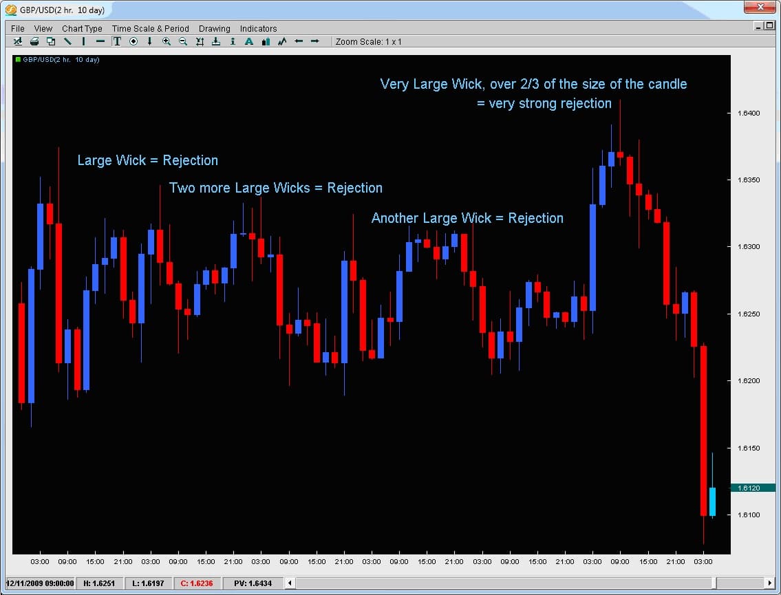
Taking a look at the example below, notice how every time the GBPUSD reversed, it did so with a very large wick and almost at the same price level?This was telling us the market simply did not accept prices at these levels with sellers aggressively entering the market quickly causing the pair to drop fast and not even close at those levels.The most notable one was the last wick with the wick being over 2/3 of the entire candles price range suggesting there was competition to sell the pair that high.

wicks

If the long wick is on a daily chart, day traders from all three sessions will have to take note of it and really be confident about their trade to go against the wick which is where the market rejected price for that entire day.If you are a day trader, you are only looking to be in a trade for a matter of hours and likely targeting an amount of pips less than the daily range for that pair (or at least you should be).

With that being said, they are also likely either targeting the price action within the days range or a breakout.However, what price levels are they watching if trading breakouts?

The highs and lows of the days candle which includes the wicks.And if the wicks represent a rejection zone, any day trades will have to be outside of it, thus making the chances of trades being placed inside the region of the wick less likely.

It should be noted when analyzing price action that the markets will usually make a second attempt to breach a price level before it gives up.Thus, if someone is going to reverse a pair, using the tail end of the wick offers the trader good risk/reward opportunities.

To learn how to find and trade these price action strategies, check out our Price Action Course which teaches you simple, rule-based proprietary price action strategies based upon 10+ years of quantitative data and analysis.

A somewhat common but important price action behavior, and Inside Bar is a candle that is completely inside the previous candles high and low.This is not just referring to the body, but the wicks as well being inside the previous candles price action.Why are inside bars important and how can they lead to trading opportunities.

Before we answer the question above we have to look into the reasons why this price action behavior takes place.There are several reasons for the inside bar forming, many of which we will list below;

  • Price is consolidating after a large up/down move in price and is about to start another leg in the same direction
  • Price is coming up against a critical support/resistance level which shows some hesitation in the market as to whether it will continue or not
  • Price Action and liquidity is dropping before a critical news announcement so with nobody taking new positions, price will not have enough order flow to move consistently in one direction
  • Profits are being taken

Regardless of what the reasons are, as traders we are most concerned with which situations are most likely to yield a price action trigger and a trading opportunity.Out of all the reasons listed below (and there are more) the least important is the news announcement as the environment leading up to a news announcement is generally recommended to be avoided due to poor liquidity.

However, all the others are critical for us because they tell us via price action what the market has done and is likely to do next via a price action trigger.

With that being said, lets look at a few inside bars and see how the price action leading up to them revealed information about why they were created and what is the likely next move.

inside-bar-pic-11

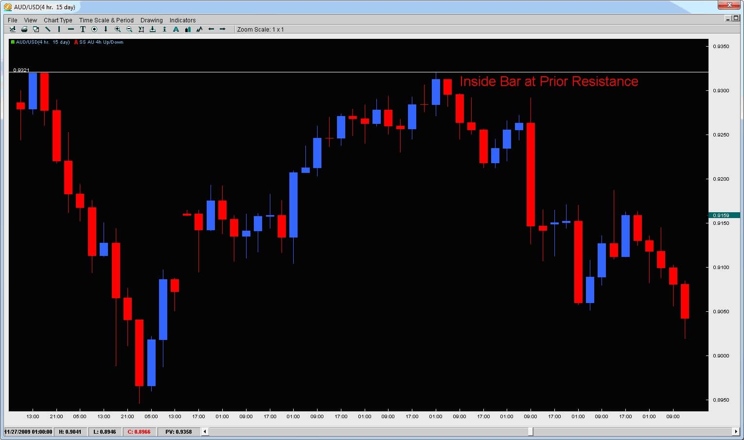
Below is another price action Inside Bar coming at a critical resistance level.See how the rejection on the 2nd attempt as it could not muster a close but only a wick at the previous resistance level? The next candle is an inside bar (not making any higher highs) and closes below the mid-point of the prior blue candle suggesting the bears are starting to wrestle control from the bulls.

inside-bar-pic21

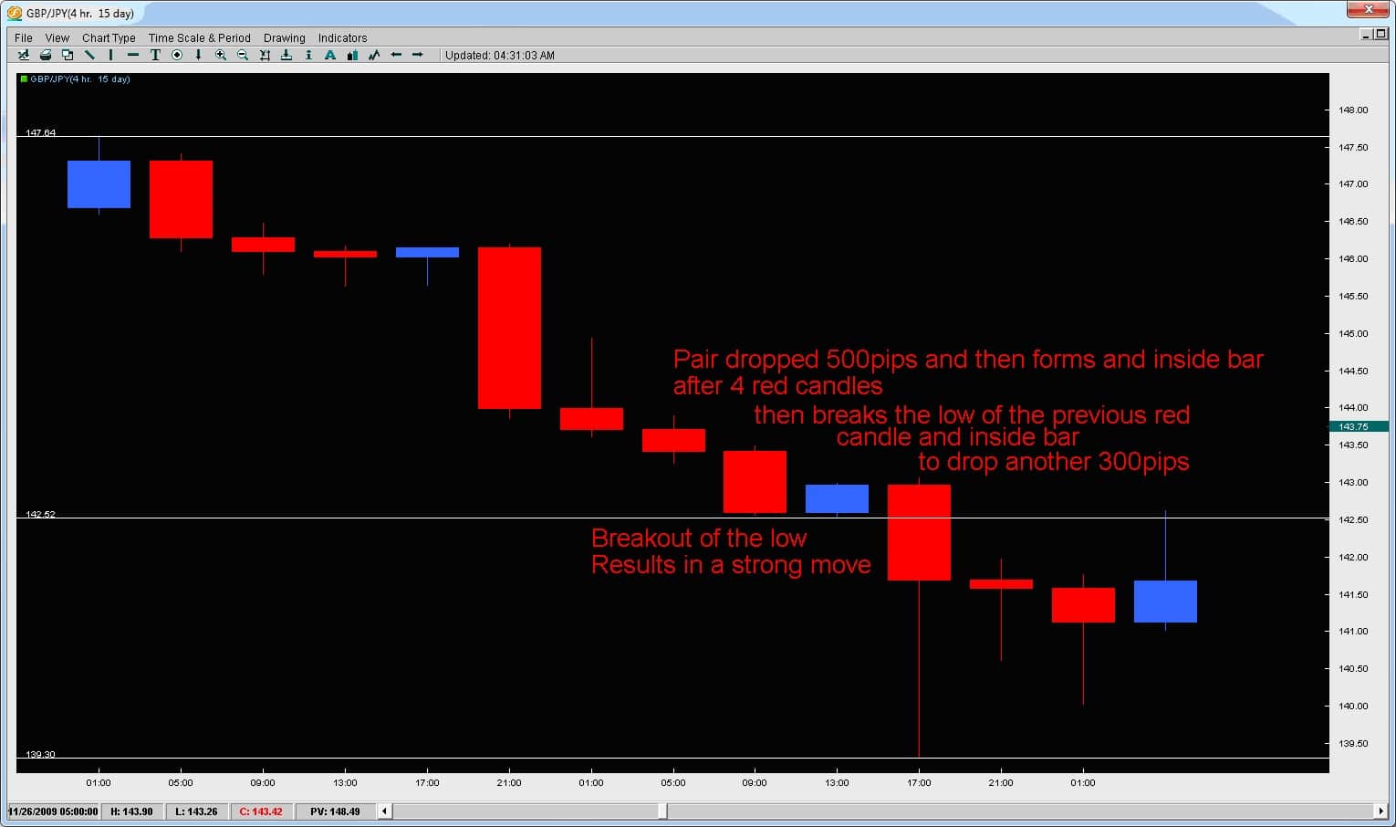
Another example of how price started a strong move and then formed a single inside bar. Price then barely made a new high (with the small wick to the upside on the next red candle) and then broke the low dropping another 300+pips. This is a common price action trigger after the formation of an inside bar.

inside-bar-pic31

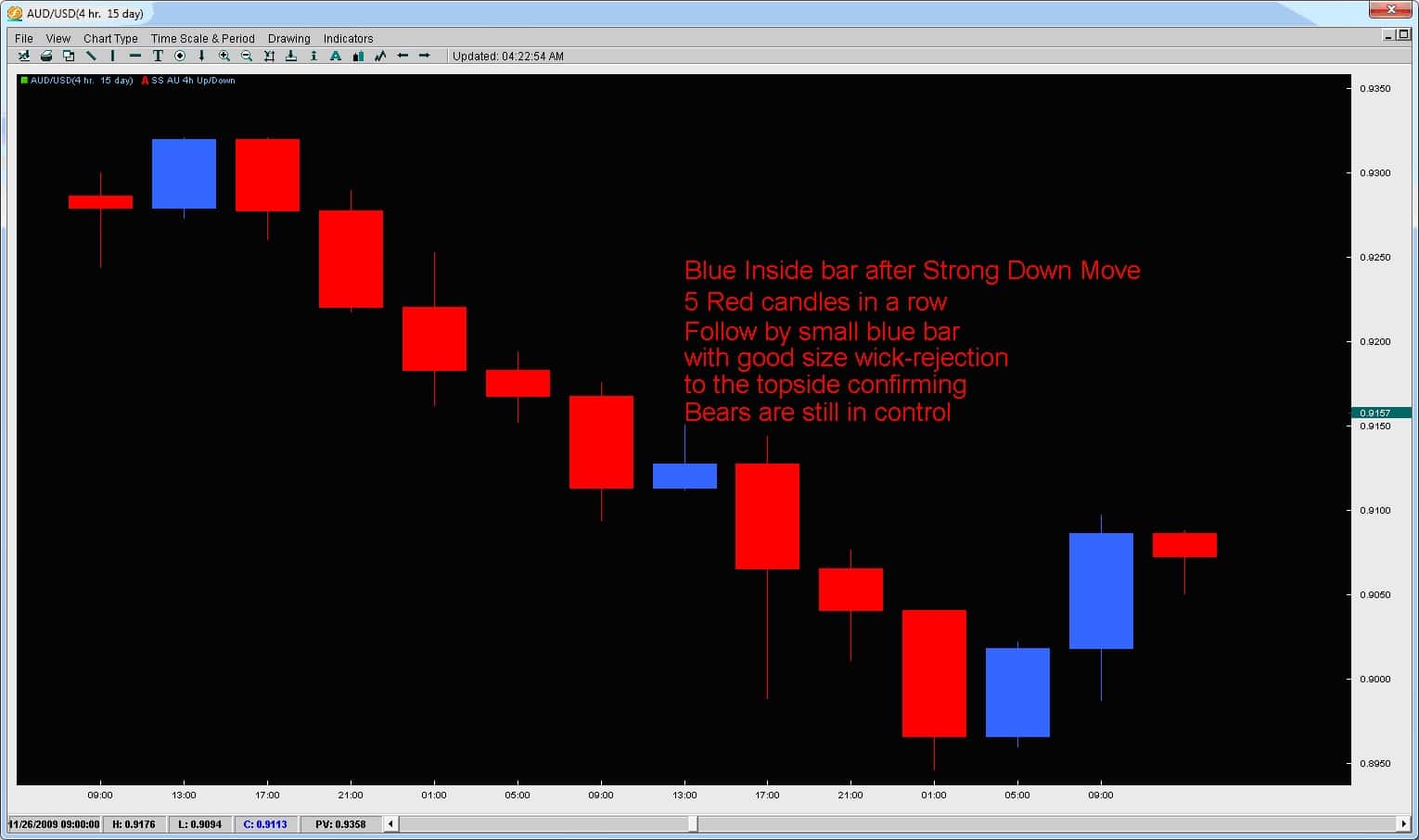
Inside bars form approximately 10% of the time (or are approximately 10% of all candles) and are a unique price action formation. When they occur and critical support / resistance levels (prior highs/lows, Fibonacci retracement levels, outer pivots, larger Kumo formations, etc) they have more impact and can often lead to strong price moves.Also watch out for Inside Bars occurring after a strong price action move. By analyzing the prior move, the wicks of the inside bar, the overall size of it and the price action of the next bar following the inside bar, we can gain an insight into the price action and where the next move is likely to be.

For more information on forex inside bar trading strategies, take a look at the Price Action Course where I share rule based strategies and triggers to trade inside bars.

Introduction

Still growing amongst the Western and European traders, the Ichimoku Cloud (or Ichimoku Kinko Hyo = One Glance Balance Cloud Chart) was originally developed pre-WWII by a man named Goichi Hosada.  Because of the war, his research was halted and then later finished in 1968 whereby he published a 1,000 page, 4 volume body of work releasing the Ichimoku Cloud to the world under the pen-name Ichimoku Sanjin.

Originally built for the Japanese stock markets, the Ichimoku cloud indicator has made its way out of the land of the Eastern sun and into the trading world at large, being applied and used widely in the Commodities, Futures, Options and Forex markets. Part of the Ichimoku Cloud trading system’s success is its ability to find trends and reversals well before they begin.


The Indicator

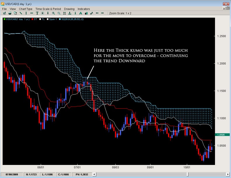
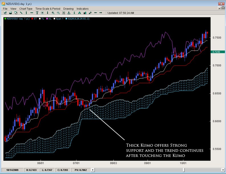
The Ichimoku Cloud has several components which give it a lot of versatility and uses.  The most unique aspect of the indicator is its ‘Kumo’ or cloud which offers a unique perspective of support and resistance.  Most western methods look at support and resistance in a linear fashion or as straight lines in the sand (e.g. Fibonacci, Pivots, Channel Lines, Trend Lines).  However the Kumo or cloud is an ever evolving object which was designed to represent support and resistance based upon price action.  Generally, when you are in a strong upward trend, the support is strong as the price levels below have been accepted.  The same goes for a strong downtrend and having more layers of resistance.  Below are two examples of up and downtrends – showing how the Kumo was quite thick in nature.
ichimoku-cloud

ichimoku-cloud2

The most important way to look at the Kumo is as support and resistance – meaning if it is thick, then the support/resistance (depending upon where price is in relationship to the cloud) is strong.  If price is above the Kumo, we are in a general uptrend or would want to look for more buying opportunities.  If price is below the cloud, it is below resistance (the Kumo) and we want to be searching for more shorts than longs.  The longer price stays below/above the cloud, the stronger the trend we are in and the more support/resistance the Kumo will offer.


Kumo Composition

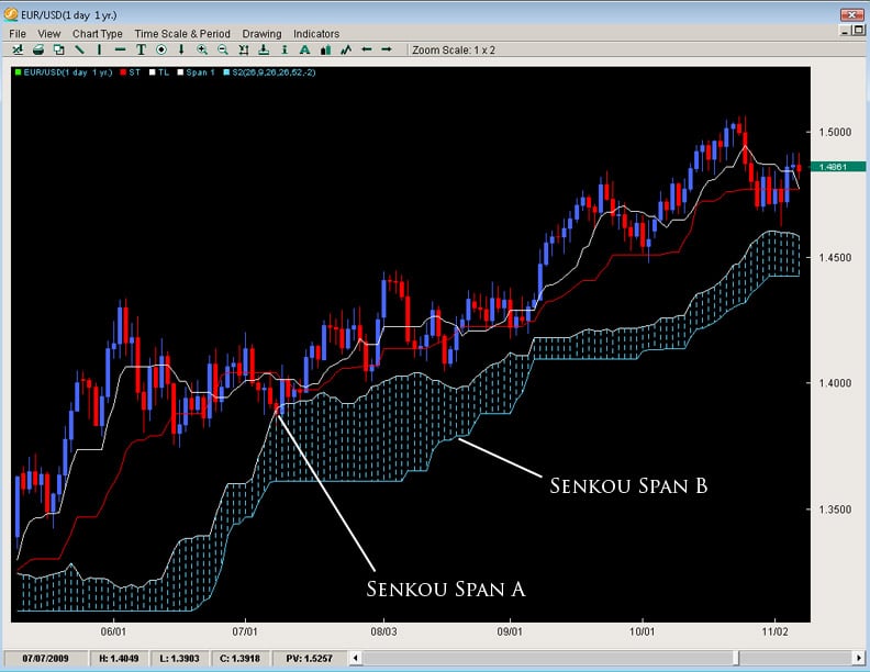
There are two main lines of the Kumo which are referred to as Senkou Span A and Senkou Span B.  For the purposes of efficiency, we will refer to them as Span A and Span B.  The space or value in between these two lines is what forms the Kumo.

Span A is formed by taking the Tenkan Line and adding it to the Kijun Line (white and red lines respectively from chart above), then dividing that value by 2 and plotting it 26 periods ahead.  The formula is;

(Tenkan Line + Kijun Line) / 2 placed 26 periods ahead

Span B is formed by taking the highest high (over the last 52 periods), adding to it the lowest low (over the last 52 periods), dividing that by 2 and plotting that 26 time periods ahead.  The formula is;

(Highest High + Lowest Low for the last 52 periods) / 2 and plotted 26 time periods ahead.
kumo-chart-1

We will talk about some important points regarding the construction of the Kumo later.


Other Ichimoku Components

(Tenkan, Kijun and Chikou Span Lines)

The Tenkan Line or Tenkan Sen (Sen means line in Japanese) is known as the conversion line or turning line is similar to a 9SMA but actually is quite different.  Remember a SMA (simple moving average) will smooth out all the data and make it equal but the Tenkan Line will take the highest high and lowest low over the last 9 periods.  The explanation for this is Hosada felt price action and its extremes were more important than smoothing any data because price action represented where buyers/sellers entered and directed the market, thus being more important than averaging or smoothing the data out.  As you can see by the chart below, the Tenkan Line is quite different than a 9SMA.  Because the TL (Tenkan Line) uses price instead of an averaging or the closing prices, it mirrors price better and is more representative of it.  You can see this when the TL flattens in small portions to move with price and its moments of ranging.
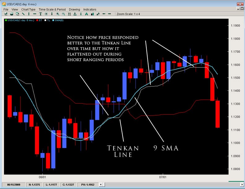
tenkan-line

Akin to all moving averages, the angle of the Tenkan line is very important as the sharper the angle, the stronger the trend while the flatter the Tenkan, the flatter or lesser the momentum of the move is.  However, it is important to not use the Tenkan line as a gauge of the trend but more so the momentum of the move.  However, it can act as the first line of defense in a trend and a breaking of it in the opposite direction of the move can often be a sign of the defenses weakening.

The Kijun Line (or Kijun Sen) is known as the datum line, standard line or trend line designed to indicate the overall trend for the instrument or pair.  The formula behind it is the same as the Tenkan line using price action and the highest high + lowest low with the only change being in the periods as it does it over the last 26 periods.

Why 26 periods?  The answer to that is a matter of history.  When the Ichimoku cloud was first created, the Japanese markets were open 6 days a week on Saturdays. If the markets are open 6 days a week, this generally results in 26 trading days for the month – hence 26 periods for the Kijun.  In essence, what it was meant to be was a measure of the highest high + lowest low for the last month of price action.  If the Kijun has been climbing – it means price has been gaining ground for the last month.  If it is flat, then it will be the midpoint of the range of price for the last month of price action (or representative of the price equilibrium).
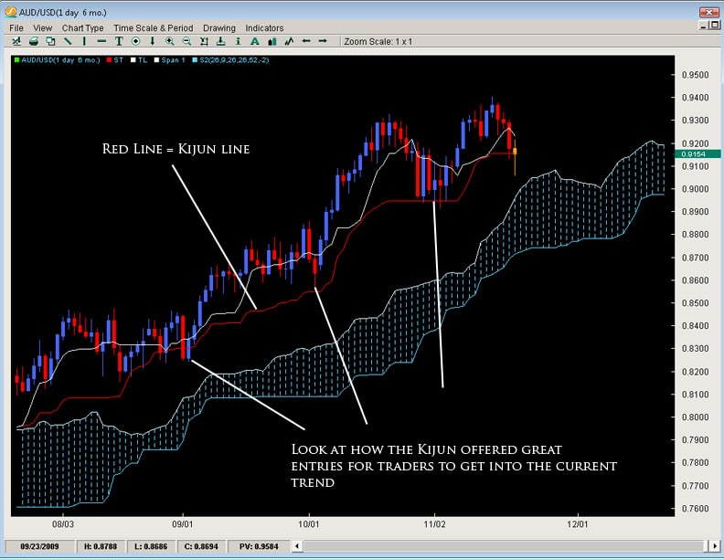
kijun-line

Also like the Tenkan Line, the angle of the Kijun is reflective of the overall trend in place.  Price breaking the Kijun after being in an up/down trend often has serious consequences for that trend and can many times lead to a reversal of sorts.  Ultimately because it uses a longer period to measure price action, its a more stable method for determining the direction of the trend than the Tenkan Line.  Because of price to respect this line during a strong trend, it can potentially be used as a stop loss for traders already in the correct direction of the trend.  Hence, when price breaks or closes below it by a significant amount, the trend is often over.

The Chikou Span or lagging line is created by taking the current closing price for the instrument and shifted 26 time periods back, hence why it is a lagging line.  This is a strange concept and not something usually seen in technical indicators which makes the Ichimoku Cloud even more unique.  The purpose is simply to gain perspective in regards to how the current price action is in relationship to previous price action.

The main application for giving perspective to the trader is how does the Chikou Span relate to price 26 periods ago.  If the Chikou Span is lower than price 26 periods ago, then there is resistance for the current upmove or pressure which could force price down into a bearish move.  However if the Chikou Span is above price from 26 periods ago, then it would mean there is little or no resistance ahead since price is in the process of making new highs and there is no recent price above it – thus paving the way for a strong trend.
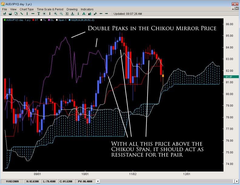
chikou-span


Applications for the Tenkan and Kijun

The most common usage of the Tenkan and Kijun are the ‘cross’ or what we call the TKx (Tenkan-Kijun Cross).  Similar to how a MACD uses a cross of its two lines, the Ichimoku Cloud does the same.  It is interesting to note that the Ichimoku cloud uses the same periods as the MACD, however it was created over a decade earlier.

One of the main signals for Ichimoku cloud traders, the TKx can often indicate when a trend is about to begin by forming a cross (upward cross = possible upward trend while downward cross = possible down trend). A generic upward cross can be used as a bullish signal (or exit for people already short) and a generic downward cross can be used as a generic bearish signal (and vice versa for current bulls).  However, notice we used the term ‘generic’ meaning there is more to the cross.

Hosada was able to give a further definition to the cross based upon its position to the Kumo or cloud.  If the cross was below the Kumo, then it was considered a ‘weak’ signal since the cross was below the Kumo or below resistance.  A medium signal was when a cross happened inside the Kumo as it was occurring within the field of support/resistance.  A strong signal was when the bullish cross happened above the Kumo as it was happening after clearing resistance.  The opposite is true for bearish signals whereby a weak signal is a cross above the Kumo, while a medium signal is inside the Kumo and a strong signal below the Kumo.  One important reminder to all this is to make sure you reference the Chikou Span to see how current price is in relationship to previous price action.
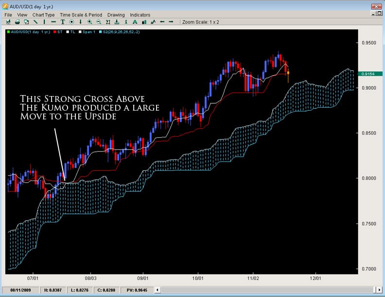
tkx

The nature of the cross usually indicates the overall strength or potential for the move but it should be noted strong trends have developed from weak crosses.  It is always also important you reference the construction of the Kumo when trading the typical TKx signals.


Some Important Final Notes on the Kumo

As we talked about before, the Kumo is designed to represent support and resistance but it has a host of implications in doing such.  To review, the thicker the Kumo, the stronger the support/resistance it will offer.  Price will often reject off of the Kumo only to resume the current trend as depicted below by a few examples.

What this also means is if the Kumo is exceptionally thin, in a ranging market it likely means the range will continue as their is neither enough support or resistance to hold a single direction for the pair.  What it also means is if we are in a current trend and price is approaching a thin Kumo, the chances increase for a trend reversal since the support/resistance offered by the Kumo is not significant.  This is why Kumo analysis is important as it can often lead to reversals and inform us in the future of pending trend changes.

Also, there is a common formation in the Kumo called the ‘flat top or bottom’.  This refers to when the Span B becomes flat.  Remember the Span B is composed of the last 52 candles absolute highest high and lowest low – thus referring to price action over the last 52 periods.  If Span B is flat, the only way it can do that is if price has not extended to make any new significant highs or lows.  This means we are in a range and the tendency of a range is to move towards equilibrium or towards the center of the range – also known as the value area for price.  The end result is during a ranging environment, the Span B is the virtual 50% fibonacci retracement level for that range and is the ever changing 50% fib level for a trending environment, dividing the last 52 candles into two halves, the upper and lower half.

What does this mean for traders?  If price is inside the Kumo, it will have a tendency to gravitate towards the flat top/bottom.  If price is above it, the tendency of price will be to gravitate towards the flat top/bottom, often using it as a springboard for a rejection off of it.
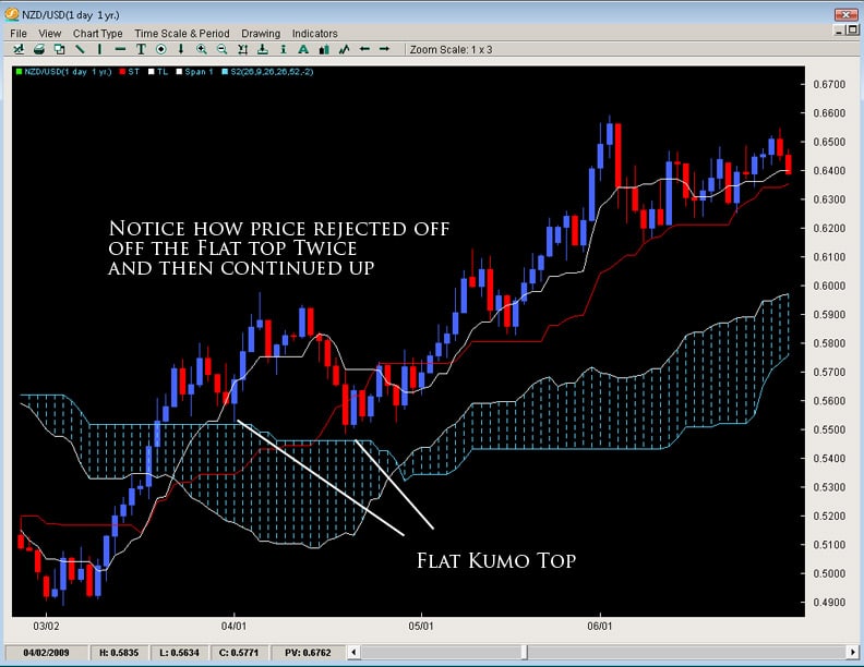
flat-top

Lastly, one of the most important things about the Kumo is what happens when price breaks it.  If we have been in a strong trend for sometime and price then breaks the Kumo, it usually represents a trend change and the likelihood of a large move about to begin in the direction of the break as you can see by the examples below.
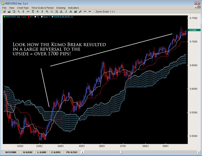
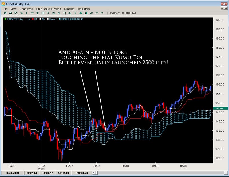
kumo-break-1

kumo-break-2

It is because the Kumo is always changing shape that it can represent a much better perspective of support and resistance.  It is essentially based upon price action and changing shape based upon previous price moves.  This makes it a little more sensitive and representational to price unlike static forms of support and resistance (fibonacci retracement levels, pivots, trend lines, etc) which do not move at all once they are in place.  It is its unique construction which allows the Kumo to be both Static and Dynamic in giving support/resistance levels to the trader.


In Closing

This is just the beginning of the Ichimoku Cloud and designed to give the trader an introduction to the key elements around such a fascinating indicator and method for trading the markets.  The Ichimoku Cloud has the ability to detect trends, reversals, support/resistance levels, trend strength/weakness and momentum for a pair.  It is due to its ability to be used in multiple environments, along with its unique perspective upon price and support/resistance levels that Institutional and retail traders have gravitated towards using this method.

As forex traders, we have the challenging task of trading to make profit from the price moves in the market. This entails finding the where (price), when (timing), and the direction (trend). Most traders end up searching the savannah of trading systems adding tons of indicators on the charts that end up looking like an italian spaghetti food fight amongst 5 year olds.
What is interesting is that the answers to these three things we have to find as forex traders (where, when and direction) are all written in the price action. With that being said, we should answer the question of what price action is.
What is Price Action?
Price Action is simply the movement of price over time. It can be as simple as one price candle or over 100’s of candles. It is not time specific but it simply refers to the movement of price due to the order flow of the market. The bedrock of it is the forex market moves because of the big players. Whatever the reason (technical or fundamental), the market only moves because the larger players buy and sell. The combination of all the buy and sell orders, along with the volume is what moves the market.
Unfortunately we do not have access to the total aggregate volume in the Forex market and any broker volume we get is just a small lily pad in the pond – not representing much in terms of the overall gestalt of volume. Thus, since we do not have access to order flow and volume, the bottom line is we have to trade the way the big players do. We have to find out the where, the when and the direction they are getting in.
The good thing about this is we have most of this information right in front of us hidden in the price action. Again, the market only moves because of order flow and its closest relative we could ever court is Price Action. By learning how to read price action successfully as forex traders, we give ourselves the most important piece of information about what the big players are doing and thus can profit from these moves.
As the smaller and medium sized traders, we are simply having to learn how to surf the waves of price created by the bigger ships in the ocean of price movement. Learning how to read price action will be the most powerful tool you could ever develop when it comes to learning how to trade because it gives you the three most important things to trading (the where, the when and the direction). It is only until you master all three of these will you see consistent profits with minimal drawdowns over time. Thus, get an education in price action and learn how to trade the markets successfully.

EURUSD
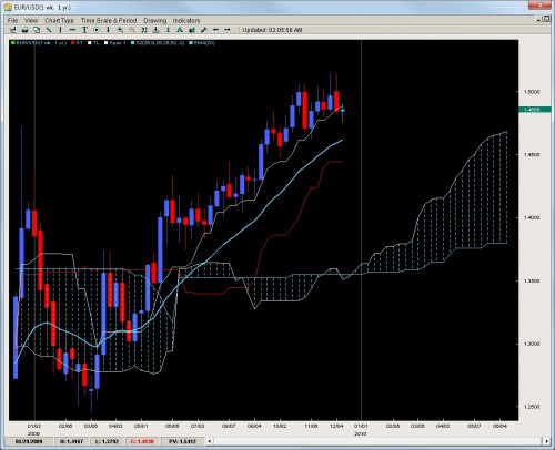
Finally breaking stride, the EURUSD has done something it has not been able to do for the last 7 months…have a weekly close below the Tenkan line. This line has held on dips and been quite a play in terms of getting into this trend. With the line being broken, there are two likely scenarios and a third unlikely one.
Scenario 1: The pair goes sideways into a consolidation or channel holding between 1.4615 (20EMA) and 1.5130 (basically the yearly high). This is the least exciting scenario but probably the most likely as heavy positions are probably not coming into the pair anytime soon. The pair simply struggled to make any new ground above 1.5000 and failed every time to have a weekly close above it. Does this mean the bulls are headed for the exit? No – but they are less confident in the short term and will likely not consider adding positions until the pair touches the 20ema.
Scenario 2: The pair starts a sell off as bulls take profits for the year and exit out of the pair. The failure to close on a weekly basis above 1.51 caused them to lose confidence short term and look for a lower/cheaper entry. If this plays out, the pair should move within 1-2 weeks towards the 20ema. However with liquidity drying up by the end of next week, unless the pair starts getting aggressive today or tomorrow, this scenario fades in likelihood as santa comes closer to visiting us through our chimneys.
Scenario 3: The least likely is the pair gets really bullish and makes new highs. We feel this is rather unlikely so if you are thinking of throwing on massive longs, caution is advised as we do not feel this is the time, environment or overall location to be putting on heavy longs. Best to wait till new year with fresh eyes and hopefully a lower price.
eu-weekly
GBPUSD
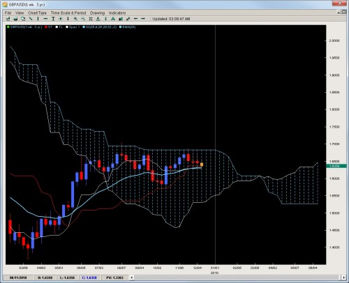
Failing once again to make a run for the Kumo Flat top and break it, the pair has now posted 3 straight weekly closes and is threatening an important base in price at the 6300 region along with the Kijun, Tenkan and 20ema. If we were to get a weekly close below this, we feel the pair would make a strong move towards 1.5700 which was the October low and launching pad for a 1300pip run. Keep in mind this was a perfect bounce off the Kijun which is not as stable now so any breakdowns this week likely lead to strong price moves once clear of 1.6200. It is becoming more likely GBPUSD will remain between 1.5700 and 1.6827 which is the flat Kumo top for the rest of the year so do not expect wild upside thrusts to end the year.
gu-weekly
AUDUSD
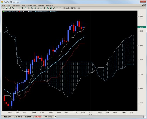
Virtually but a cigar short of closing below the weekly Tenkan, the pair is threatening a break below the white line which has held since July (only below for 1 week) and essentially since March. A weekly close below this will likely target the 20ema which is down at 8800 where the longer term bulls will be tested and tempted to add positions. Keep in mind a break of this line would likely start a drop towards 8500 and perhaps down to 8200 where there is a good price base and likely where the kumo would be in such a venture. Overall, we feel the pair is showing signs of being over-valued and may need to unwind a bit before another push up towards parity is attempted but its unlikely bulls have the gusto right now for an attack on the yearly highs or 9500 so we expect at best a sideways consolidation between 9000 and 9400 but would not be surprised if a strong sell-off occurs as there is not much to prop the pair up except for a small 3 week price base at 9000.
au-weekly
USDCAD
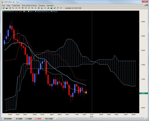
The drifter of the pairs, price action is getting less enticing every week as we are seeing multiple inside bars with little breakouts and a lot of wicks on the weekly charts communicating a lot of rejections and un-clarity about where price should be for this pair. Its forming a wedge and a rather small one so these are generally environments to be avoided. There is a small base which we mentioned last week in the 1.04’s and we mentioned if you wanted to get long, that was the place to do it. It definitely yielded some profit bouncing about 100+pips off that figure but each week such a move becomes more dangerous and less recommended. The only other base to go long is at 1.0200 (yearly low). Beyond this, we do not feel any other longs will enter until a break of the 20ema which has not happened since April.
uc-weekly
NZDUSD
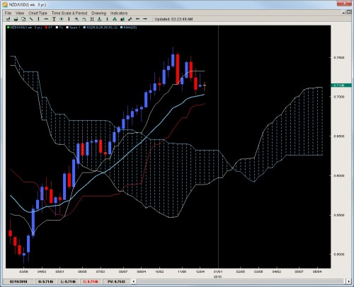
The underperformer of the trend pairs against the greenback, the pair has now formed a short term range of price action between the Tenkan and 20ema with two rejections at the Tenkan and one at the 20ema. The good thing about this price action is it gives us clear plays on both sides of the market and out of all the pairs, we feel this is one of the better ones to trade with the established rejections. The lines in the sand are more clear here than any of the others so plays (light ones) could be made on both sides. With all the lines starting to go flat, the chances of this range holding (at least to the upside) are solid. A downside break is the more likely scenario but the jury is still out on that one. Any aggressive selling today or tomorrow would bolster the downside argument. Ultimately, we feel any strong dips will likely lead to price basing around 6500 which we feel is a good value area to establish longs for another run up to 7500.
nu-weekly
Chris Capre specializes in using Ichimoku, Momentum, Bollinger Band, Pivot and Price Action models to trade the markets. He is considered to be at the cutting edge of Ichimoku analysis along with building trading systems and Risk Reduction in trading applications. For more information about his services or his company, visit https://dev2ndskies.wpengine.com