Tag Archive for: price action

I recently wrote a controversial article dispelling some of the misconceptions about the ‘Quality vs Quantity‘ argument, the ‘Less is More‘ being better for your trading.  It has already garnered a lot of questions and responses on the web, which was its purpose.

But there are still some lingering and freshman ideas floating around there.  Thus, I wanted to write a brief article to end the week highlighting some of the key takeaways, and what not to be fooled by.
 
High Quality Signals Only Come From Higher Time Frames
The idea that high quality trades, setups and signals only come from higher time frames really comes from an inability to see and read price action.

high quality signal higher time frames trading like a sniper 2ndskiestrading.com
Ask yourself – what constitutes a high quality forex signal?
Some of the main components (regardless of time frame) should be;
1) a pattern that repeats itself with consistency and accuracy
2) a signal that offers low risk and high reward potential
3) a pattern that offers a clear entry and exit pattern
Let’s break down each one here so you fully understand them;
 
1) A pattern that repeats itself with consistency and accuracy
high quality patterns that repeat themselves 2ndskiestrading.com
If you haven’t noticed, the markets are changing with daily ranges contracting massively and currently at 5 year lows.  HFT algos now comprise 28% of the daily volume, but 3 years ago were 10%.  So this would change how the price action unfolds considerably as they are using different techniques, technology, and patterns than traditional human traders would (or could).
Even though the patterns are changing, they are patterns that repeat themselves nonetheless, and for someone who is a real student of price action, you will be able to see these patterns on all time frames.
As long as the price action pattern is relatively consistent with both the formation and outcome, this is a key ingredient for a high quality signal, and thus a tradable event.
 
2) A signal that offers low risk and high reward potential

quality vs quantity which is better 2ndskiestrading.com
The size of my stop in relationship to my target is what constitutes a high quality signal.  The greater this is above 2x reward v. risk, the better the quality of the signal.  I still have to figure accuracy into the equation, as profit is really a measurement of risk, reward and accuracy.
Regardless, a 200 pip winner with a 100 pip stop offers the exact same profit potential as an 60 pip winner with a 30 pip stop.  Assuming you risk the same on each trade in terms of % equity, they offer the exact same profit potential.
Now one thing should be pointed out;
Risking 100 pips, how many times would I be able to grab a 9x, or 11x reward play, meaning I could grab 900 or 1100 pips from that trade?  I’m assuming not many at all, and something you’ve likely never done just risking 100 pips.
But what about risking say 10 pips and gaining 90?  Since 900 pip straight moves are not common on a daily chart (maybe 5-6x a year), but 90 pip moves occur everyday, the latter once again offers more profit potential.
Just the other day, one of my price action course students did just that, snagging 128 pips on the day, grabbing a 9x reward play, an 11x reward play, and a 2+x reward play.
So you trading the daily charts only risking say 100 pips, would have needed to bank a 900 pip runner, an 1100 pip runner, and a 250 pip runner, just to equal what my student did in < 24hrs!

making money trading price action with chris capre 2ndskiestrading.com
Ask yourself Mr. (or Mrs.) Daily Chart Trader Only, how many times will you be able to do that in one single day, let alone a year?
If you are on avg. banking 2x reward plays, and trading 3x per week, you would need an entire month of perfect trading just to equal his half day of trading.  Add 3-4 losses in there, and you are talking 1.5-2 months to achieve what my student did in 24hrs.
Which would you rather do?  Work for an entire month to make what you could in a day?  Wait for months on end to find something  you could achieve almost daily?
Food for thought, but high quality signals happen everyday.  If you are not seeing it, you just haven’t learned how to yet, but with proper training in price action or ichimoku, you could.
 
3) A pattern that offers itself a clear entry and exit pattern
For any signal to be high quality, as discussed earlier, it has to be 1) repeatable and solidly accurate, 2) offer low risk/high reward potential, and 3) offer a clear entry and exit pattern.
For those that have read my article on understanding impulsive and corrective price action, you will remember my key model is to find impulsive moves and trade in that direction, as the next legs are likely to be a corrective move, followed by another impulsive move in the same direction.
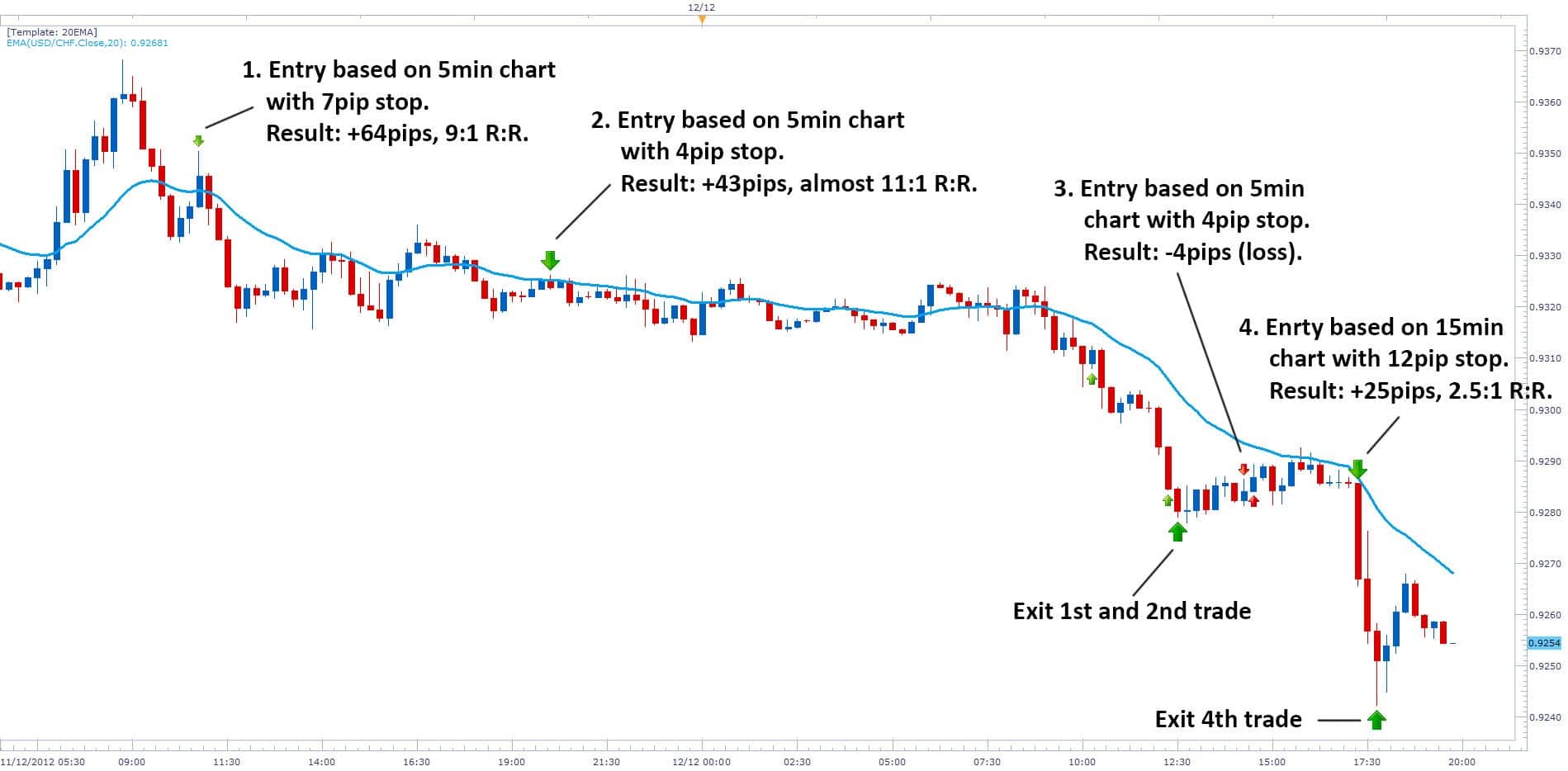
Now using the same chart from my student below, look at the 4th trade which is the last one on the day (chart below).
price action trading top student 2ndskiestrading.com usdchf
Notice how he was using my model of following the impulsive and corrective price action, looking to short with trend on a corrective pullback and trade with the institutional money.
His first attempt failed for a small 4pip loss, but his second attempt caught a really opportune moment to get in, and immediately after his entry, the sellers came in with force, bottoming out with a pin bar setup that he recognized as a likely bottom, along with a few other clues from my price action course.
He ended up banking +25 pips on a 12 pip stop for a 2x+ reward to risk play, all in 15 mins.
Notice how he controlled the risk exceptionally well with precision and confidence, almost like a sniper would taking out his targets.  For those with eyes, he had a clear entry and exit pattern, which is needed to have a high quality signal.
This was a high quality A+ setup that was obvious and was begging to be shorted.  You will also notice he had a good strike rate, hitting 3 out of 4 trades for 75% accuracy, all while trading < 1hr charts.
To do this he had to be patient and disciplined.  You don’t have to wait for days to find these trades, as they come daily.  You just need to learn how to spot these high quality intraday price action setups.
He was looking for easy opportunities, acted with complete confidence, swiftness, precision and without hesitation.

less is more trading with precision like a sniper 2ndskiestrading.com
He also avoided any risky situations, and used highly effective risk management, never risking too much per trade or more than necessary.  He never interfered with his trades as you can see on trade 2, he had to be patient for the trade to mature.  When it did, he took profit, but he never exited early.
And if you look at the 2nd and 4th trades, he was looking for the easy prey – the most obvious setups out there.
 
In Summary
As I stated in my prior article on quality vs. quantity – which is better for trading?, the ‘less is more‘ doesn’t apply mathematically and always hold up, as I’ve already demonstrated.  Unless your accuracy is significantly higher, your ‘less is more‘ theory is actually a lot less profit mathematically.
Food for thought.
Now it should be stated I am not saying you should trade intraday only, or abandon the 4hr and daily charts.  For those of you with full time jobs, families, and busy lives (many of you), I recommend trading the daily and 4hr strategies as these will be most suited to your situation and availability.
I always advocate finding what is most natural to you, your mindset and situation.  This will always be the most profitable strategy you could engage in.  For some that will be on the higher time frames and the ‘less is more‘ approach which has some advantages.
But for others, it will not be, as you have the skill set, mental aptitude, and availability to trade intraday. The key is to finding what would work best for you, and then learning that to the best of your abilities.
Just don’t fall prey to the ‘one size fits all‘ or ‘less is more‘ approach, because it may actually be ‘less’ for you.
To argue high quality forex trading setups only manifest on higher time frames is a sophomore understanding of trading price action, or trading as a whole.  They manifest on all time frames, you just have to learn how to see them.  That does not mean you should trade them all – just find a method of trading that fits you best.
Make sure though, you don’t fall for any one sided arguments saying quality is better than quantity, or vice versa, as the answer lies somewhere in between, and in reality – a balance of both!
Kind Regards,
Chris Capre

There seems to be a ton of confusion on both sides regarding the Quality vs Quantity Argument when it comes to trading.  Being such an important subject for a trader, I have been wanting to write about this for some time so it’s time to put some of the myths, mis-information and confusion to bed here.

quality vs quantity in trading 2ndskiestrading.com

One of the big forex trading arguments going around has to do with ‘Quality vs Quantity‘, and it is often masked in the typical;

-Trading Higher Time Frames = More Accuracy

-Trading Smaller Time Frames Carry More Risk

-Anything Below The 1HR Charts is Just Noise

-Quality Trades Make More Money Than Quantity

In regards to the above statements, only one of them is true, but it is incomplete by itself and does not paint the whole picture.

Today’s article is here to dive into this subject, explore both sides of it, and talk about which of the two competing theories is correct.

Quality Is Better Than Quantity When It Comes To Trading
I know two groups of billion dollar business entities that would completely disagree with this argument. They would be Casino’s and HFT shops (High Frequency Trading).

Casinos often times (in the various games you can play there), only have a slight edge, often times 1-4%, meaning they are 51-56% likely to win at every play, with a 49-44% chance to lose.  This small edge might not seem like a lot, but played out over 1000’s of times a day, and it all adds up.

high frequency trading algos quantity vs quality 2ndskiestrading.com
HFT algos also take a similar approach.  They are not trying to make huge winners and let trades run for days. They are in anywhere from hours to minutes, perhaps seconds, or even nan0-seconds.  They make small trades for ultra small profit, but they do this hundreds of times a day, and make money year in year out.

These two things alone debunk the whole quality is better than quantity argument, as they are highly successful at what they do.  In 2011 alone, HFT firms made over $1.2B (yes, billion) in profits.  Not bad for having such an inferior trading style!

HFT methods simply use the mathematics and repetition of the edge to make profit.  It’s an edge – maybe not the easiest for a human trader, but an edge nonetheless, and it makes money.

The bottom line is, if you have an edge, the more times you can apply it with the same level of accuracy, the more the edge will play out in your favor.  And that leads to more profits.

quality vs quantity a comparison approach 2ndskiestrading.com

A Comparison Approach
To really see the numbers and a comparison approach, let’s take System A with 60% accuracy, trading 5x a month, risking 100 pips and targeting 200 pips.  Below is how the math works out;

5 trades over 12 months = 60 trades per year
60 trades x 60% accuracy = 36 winners and 24 losers
36 winners at 200 pips gained =  7200 pips gained
24 losers at 100 pips lost = 2400 pips lost
Total Profit =  +4800 pips

Now, lets take System B, which is the same as System A, but bring down the accuracy just 5%, assuming you will be less accurate trading the same system on a lower time frame.  Let’s have you trading 20x a month (~5x per week), risking 50 pips and targeting 100 pips (same ratio of risk to reward).  Here is how the math plays out below;

20 trades a month = 240 trades per year
240 trades at 55% accuracy =  132 winners and 108 losers
132 winners at 100 pips gained per trade =  13200 pips gained
108 losers at 50 pips lost per trade = 5400 pips lost
Total Profit = +7800 pips

Assuming you risked the same equity % per trade using System B – trading quantity over quality made more pips and profit.  Even if I make System A 15 % more accurate than System B, here is how the math plays out;

60 trades at 70% accuracy = 42 winners and 18 losers
42 winners at 200 pips gained per trade = 8400 pips gained
18 losers at 100 pips lost per trade = 1800 pips lost
Total Profit = +6600 pips

As you can see, even being 15% more accurate, System A still under-performs System B.  Only until you get to 77% accuracy will System A outperform System B.

So this whole argument that Quality over Quantity is mathematically false.

One of the key questions you should be asking yourself then is;

Can I be 77% accurate trading my system on the higher time frames?

If not, you may want to reconsider how to maximize your edge, which is all you are really doing in trading. But the fact is that trading on higher time frames will take longer to make money as you will have less signals in the market.

quality vs quantity key points 2ndskiestrading.com
Key Points
A few of the typical or vanilla counter-arguments to the quantity makes more than quality statements are;

1) Trading higher time frames is less stressful and is More Accurate

2) Anything below 1hr charts is just noise

3) Trading lower time frames causes you to over-trade and over-analyze

Of the above statements, only one is true to some degree (#1) , but again it is incomplete by itself and needs to be fully understood.  Let me break down each one so you can fully understand the differences.

Trading Higher Time Frames is Less Stressful and More Accurate:
Of all the statements, this is really the only one with some truth, and it has to do with the second part (being more accurate).

I have quantitatively tested various 1, 2 and 3 bar price action signals (over 24 in total), such as pin bars, inside bars, engulfing bars, 2-bar reversals, outside bars, and more across every time frame from the 1m to weekly.  Statistically, if you are just trading these patterns by themselves, they tend to be more accurate on time frames such as daily and 4hr strategies (along with the 1hr), then they do on say the 5m.

The reason for this is, a daily candle includes 24hrs of price action, therefore 24hrs of market sentiment and order flow, which is three sessions total.  This can have a lot of info as to how players are positioning themselves both intraday and daily.

Thus, with a greater amount of market sentiment over a longer period of time, you can trade some of these patterns with greater accuracy.

However, as we have seen above, greater accuracy does not always = more profits.  One thing should be noted though accuracy is not the same trading the often promoted NY Daily Close.

I have one system that on the NY Daily Close, on one pair, trades highly accurate, but another pair quite poorly.  If you have an idea as to why, write in a comment below, but the statistics and profitability are night and day, so NY Daily Close is not ideal for all systems, pairs and time frames, and in many cases, under-performs massively.

Thus to sum it up, trading the higher time frame ‘can’ lead to more accuracy.

However, the notion of trading the higher time frame is less stressful is not true, and really a matter of having a successful trading mindset.  Some people are more naturally wired to have a set and forget style of trading.  Others are better at managing small details, so trading a higher time frame would actually work against their natural mindset.

lower time frames is more stressful 2ndskiestrading.com

There is no one-size fits all, thus the key is to find what is most natural to you.

I would like to state generally, if I was starting with a new student, I would start them on a higher time frame as accuracy in the beginning is critical to the learning process.  This is exactly how it is in my archery training – in the beginning you start with a target close by, say 3-6 meters, and only after time do you move to targets farther away.

But the idea of lower time frames being more stressful is a matter of mindset, training and practice. Stress is based on how one perceives information and reacts to stimuli.  To some people, being bored is more stressful, and there are tons of studies that boredom can hugely interfere with the trading and learning process.  For an F1 driver, being stuck in traffic may feel like torture, but doing 150MPH may be joyful. Food for thought.

Anything below 1hr charts is just noise:

First off, this argument often comes from daily chart traders saying price action below the 1hr is just noise. Ironically, this same argument comes from 1hr chart traders who say the 1m time frame is just noise. Who is right, and is it just a matter of perspective?

The truth of the matter is, although there is a greater possibility to witness ‘noise‘ (price action that is the result of non-directional interest and order flow), on lower time frames, support and resistance levels work just the same.  They simply require a little tweaking.  But the bottom line is, order flow creates price action, and price action is simply information.

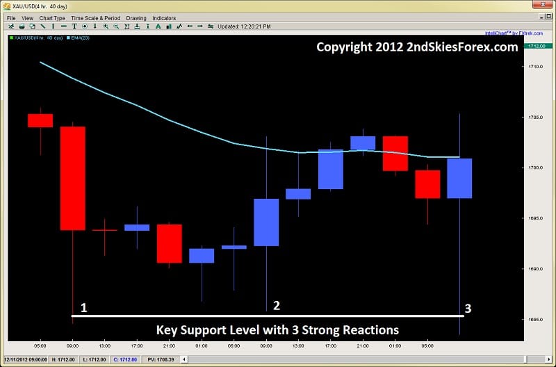
Using a recent example of a live intraday price action trade I did on Gold, take a look at the two charts below;

Exhibit A (4hr Time Frame Gold/USD)
price action quality vs quantity 2ndskiestrading.com exhibit a gold 4hr chart

Looking at the chart above, we can see three strong reactions to the $1685 level on Gold, all communicating strong buying interest at this level.

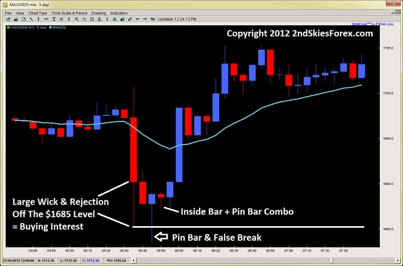
Now look at the chart below which is the third rejection on the 5m time frame.

Exhibit B (5m Time Frame Gold/USD)
price action pin bar + inside bar combo quality vs quantity 2ndskiestrading.com exhibit b gold 5m chart

Looking at the chart above, we can see the same strong reaction and buying interest off this level in the first wick.  But we can also see there are two high quality price action signals off this level, with a pin bar false break, along with an inside bar + pin bar combo.

I actually got long on this trade, and made over +1415 pips of profit just using pure price action on the 5m chart.

Does the price action at the bottom of this chart look like ‘noise‘ to you?

I don’t think so, and it shouldn’t.

Learning to filter out useful information and helpful information is just a matter of training and time.  But the idea anything below the 1hr chart is just ‘noise‘ is ridiculous and really a freshman understanding of price action.

Trading Lower Time Frames Causes You To Over-Trade and is Greater Risk:

Although there is some truth to this, it really is misleading.  If you analyze each bar, sure, you will be over-analyzing the charts, but this applies to any time frame.  In a choppy range, you are not watching every bar for clues, especially the bars in the middle of the range.

However, if you are marking your key levels on a higher time frame, and simply looking for signals at those levels, then the chances of you over-analyzing are slim.  It is really a question of trading and preparation- not a fact that you will over-analyze.

mind has neuro-plasticity 2ndskiestrading.com

The mind has neuro-plasticity to it and can learn almost any skill.  You can learn to filter out unimportant bars and price action on the chart – all it takes is a little practice.  Once you do, you wait for your key levels and signals, and get in without any extra analysis or stress.

The whole idea of doing less is better for you (or being lazy), I have already demonstrated, doesn’t make you more profitable.  Try this same logic to exercising, playing piano or hitting a golf ball, and tell me how that works out!

As to trading the lower time frames or intraday trading equaling greater risk, is a confusion.  Risk has nothing to do with the time frame.  Risk has to do with three things;

1) Position Sizing
2) Size of Stop Loss in Relation to Target
3) Accuracy

I can have a 3 pip stop (via position sizing) = more risk than a 500 pip stop.  I can also make more money with a 50 pip target and 20 pip stop (2.5:1 reward-risk ratio) than a 500 pip target and 250 pip stop (2:1 reward to risk ratio), with the same equity % at risk per trade.  So this notion that risk is > on lower time frames is mis-informed.

Does This Mean Quantity Is Better Than Quality?
This is the real question, and it comes down to edge, personality and availability.  If you are not available to trade more throughout the day, and have a full time job with only a few hours to view the charts, then I’d suggest trading the higher time frames.  However, if your personality is more suited to being more active, then trading 4-5x a month could be harmful to your learning process.   So remember trading rule # 1 – know thyself when it comes to trading, and find a system, time frame and style that best suits you.

trading rule #1 know thyself 2ndskiestrading.com

And we always have to consider our edge.  If we trade the daily time frame at 60% accuracy, and the 4hr or 1hr time frames more often with slightly less accurately, do the math and see how it works out.  If it’s more profitable trading more often with slightly less accuracy, then do it, as long as it doesn’t throw off your life or health.

But the bottom line is, the whole argument quality is better than quantity doesn’t always hold up, and you need to do the research and the numbers to determine which has a greater edge.  And without a doubt, it is a fact if you can take your same edge, and apply it more often than you are now, you will make more money and be more profitable.

Thus, in regards to the question as to which is forex trading method is better, the answer is neither one is better, but both!

Quality matters, but can under-perform.  Quantity repeats the process faster of making profit, but has to be considered in the larger scheme and what is most natural for you.  However neither forex trading method is better, and the best edge lies somewhere in between the two.

So don’t be fooled by any freshman arguments stating one is better than the other – because they are simply not true, highly inaccurate and misleading.

Hopefully this quality vs quantity forex trading article will put a lot of the mis-information to rest, and give you a new perspective on this critical subject. In a follow up article, I will talk about how I approach this subject in my personal trading, and what I think is the ‘Ideal Trader‘ in relationship to these two.

Kind Regards,
Chris Capre
This is the third installment introducing details to subjects which are not really discussed or talked about when it comes to Ichimoku Trading, that of using Ichimoku Time Theory and Ichimoku Wave Theory. Remember, according to Goichi Hosada (the creator of the Ichimoku Cloud), the Ichimoku trading system is based upon three pillars, and they are;
1) Ichimoku Time Theory
2) Ichimoku Wave Theory
3) Ichimoku Price Theory
This Ichimoku trading system article will be focused on introducing the key principles to Ichimoku Price Theory.  For those wanting a review of the other two, you can find those articles by clicking on the links above.
It should be noted to really understand and apply Ichimoku Price Theory, you will need an understanding of the prior two, particularly a good grasp of the Time Theory which is used quite extensively with the Price Theory.
The goal of this article will be to introduce the most basic components of the Price Theory, which may be considered the most complicated of the three.   I will discuss the main price calculations, how to formulate them, give examples of each one and some helpful tips when applying the Price Theory to Ichimoku trading.
Introduction To Ichimoku Price Theory
First, it should be noted we do not want to see these price targets as absolutes.  They are really guides to give us highly probable approximations as to where the market is likely headed during a particular wave or move.  These methods take practice to learn how to use, so take your time with them, but never look at this as an absolute target.
In reality, there are 4 basic price measurement methods according to the theory, however the 4th is generally regarded as a low probability event and takes a considerable amount of skill to spot and use.  So for our purposes, we will only use the basic three which are the most common and critical to learn.
The three main price measurements are known as;
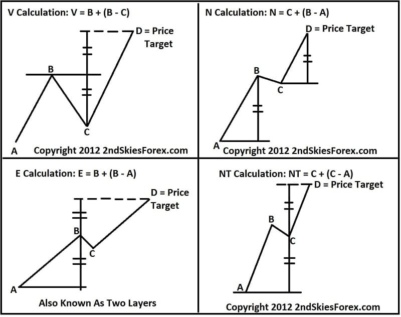
1) The V Calculation = B + (B – C)
2) The N Calculation = C + (B – A)
3) The E Calculation = B + (B – A)
The formulas for them are listed above, but I will show you a diagram to better understand them which is below.
Ichimoku Price Theory Price Target 2ndskiesforex small
Although I listed the NT Calculation, for now just spend time understanding and practicing the first three price measurements.
The V Calculation
Looking at this general structure, we have a bullish move from A – B – C.  You will notice the depth of the retracement of C in relationship to the A – B move, which is about a 61.8% retracement.  If we were using Ichimoku Wave Theory, this would correlate to an N Wave.
The way to use this as a price measurement method is when price breaks the horizontal line at B for that is only when the V Calculation and pattern would be active.  Of course we can make the calculation ahead of time, and that is the point of the price measurement methods (or ichimoku price theory in general).  But the calculation actually does not become ‘active’ till the line at B is broken.
Once this does, we can expect an upside price target of D to be achieved (within a handful of pips) based on the V Calculation.  An example is below.
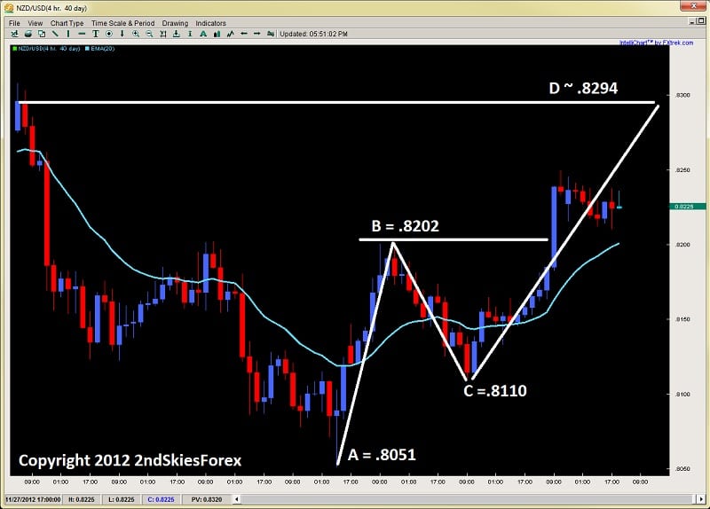
V Calculation Using the NZDUSD 4hr Chart
V Calculation ichimoku price theory 2ndskiestrading.com
So using this chart and running through the math of the V Calculation, we take .8202 + (.8202 – .8110 = 92), or .8202 + 92 pips = .8294.  As you can see, this matches up nicely with a current swing high and natural target for an upside continuation in the Kiwi (should it continue).  This is a basic example of how you can use the V Calculation to gauge a potential target for the pair.  An ichimoku trader using this calculation along with the swing high would only bolster their confidence in the upside target being hit.
Keep in mind this is a live chart and I have no idea how this will play out, but wanted to show it as an example.
Lets run through examples of the N and E calculations so you can see how they operate.
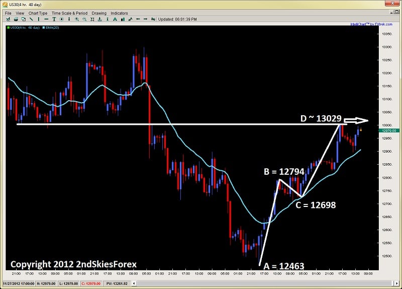
N Calculation = C + (B – A) Using the Dow Jones Index 4hr Chart
N Calculation ichimoku price theory 2ndskiestrading.com
Now using this chart above and the numbers for the N Calculation, C (12698) + (12794 – 12463 =  331), or 12698 + 331 = 13029.  So we would have a general target of 13029.  Now if you remember, these numbers are not meant to be absolutes, only highly probably approximations of upside or downside targets.  Considering the major role reversal level was at 13003, we can consider this to be a good target for D using the N calculation.
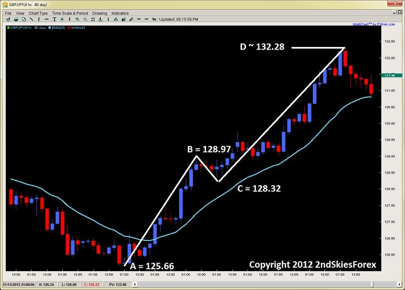
E Calculation = B + (B – A)  Using GBPJPY 4hr Chart
E Calculation ichimoku price theory 2ndskiestrading.com
Using this chart above on the GBPJPY and the E Calculation, B (12897) + (12897 – 12566 = 331), so 12897 + 331 = 132.28.  In this case, the market actually only got one pip higher than the D price measurement or target, showing a fine example of how the E calculation and price measurement theory can work.
Some Additional Notes
As I said before, ichimoku price theory should be combined with ichimoku time theory as they work in tandem.  But the scope of this is for another article and far too large for an introduction to ichimoku price theory.
Another note in terms of deciding which price measurement to use is based on the price action of the actual moves you want to measure.  You will notice all of the calculations have certain levels of impulsivity and correctiveness to the A, B and C moves.  On a basic level, what you are doing is gauging the level of the retracement from B – C, along with the correctiveness of the pullback from B-C to determine which calculation you will use.  Thus in essence, you need the A, B and C components to really apply any calculation at all.  But how you read these moves and waves will determine which calculation you use.
A critical note as well, is when measuring bull or bear runs.  The calculations you see in the first diagram are for bullish runs.  For bearish runs, you will substitute the + for a – between the first variable and the set. Thus, using the V Calculation, instead of it being V = B + (B-C), it would be V = B – (B – C).
In Summary
This was an introduction into Ichimoku Price Theory which is by far the most complex and intricate of the three pillars of The Ichimoku trading system.  The three basic calculations are critical and the foundation of the entire price theory, thus the most important formulas for you to learn.  Eventually you will combine price theory with time theory, but for now, just practice the basics here.  These price measurements are not to be considered absolute values, and Ichimoku was always meant to be used in combination with price action.  In fact, many aspects of ichimoku and the formulas are interpretations and patterns often found within price action, so the two are really intertwined.
For a more in depth study and training on Ichimoku Price, Time, Wave Theory, and Ichimoku Trading, make sure to visit my Advanced Ichimoku Course where we explore these methods in great depth, along with giving rule based systems to trade ichimoku both intraday and a trending/momentum basis.

Last week was the first time I had gone back to my archery school in over a year.   Approximately 2mins into the class, I realized how much I had missed formal archery classes, but also how archery helps my trading.

Now I am not suggesting you need to grab an Olympic bow and start taking archery classes to take your trading to the next level.  But, it often helps to acquire a second skill or practice to assist your main endeavor – i.e. trading.
For example, Joe Namath was constantly reminded by his coaches he needed to work on his footwork.  So he did what every quarterback does…he took up dancing!  Footwork was critical to his position, and dancing helped him improve his footwork dramatically.
In almost all skill based endeavors, an additional practice can really improve one’s core skill.  I’m going to share with you three ways Archery helps my trading.
 
1) Focus on the Complete Process
In archery, to hit the target consistently, you have to repeat a specific motion with the precision of a Swiss watch.  But to do this, you have to be completely present and focused on the moment and process.
I had developed a habit of pulling my back shoulder towards my head.  As my teacher corrected me on this, my concentration naturally became more focused on my pulling shoulder.  But, in the process, I wasn’t rotating my front elbow properly.
I quickly realized too much concentration on one area meant less on another.  Now just imagine if I was a tightrope walker and had this problem 😮
tightrope walking 2ndskiestrading.com
I find this to be the same with developing traders – they focus too much on strategy (particularly the system and entry) but not enough on controlling risk.  Managing risk is a game of pure mathematics, and with most traders, they take profits too early, but get hit for their full stops.
 
Does this sound familiar?
This is a mathematical disaster waiting to happen, and unless you understand your risk of ruin tables, along with how your system performs over time, you may be 60% accurate or better, but mathematically doomed to lose money.
To be a successful trader, you have to focus on the complete process and every aspect of trading.  This means just as much attention to proper risk management, building a successful trading psychology, AND a winning system.  If any one is lacking, you will unlikely make money over time.
 
2) It’s All In the Mind
My last session before returning home was the advanced practice focused solely on shooting at longer distances.  Normally, I train at 18m, but for this class it was at 30m.
Obviously, some adjustments had to be made, like changing the sight, getting used to holding the bow higher, etc.
After a few rounds, I was shooting close (but not quite) to what I normally would at 18m.
At the very end though, things got interesting.
We ended by shooting three rounds back at 18m, and it ‘felt‘ incredibly easier.  Yes, precision becomes more critical at longer distances, but it also felt easier as a whole.  Something changed in my mind, and I definitely felt more confident about shooting at 18m.
But what I noticed is with the top shooters in the school, they almost shot identical to what they did at 18m. Why were they able to shoot the same at 18m as they did at 30m?
The difference was in the mind.  To them, their mind was just as focused on the task at 12m as it was at 30m, and they were also just as confident.  That difference in the ‘thinking it was harder’ for me, definitely translated into my experience of it, particularly my confidence.
brain working 2ndskiestrading.com
Just like archery, so much of trading is in what goes on between your two ears.  Take a look at your last 20-30 losing trades in your journal, and see how many of them are related to mental errors, as opposed to you executing everything perfectly, but the trade just not working out?
Now do the math and see what you would have done if you had executed the strategy perfectly.  Try the same for your last 20-30 wins, particularly the ones whereby you exited too early, and do the math again. Take a look at the results, and I’m willing to be with over 90% of you, your performance would have improved (if not been highly profitable) if you had used the strategy according to its rules.
Numbers are the best sirens for traders, so see the financial impact your mind has on your results.  Now imagine that every month for the next 5 years and see what the difference would be.  You are likely talking about two different trading careers.
So ask yourself how many errors do you make simply because of your mind & emotions, then see what you can do to make less errors.  For traders more often than not – it’s in the mind.
 
3) Repetition is Key
Nobody will become a professional golfer swinging the club only 5-7x a month.  The same goes for throwing a baseball, playing piano, and trading as well.  There is no way you are going to really understand trading, patterns, price action, or the markets if you are only pulling the trigger less than 7x a month.
If you are currently doing this, you are not getting enough feedback from the market, and almost certainly not finding good setups, because there are plenty that happen per day.
beijing olympic archer 2ndskiestrading.com
Just like in archery, repetition is key to getting the process and technique down.  This does not mean you will become a better archer shooting an arrow every 10 seconds as opposed to every 20.  There has to be deliberate practice and you have to be able to concentrate on each trade, just like each arrow.
Thus, repeating the process more often will generally lead to better development, so make sure you are trading every day unless there is absolutely no signal with your system.  But if that is the case, consider getting another system.  Trading is like a feedback loop which communicates information on you, what you see in the markets, and how you are doing.  Any lack of feedback usually means a missed opportunity to both profit and learning more about yourself and where you need to develop.
 
In Summary
Often times, when learning any skill based endeavor (like trading), finding another practice to engage in will often help augment your development as a trader.  Many things come to mind, such as playing chess, learning an instrument, training in a brain gym, playing poker :-), and also archery.  All of them have aspects which develop key skills highly useful for trading, and could provide the necessary tools to take your trading to the next level.
In terms of trading though, make sure to realize how a lot of it is in the mind (confidence, emotions, etc), to focus on the complete process (risk management, trading psychology, strategy), and how repetition helps develop your skills as a trader.

I wanted to write a brief article on a simple method I use to analyze price action – that of drawing trend lines to read the forex price action angles, or the speed of the buying/selling in the market.

I’m going to use an example to highlight how they can be useful for understanding trends, transition phases in trends, and when to look for key price action reversals in the market.

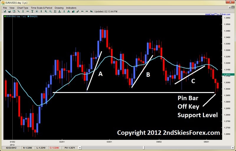
Exhibit A:  EUR/USD Daily Chart
price action angles - trading forex price action 2ndskiestrading.com sept 17th

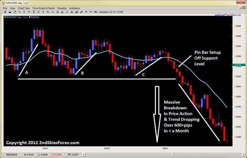
Looking at the forex price action trading trendline chart above, the EURUSD started 2012 dipping to 1.2600 before starting an impulsive bull run which climbed almost 900+ pips in a month and a half.  Now if you look towards the left side of the chart, you’ll see a pullback to the horizontal line.  Price rejected off this line, forming a piercing pattern that climbed 6 out of 7 days and over 500+pips.

This is the move in line A.

After reaching the peak from move A at about 1.3500, price then sold back in 11 days back towards the same support line.  Although the low from this sell-off was a tad higher, take a look at the bounce off the level.

Notice how it had 3 bear days in the 8 day move (2 more than in prior move), but only went about 400pips (20% less)?

To me, when I see two rejections off a key level, I’ll draw trend lines on both of them (underneath if they are bull moves, and above if they are bear moves).  The reason I do this is to measure the strength or speed of the buying/selling.  This is communicated to me by looking at the price action angle of each trend line.

In this case, I have a weakening angle from A-to-B.  This communicates a weakening effort by the bulls and that the bears are trying to take control of the market.  Keep in mind, this is all happening above a support level, so the bulls still have overall structural control.

When you however look at the last bounce off this noted support line, we can see a massive weakening in the angle.  When I see three structural, or price action angles weakening successively, this usually is a sign of an impending breakdown.  What is also interesting is the C leg took 12 candles to gain only 250pips (50% less than A-leg, and 38% less than the B-leg).  Put these two together, and you should be looking for a breakout to the downside.

What is interesting is how price action formed a pin bar strategy off this key level.  If you were just trading pin bars as is, without the ability to read price action in real time, you would have taken the long on this pin bar setup, but then got crushed on the ensuing breakout which is below.

Exhibit B: EUR/USD Price Action Angle Weakening/Trend Change
price action angles - pin bar strategy trend change 2ndskiestrading.com chris capre

Working with this chart above, we can see how even though there was a pin bar setup at the horizontal support level, price dropped right through that – stopping out traditional pin bar traders who were not reading the price action in real time, or the change in the angles.

In a flash, the trend was reversed and the pair sold off over 600+pips in less than a month.  Had you been reading the price action angles in real time, you would have spotted this potential trend change, and looked to get short instead of longing off the pin bar setup.

This is one way to use forex price action angles to help with your reading and understanding price action.

Another way you can use them is in understanding parabolic or climactic price action moves.  These can also be understood via these trend lines and angles.  But they are a simple tool which is highly useful in forex trend trading, understanding transition phases in trends, and when to look for possible reversals.

I hope you enjoyed this article and found it a useful addition to your price action trading toolbox.

For those wanting to learn to trade price action, get access to the traders forum, a lifetime membership with free updates and more, visit my forex price action course page.

Breakouts are some of the tougher environments for traders, and understandably so because they represent potential, but often fail.

I’ve already written an article for trading breakouts Post-Breakout, but what about the Pre-Breakout moments where you have to make that key decision to trade it or not?

How do you identify them and what are the key elements that precede strong breakouts?

This is the key point of this article – to give you 3 tips for identifying a soon to be strong breakout so you don’t get trapped in a false breakout.

I will go over the three elements you will want to find before considering a breakout, then briefly highlight what is behind them from an order flow perspective.  By learning to spot these breakout trading clues, you can position yourself to trade higher probability breakouts and capture a larger portion of the upcoming move.

1) Well Defined Support/Resistance Level
The first pre-requisite to identifying a healthy pre-breakout situation is having a clearly defined barrier in the form of a support  or resistance level. The classic case is when you have a trend in place (lets say uptrend) and then the price action runs into resistance at a key level.

Ideally, you want there to be at least two touches on this level before defining it.  The more horizontal and neater this level is – the better.  But it should be noted, this is just a pre-requisite and generally by itself not enough to identify a healthy breakout setup.  The reason for the two touches is to identify a sticking point where players are parked and what level they are defending that the (bulls in this case) are unable to penetrate.

By finding both parties present, we have the environmental potential from an order flow perspective to create a healthy breakout.   In this example, the sellers are clearly holding a price they want to defend and have stops just above it.  By them staking their defense in a clear location, it communicates where their orders and stops are likely parked.  It is tripping those stops, along with bringing in new buyers that is the goal of the bulls.

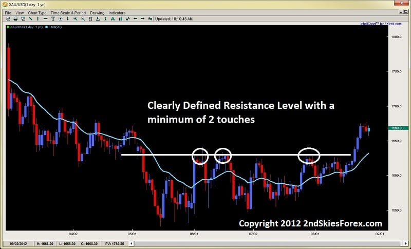
Below is an example of a clearly defined resistance level after a downtrend and consolidation period, communicating there are bears clearly defending a level.

Image 1.1
breakout trading clear resistance level 2ndskiestrading.com aug 28th

2) Pre-Breakout Pressure or Tension (Squeeze)
The second element you want present prior to a breakout is a pre-breakout pressure or tension that manifests as a squeeze.  This pre-breakout tension is highly important because it creates a friction and pressure upon the defenders (in this case the bears).  As the bears realize their rejections off a key level are getting smaller, while the bulls continue to gain more upside and territory, it causes a friction in their minds that forces them to make a critical decision (either stay in and defend, or exit the market).

As the room gets smaller and smaller for them to work with as the bulls squeeze the bears out, sellers defending a level will often exit early, leaving the defense to those who are not realizing the game is up. This further weakens the defenses at these levels until very few are left to carry the burden.

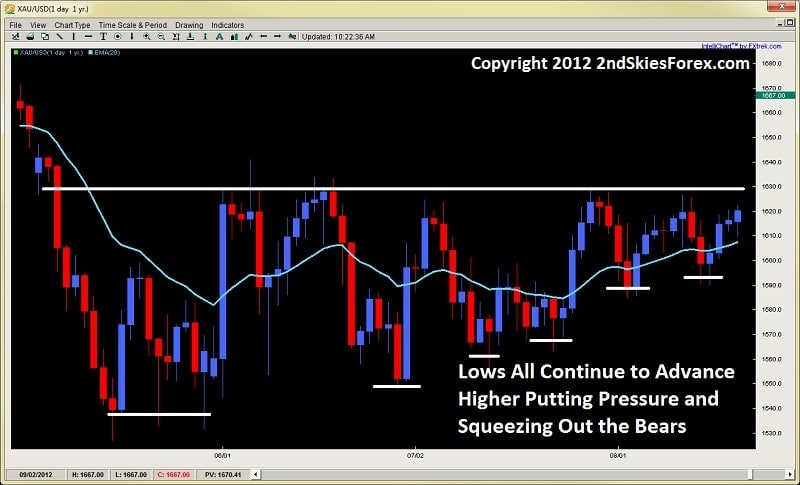
You can easily identify a price action squeeze and this pre-breakout pressure, or tension, by the price action forming higher lows in attacking a resistance level, or lower highs when attacking a support level. This is a combination of the current bulls willing to buy up the instrument at a worse price, along with new bulls wanting to get long before the breakout.  A good example is presented in the same chart which I will zoom in on to highlight.

Image 1.2
price action squeeze breakouts chris capre 2ndskiestrading.com aug 28th

3) 20EMA Carry
Another key element you will find prior to breakouts is the 20ema begins to carry price leading up to the key resistance or support level that is being defended.  This is not so much that traders are placing orders there prior to the breakout (although many will), but also a visual representation of how the squeeze is taking place.

Just looking at the chart above, we can see in the beginning, after the first rejection off the key resistance level, price penetrated nicely below the 20ema.  But as we get closer and closer towards the right where the squeeze is taking place, you see the market barely go below it for more than a single candle before resurfacing.

Also, you will notice how the first few times the rejection approaches the 20ema, it breaks through after one candle.  But towards the end many candles start to float above it where some traders are entering in anticipation of the breakout.

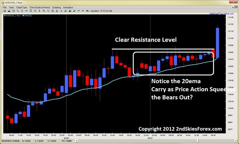
Another really good example was one I traded and blogged about ahead of time with the AUD/USD on the 1hr time frame.  The pair had been trending up for 110 pips over two days, but ran into a key resistance level that it got stuck on at 1.0081 (image below).

Image 1.3
20ema carry price action squeeze breakout 2ndskiestrading.com aug 28th

Using the example above, notice how the 20ema in the middle of the chart is penetrated about 20pips, but then as we get closer and closer to the resistance level and the squeeze begins to happen, notice how the 20ema begins to carry the price action, and the penetrations get smaller and smaller?

This is a combination of very few sellers defending the level, while the bulls in anticipation of a breakout (realizing they have control) are likely entering new positions to get in ahead of the upcoming breakout (I was one such trader).  Eventually the pre-breakout pressure and tension became too intense and the bears gave up when the bulls made their push, tripping stops and creating a large breakout bar with a strong close.

In Conclusion
Identifying breakouts can offer highly profitable opportunities when you can position yourself well.  But to do this, you must be able to identify highly probable breakouts with these 3 key elements which are;
1) Well Defined Support/Resistance Level
2) Pre-Breakout Pressure/Tension (Squeeze)
3) 20EMA Carry

If you can learn to spot these key elements prior to a breakout, along with reading various other price action clues, you will find yourself entering in higher probability breakouts, increasing your success and profitability.  You will also find yourself not getting trapped by false breakouts which can wreak havoc on your account and confidence in trading them.  Thus it is critical to read and identify the key elements prior to a breakout.

For more info on how to trade price action, along with lifetime membership, getting access to the traders forum & more, make sure to visit my price action course page.

Other Related Articles:
Trading Breakouts
Key Price Action Elements to Breakouts
Breakout Role Reversal Setups

Now that I have outlined the major components to Ichimoku Time Theory (ichimoku numbers), I want to talk about the 2nd pillar of Ichimok which is the Wave Theory.
Remember, the main pillars of Ichimoku are not the Tenkan, Kijun, Chikou and Kumo.  These are components of Ichimoku to help you read the main aspects of what is going on with the trend, support and resistance, and price action – all within a glance.
But…..these are NOT the pillars of Ichimoku.  This led Hosada to state the following when he realized everyone was getting stuck believing the Tenkan, Kijun, Chikou and Kumo were all Ichimoku was about;
“Of the 10,000 or so people who are practicing and trading ichimoku, only about 10 really understand it.”
The 3 main pillars of Ichimoku are;
1) Ichimoku Time Theory
2) Ichimoku Wave Theory
3) Ichimoku Price Theory
I have discussed Ichimoku time theory which is the basis for all the other pillars and all of the ichimoku components you use when you look at any ichimoku chart.  Now I would like to get into the 2nd pillar which is Ichimoku Wave Theory.  I will get into the basic components or waves only as there are several types of waves (basic, mid-term, etc.) so to give an introduction without confusing anyone, I will write about the basic waves in today’s article.
3 Basic Waves
There are 3 basic waves which are the most important ones to learn because they are the basis of the ichimoku wave theory and will always be a part of your wave counts.  They are;
1)  I Wave
2) V Wave
3) N Wave
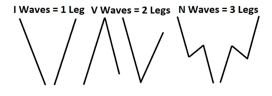
Ironically, an I Wave is 1 leg, a V Wave is 2 legs and a N Wave is 3 legs.  Just like all the basic ichimoku numbers are building blocks for all the other numbers, it is the same with the waves.  But let me show you a picture below to help give you a needed visual.
basic ichimoku waves ichimoku cloud chris capre 2ndskiestrading.com
Looking at the image above, you can see how the one, two and three legs form the individual waves.  I, V and N waves can all be up or down so that does not matter.  Generally, I waves are impulsive price action moves, but they can be corrective.  V waves are usually one impulsive and one corrective move, but can be two impulsive moves back to back.  Whereas an N wave is usually an impulsive leg, followed by a corrective leg, and then another impulsive leg in the same direction as the original leg.
Being the most complex of the three, the N wave can have variations of this, but the first leg of the N wave should be impulsive with the other two having variations between them.  Generally, most N waves will end with a higher high for an up wave, and a lower low on a down wave.
So the wave should end up lower or higher than where it started.  If this is not the case, then it usually means a breakdown of the wave structure, but lets look at a few examples.
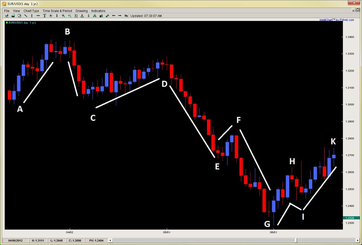
basic ichimoku wave examples chris capre ichimoku cloud 2ndskiestrading.com
Using the chart above, I have labeled several lines, all of which individually are I Waves.  As I said before, they all are components of each other, so a V Wave is really two I Waves put together, while an N Wave is either three I Waves, or one V Wave and one I Wave.  But lets break this down in the chart above.
Starting at the top left of the chart, the first movement from A-B is an I Wave.  Now by that token, the move from A-B-C is a downward V Wave.  A-B-C-D would be therefore an N Wave, but also composed of two V waves (one up and one down).  As a general rule, it’s better to look at the wave structure from a macro perspective then a micro one, so breaking say four N Waves up into 16 I waves is unnecessary.  Look for the larger macro structure (gestalt) of the wave structure and you got the trick.
Now, as I stated, even though A-B-C-D is an N Wave, it doesn’t end with D being higher than B.  When this happens, it generally means a range bound market at a minimum or a breakdown into a downward N wave, but rarely ever do these end up with higher prices above B, especially if C is breached.
Since this did happen, we actually have an downward N Wave starting at B-C-D-E.  We can also count a downward N Wave from D-E-F-G.  This brings me to the point that N Waves generally continue in their original direction until the ideal structure of the waves gets broken or disrupted.  It also means N Waves can continue and parts or legs (ends) of them can start new N Waves in the same direction.
So if we were counting a new N Wave from F-G-H-I, since the wave structure is being disrupted, we would expect a likely reversal, and this is supported by the upward N Wave starting at G-H-I-K.  This may seem like a lot, but this should give you some starting ideas of how to use these basic waves when reading an ichimoku cloud chart and will get easier with practice.
Usage in Trading
There are many ichimoku trading strategies we can use with these basic waves in trading, and if you were paying attention, I already gave away one idea.  One example is how the wave structure generally performs (particularly N Waves).  If the structure breaks down from its ideal formation, then watch for trend change – minimally a consolidation, but definitely not a trend continuation.
Another way this can be useful is if the number count (using ichimoku numbers) in a particular move is getting long, such as a two section, one period or a combined-6 move.  These common turning points, combined with wave structure changes often bring a confluence of signals together which can mark major turning points in a move.
For example, in the chart above, the move from D-G is actually 1 day short of a one period move (a common turning point).
Additionally, you can combine forex price action strategies with these moves, especially reversal setups, so when you see (for example) pin bar setup happening at a major resistance, along with an N Wave structural change, this can increase the probability of a reversal.
Other ways to do this is if the V Wave is not a traditional impulsive move followed by a corrective move.  For example, if it is an impulsive move followed by another one counter-direction, this could also be suggesting trend change or a range bound market, depending upon how it started the V Wave.
As you can see, there are many ways, too many to discuss here, but hopefully this gives you something to work with.
In Summary
Although there are other waves that we have not discussed, this is a good introduction and start to understanding Ichimoku Wave Theory and gives you the foundational theory to start practicing with the basic waves.  But it is important to understand this is one of the key pillars underlying all of Ichimoku Kinko Hyo theory, so understanding the basic waves is a gate towards understanding ichimoku trading strategy as a whole.
Best is to practice forex wave theory by itself so you learn it as an individual component.  Then after building some experience, combining it with ichimoku time theory.  But hopefully for now, this gives you a nice introduction to Ichimoku Wave Theory as there is very little information about it available, nor discussed openly.
For those wanting to learn how to trade the Ichimoku Cloud, time, wave and price theory, along with lifetime access to the Ichimoku traders forum, discussing ichimoku setups using rule-based systems, make sure to visit my Advanced Ichimoku Course.

With the holiday coming tomorrow, I wanted to write a short price action article with 3 quick, but highly useful tips for using a breakout trading strategy.  If you can add these forex breakout strategy tips to your price action toolbox, you can significantly increase your success rate when trading.
 
1) Time of the Day
One of the key components to a successful breakout is volatility.  When you have greater volatility, you have more orders/players behind the market and therefore increase the probability the breakout bar will have more force behind it. This helps the breakout bar to take out more stops and push the market further in the breakout direction.
But, volatility fluctuates tremendously throughout the day.  Statistical analysis has pointed out to how breakout strategies actually function far better during the London and NY session while tend to fail during Asian market hours.  This is simply to do with volatility, so the time of the day you take the breakout trade will have an impact on the success of your trade.
Ideally, breakout trades are taken during the following times;
-1st three hours of London session
-30mins before NY open up to 30mins before London close
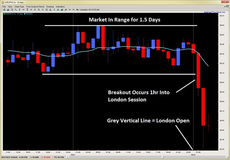
A great example of this is in the chart below how price consolidated for a day and a half, then broke out massively during the 2nd hour of the London session.
Image 1.1 EURJPY 1hr Chart
breakout trading price action 2ndskiestrading.com image 1.1
Outside of these times, the probabilities decrease for your breakout trade (variably depending upon hour) as volatility is either low or in a declining phase and may not have the order flow behind it to break through the key levels.  Also avoid taking breakout trades several hours prior to major economic announcements, or going into major holidays where trading and liquidity will be subdued.
 
2) Use Options Data to Aid Your Timing
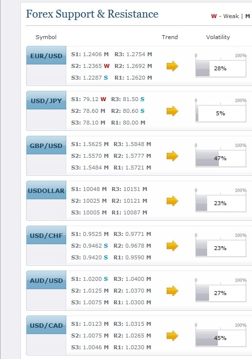
Daily FX has a useful piece of data in their technical analysis page whereby they publish a Volatility Percentile feature.  This is derived from options prices with a higher number communicating options traders are expecting greater volatility, while a lower figure suggests more range bound/reversion to the mean type play.
Image 1.2 Volatility Percentile Data
volatility percentile breakouts 2ndskiestrading.com image 1.2
You can simply check the data at any time (per pair) to see where the volatility percentile figure is at.  When you are thinking of taking a breakout trade, ideal is to have the Volatility Percentile figure above 70% or greater, suggesting options traders are expecting a greater amount of volatility in the market and thus increasing the probability of your breakout trade working out.  If several of the pairs are above these percentages, then there is broad market participation which will likely create strong impulsive moves in the market which are ideal for breakout trading.
 
3) The Longer the Compression, the Better
Usually breakouts give you several warning signals ahead of time a breakout is happening, either via a squeeze in the price action to one side of the market, a tightly coiled range or higher low/lower high forming inside the range.  Regardless of what the clues are, the longer the compression in the price action, the better.
Why?
Markets, traders (and brokers) do not like tightly bound up price action.  Smaller ranges and markets mean less continuation and directional follow through.  If markets turn around quickly, they offer us less profit in the direction we have chose.  But a long compression in the price action will build up a pressure and friction which eventually needs to be released.  The longer this builds, the better, for when it breaks out, the market can often go for a large move in the breakout direction as seen in the chart below.
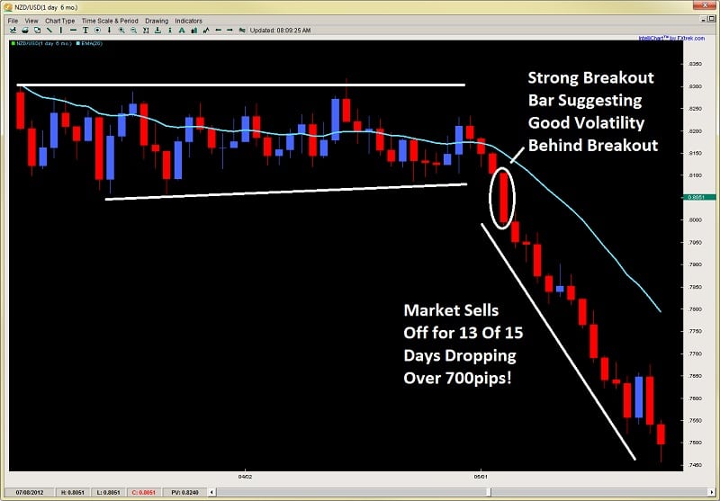
Image 1.3 NZDUSD Daily Chart
breakout bar nzdusd price action trading 2ndskiestrading.com image 1.3
You will notice in the chart above how the price action was consolidated in a tight 200pip range for almost two months.  But when it broke out, forming the breakout bar, it sold off for the next 5 days in a row, 11 out of 12 days and 13 of 15 days, selling off for over 700pips.
 
In Conclusion
Breakout trades can offer some really profitable opportunities, but can be maximized by adding these three forex breakout strategy tips above which are;
1) Time of the Day
2) Using Options Volatility Data
3) Looking for long compression periods prior to the breakout
If you can learn how to spot these, along with other various price action clues, you can increase the profitability and success rate to your breakout trading.
For more info on how to trade price action and breakouts, along with lifetime membership, getting access to the traders forum & a lot more, make sure to visit my price action course page here.
Other Related Articles:
Key Price Action Elements to Breakouts
The Best Support & Resistance Levels
Breakout Role Reversal Setups

If I had to follow only one simple rule of price action, it would be to understand impulsive and corrective price action, and if I could only trade one type of move, it would be impulsive moves hands down. They offer the most profit potential, communicate where the institutional players are buying and selling, whether they are buying or selling, and what the dominant trend is.

This is not to say one cannot make money trading counter-trend, but that far more money and profit will be had trading with the trend, but to be more specific – trading impulsive moves.

The Base of the Pyramid

If I had to look at price action as a structure, it would be a pyramid, with the base being how price action is a reflection of order flow (particularly executed transactions). The next part (or level above) from that base would be understanding price action through the lens of impulsive vs. corrective moves.

I will briefly describe what impulsive and corrective moves are, giving the key characteristics of each type of move. Then I will discuss what they generally communicate from an order flow perspective. After this I will talk about what is the general pattern they will form, and how you can use this for trading impulsive moves.

What Is An Impulsive Move?

An impulsive move is one whereby the market moves quite strongly or heavily in on direction, covering a great distance in a short period of time. These moves tell you when the imbalance between the buyers and sellers is really strong and there is heavy participation from the institutional side.

Logically, more money can be made during these impulsive moves, as they cover more points or pips in less time. They are generally more volatile, and thus provide us with great opportunities to get more R (reward) with less risk since the market will stretch more easily in one direction. But no matter what, we want to be trading with these moves as much as possible, not against them.

Three Characteristics

Impulsive moves tend to have three characteristics common among all of them. These three can help clue you in to when an impulsive move is starting, or in play. They are;

  1. Large Candles (bodies)
  2. Mostly of one color (blue/bullish, or red/bearish)
  3. Closes towards highs/lows of the move

Let’s examine all three points.

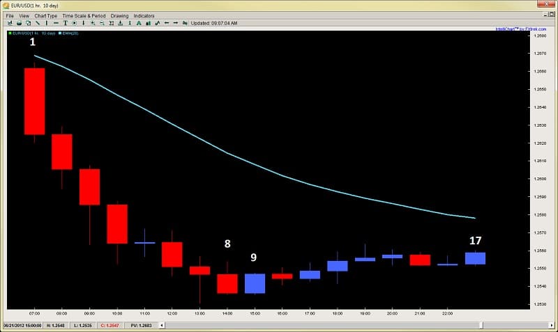
1) Large Candles communicate to us there is strong participation and order flow behind this particular candle. Strong imbalances during a candle will translate into larger candles than the norm. When you see large candles forming consistently in one direction, they indicate strong order flow behind them from the institutional side. Since the larger players are behind them, they give us a clue of the direction we want to take, essentially surfing the waves they (institutional) are creating. Take a look at an example below.

Image 1.1 – EURUSD 1hr Chart
impulsive price action EURUSD 1hr chart 2ndskiestrading.com

Notice how in this chart, the candles that stand out the most are the red ones, particularly the ones towards the top left? They are the largest in this entire series, communicating strong order flow behind them.

In fact, if you look at candles 1-8, all but the blue doji in the middle are solid in size. Yet candles 9-17 are all contained within the highs and the lows of last 2-3 candles in this down leg, communicating weak order flow and participation behind them.

As a whole, impulsive moves tend to have large candles (bodies and wicks) behind them.

2) Mostly of One Color – this ingredient is also common among impulsive moves as it communicates something critical to us – time. More specifically, how the bulls or bears were able to maintain control of the price action over time.

In the chart above from image 1.1, you will notice in the down leg, there is only 1 blue candle, meaning for 8 out of 9hrs, the bears had complete control of the market (almost one full trading session).

By maintaining control over time, the market is communicating who is the more dominant side because they are not allowing the other to take control of a candle for that time period. The greater the imbalance is between the bulls and bears over time, the greater the dominance is from either the bull or bear side of the market.

It is important to look at price action not just based on structure of the candles, which is one dimensional. Price doesn’t just move in a vacuum, it moves in time, and HOW price moves over time can communicate a lot of information to us as traders.

3) Closes Towards the Highs/Lows of the Move – If you think about it, when the market is in a strong trending move, let’s say using a 4hr chart, and the candle that closed in the direction of the trend (in this case uptrend) has a very small wick, thus a strong close towards the highs, what does that communicate?

It should communicate that there is very little profit taking from the players behind that candle. If they were worried going into the close of that candle about an upcoming resistance level holding, or perhaps the bears may take control of the market, they would likely close their position, or take profits right before the candle closed.

But when you have a strong close with a very small wick, this usually indicates very little profit taking, thus a confidence the move will likely continue. This is highly useful to us as traders, and will be common among impulsive moves like in the chart below.

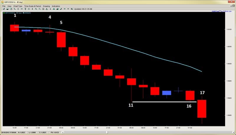
Image 1.2 GBPUSD 4hr Chart
impulsive price action GBPUSD 4hr chart 2ndskiestrading.com


Starting with the top left of the chart using candles 1-4, the price action moves in a sideways corrective fashion until candle 5, which if you notice, increases in size tremendously (rule #1 of impulsive moves). From here, price continues on selling for the next 9 candles, 10 total in a row, or 40hrs of selling (rule #2 of impulsive moves).

But looking at the candle closes, you can see most of them are towards the lows, showing very little profit taking along the way, thus suggesting likely continuation.

Only until candle 11 do we get a strong rejection, and from here price then moves sideways in a corrective fashion until candle 16. But what happens at candle 17?  The candle expands (rule #1) telling us the trend will likely continue.

So these are three examples of the common characteristics of impulsive price action moves.

What About Corrective Moves?

The good thing about corrective moves is they are easy to spot, since they have the inverse characteristics of impulsive moves. Meaning, they tend to have;

  1. Smaller Candles
  2. Greater mix between red/blue or bull/bear candles
  3. Closes more towards the middle with larger wicks

Thus, if you apply the logic of impulsive moves, you can easily understand and identify corrective moves.

How Do They Relate to Each Other?

Generally, impulsive and corrective moves tend to have a common pattern or dance with each other.  The general pattern that tends to play out between them is the following;

1) Impulsive moves about 75% of the time are followed by corrective moves.  These corrective moves can either be horizontal, slightly against the impulsive move, or even slightly in the same direction, but they denote a change in the order flow and participation.

2) 75% of the time, these corrective moves are followed by impulsive moves in the same direction as the original impulsive move.  Why?

Because those who are in control, rarely give up control unless encountering a strong counter-trend force.  Even then, they usually make a second attempt to take out a recent swing high or low before giving up.

Only when they fail a second time will they usually exit the market, either waiting for a new chance to get in on a pullback, or reset completely.  This is why V-Bottoms are quite rare and only form about 10% of the time.  Usually there is a 2nd bottom, which is could be a LL (lower low), HL (higher low) or a similar low.

3) This series between the impulsive vs. corrective moves will generally continue until the market encounters a counter-trend impulsive move, which usually translates to an equal or greater force on the opposing side of the market.  Very similar to Newton’s Laws of Motion about an object in motion will stay in motion until acted upon another object with equal or greater force.

Let’s look at an example below.

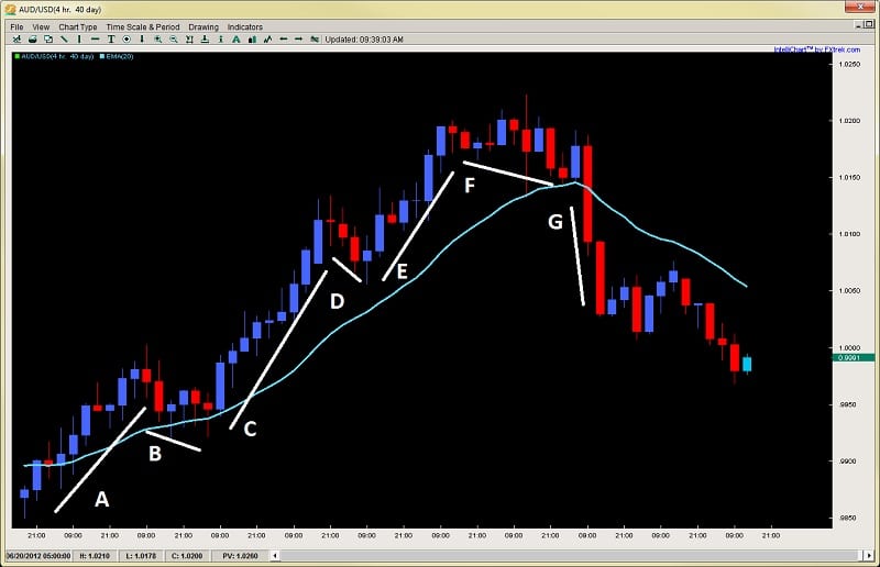
Image 1.3 AUDUSD 4hr Chart
impulsive and corrective price action series AUDUSD 4hr Chart 2ndskiestrading.com

Glancing at the chart above starting with the bottom left at move A, you can see how it was an impulsive move, followed by a corrective move (B).  This series continued until…it hit a counter-trend impulsive move in G.  It was only until here did the bulls finally relent control as the opposing bears took control of the price action with the bulls likely taking profit or exiting all together, especially after the low point from move D was taken out.  Ironically, what followed move G, was a corrective move after, followed by the bears continuing the down-leg.

An Example Trading Impulsive Moves

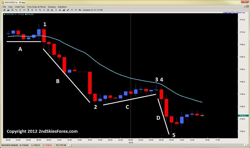
Today gave a really good example trading an impulsive move. Gold was a perfect example of a textbook impulsive-corrective series, offering a great setup to go short for a large reward to risk play.

Take a look at the chart below which is the 1hr chart on Gold. Starting with the top left of the chart, we can see a consolidation over line A which is a corrective move.  Then at candle 1, we have more selling in one hour than total buying for the last seven, which starts an impulsive leg down at B, selling off about $25 in 10hrs.

At candle 2, we see a corrective move (C) whereby price climbs about $8 in 12hrs, so less than 1/3 the climb from move B which took more time.  This is a clear example of how its less profitable to trade counter-trend than with trend.  This is not to say we cannot trade counter-trend, but there is far less money to be made.

Image 1.4 Gold 1hr Chart
impulsive corrective price action trading 2ndskiestrading.com oct 15th

The corrective move at C ends with a pin bar rejection just $.50 below the 20ema, then starts another impulsive leg down at 4, dropping over $18 in 3hrs, also ending with a large pin bar.  I actually bought off the lows and made a quick profit, but there was far more profit to be made in less time selling from 3 or 4, then buying off of 5.

In terms of knowing whether to buy or sell, if you can learn to find an impulsive move, followed by a weak corrective move, often times that corrective move will offer a pullback setup into the 20ema or a prior support/resistance level.  These offer high probability low risk high reward setups.  Anyone selling the pin bar rejection at 3, or the pullback into the 20ema at 4, with a tight stop above the 20ema, targeting either the low at 2, or waiting for the pin bar close at 5 would have made anywhere from a 3:1 reward to risk, up to 12:1 reward to risk.

These opportunities show up in the market all the time, and if you can learn to read them, you can make a considerable profit by trading with the institutions impulsive buying or selling.  This is why it is critical to learn to read these moves, as they will help you not only trade in the right direction, but find highly profitable setups.

In Summary

This is just an introduction to how I approach price action and how I use this model as a base for understanding price action.  When you can learn to read impulsive and corrective moves, you will find they are highly effective for many things, such as;

  • finding the right direction
  • staying in the trend
  • spotting great pullback opportunities to get back in with trend
  • knowing when the market will continue and when the market is likely to reverse
  • how to find some of the more profitable moves in the market (impulsive)
  • knowing who is in control of the market
    and more…

There are many other facets and subtleties to trading impulsive and corrective price action, but this is a good introduction to my base theory and model for trading price action.  If you can learn to spot the impulsive and corrective moves in the market, they can greatly enhance the odds of your trades along with helping you spot key characteristics in the markets.

To learn more about trading impulsive and corrective price action, visit the Trading Masterclass.

Today I am going to give a lesson on how to find some of the best support and resistance levels in the market.  If I had to say – I think there are three types which are the best support and resistance levels you could find.  But it would take a long time to go into each type, what are the characteristics of each, what they mean from an order flow perspective, and how to trade each type.

So I am going to cover in today’s lesson, what are some of the most critical variables to look for when evaluating support and resistance levels.  If you can learn to spot these levels, read the price action and key variables before the market reaches these levels, you will greatly enhance your trading, by finding better entries, knowing how the market is likely to react off a level, and how to increase the probability of your trades.

By first learning to read these key variables which I will list below, they will provide you with a lot of information in terms of;
-how the order flow is relating to them
-how these levels will improve the probability your trade or rule based price action system
-how you can trade these key levels 

Note: I want to hear your feedback on this lesson, like what key points stood out for you, what you found useful, how you can apply this to your trading, or…even if you want to throw tomatoes at me, I want to hear your comments 🙂

I will start this lesson by talking about what are some key things to look for when evaluating support and resistance levels.  I will then describe with some details how each variable informs you of the order flow behind the price action.  Then I will go over some basic methods of how you can trade them.  I will also give examples to demonstrate how these elements work, then end with a brief overview of what we covered.


Key Things To Evaluate Support and Resistance Levels

If I had to list what are the key things I use to evaluate support and resistance levels, it would be the following;

1) How price reacted to this level in the past (held, became a breakout – pullback level, bounced violently or timidly off of it)
2) How significant is it (lower time frame, higher time frame, held for how long?)
3) How is price reacting or responding to it now
4) What is the speed or impulsiveness price is approaching it now
5) What is the price action context prior to this level

All of these things communicate information to me about the uniqueness of this level, how the buyers/sellers reacted towards this level in the past, how likely they will respond to it in the future, and what they are most likely to do at this level.


Zones & Areas

It should be noted that I do not consider support and resistance levels to be lines in the sand, but more of a ‘zone‘ or ‘area‘.  That means I do not consider a resistance level to be one price, but likely several pips on either side.  This could be due to differences in price feed, server time, what other traders think of that level, and how they would play it.

A scalper will more likely get as tight to the level as possible, but scalping orders rarely are large in volume or market movers.  However, a swing trader or large institution will likely be getting in at several levels, and the level you might be spotting may be one of them they are placing a large order at.

Because of this and all the different ways institutional players relate to these levels, support and resistance levels for me are zones or areas which could be anywhere from a few pips wide to 10+, maybe more depending upon the time frame the level relates to.

Obviously a level from a weekly time frame over years would have a little more play then an intraday level on the 1hr chart so take this into consideration.


What Each Variable Communicates

Although I could spend an entire treatise writing about all the things each variable above communicates, I will go over the key points here.

1) How Price Reacted To This Level In The Past – this is a big one as it tells me what the major players thought of this level.  Was the pair highly over/under valued here and it produced a violent reaction in the past?  If so, then the first time it comes back to this level, we can expect a strong reaction.  Why?

If the reaction off a level was fast, that translates into heavy buying/selling with some large player initiating the rejection.  This is followed by other players quickly rushing in to get as close to that price as possible, essentially chasing for the best price, but agreeing with the initial rejection.  These levels are defended with a lot of money, and if price does not come back for some time because it traveled fast and furious off this level, then the next time it gets there (especially if it’s the first time back), expect a strong reaction.

Exhibit A – Gold Daily Chart
best support and resistance levels gold chart 1 2ndskiestrading.com

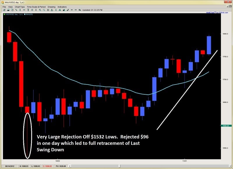
When gold sold off massively due to huge margin increases by the metals exchanges, it crumbled hard and everyone was wondering where the bottom was.  It found it eventually at $1532 where in one day, it opened at $1640, jumped up $23, dropped $130, then bounced $96 from the lows which was quite an amazing rejection inside one day.  This is a violent reaction, so traders were definitely taking notice of it the next time it approached this level.  Can you guess what happened when it got there again?


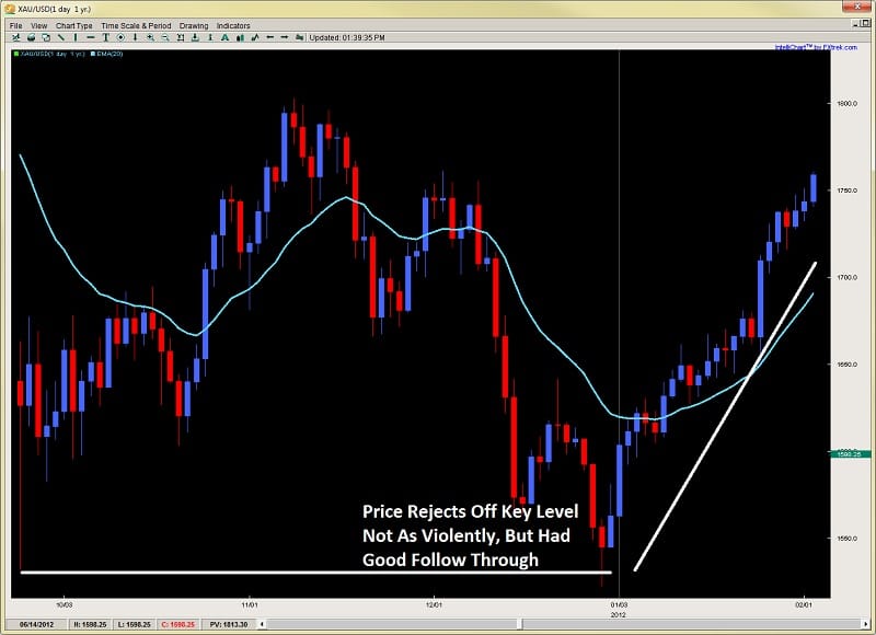
Second Approach Gold Chart
best support and resistance levels gold chart 2 2ndskiestrading.com

As you can see, price held this level with a tiny breach, then bounced the next 4 days in a row, suggesting strong follow up buying on this rejection.  The first time back usually is a slightly lesser bounce since many know of the level, and thus less traders are trapped (or surprised) from a violent rejection the first time around.  But usually, this level will hold.

Remember, this is one scenario of how price has related to it in the past.  All the other types of reactions communicate a different story.

2) How Significant Is It (lower time frame, higher time frame, etc) – this really has to do with time as all support and resistance levels have what I call a ‘time degradation‘ to them.  Simply put, traders have a memory, but they are more inclined to take recent information as more valuable then information a while ago, especially if they are short term traders.  Generally, higher time frame levels will dominate and last longer than lower time frame levels.  Also, when possible, I’m more interested in drawing levels that are more likely to maintain the trend as that is the more probable scenario.  I particularly relate to these when reading the impulsive vs. corrective moves in the market.

For more information about understanding impulsive vs. corrective moves, make sure to watch the video here.

But once you have established the trend according to the impulsive vs. corrective series, look for breakout pullback level where the trend continued, or major swing highs/lows where the trend paused and pulled back to.  These will often present great opportunities to get in with trend.

3) How Price is Reacting To It Now – Is price closing on a support level, and just sitting there, with smaller and smaller bounces off it? If so, a breakout through the level is more likely as there is no strong buyers able to push back, and the sellers continue to squeeze them out of the market.  Was there a strong pin bar reversal off this level?  If so, it could be telling you it will likely hold on a second attempt and start a reversal, hence look for an entry close to the level.  How price reacts to the level in the moment can tell you if it’s likely to hold or not, but this analysis should be done before it reaches the level.

Often times the market will demonstrate a price action reversal signal at these levels.  Keep in mind, this is the ‘effect‘ of how players responded to the level, not the cause.  Order flow was the initial cause, and the level was the location.  Everything else was a response to the initial reaction off this level.  Hence these price action triggers are often ‘secondary entries’ (or sub-optimal) regarding the level.  Sometimes a price action trigger, say a pin bar on a 4hr chart can be an engulfing or piercing bar on a 1hr chart.  So sometimes it helps to look at a lower time frame to see what the more micro responses off this level are, or what the price action context was leading up to it.

But no matter what, there will always be clues as to what the major players are doing at this level, and what the more likely scenario is.  Look for impulsiveness (strength) off the level, or weakness (corrective price action) off this level for initial clues.

4) What Is The Speed Or Impulsiveness Price Is Approaching The Level – this will really tell you a great deal of information whether a level is likely to hold or not.  If you are trading with trend, and with the move when it is approaching a level, how strong the move is heading into it, and what is the underlying characteristics behind the price action (speed, acceleration, etc), will tell you what is more probable.

If a level is an intraday level, or one from only a day ago, a really impulsive move is likely to break through it. If it’s a daily low or high, or a level that held for a week or longer, it will have a better chance of holding. Think of it like a moving object.  Consider the size of the object in relationship to what the obstacle in its way is.  Normally, force x acceleration (& mass) will tell us whether the obstacle ahead will cave or not. Unfortunately, we do not have exact information about the orders at a level, such as the number and size of them which would equate to mass and volume of the object.  Level 2 quotes would help in this fashion, but if you don’t have that, then what?

Why not use the other principles above, such as;
-how did price react there in the past
-how significant is it
-how is price reacting to it on first touch

Weigh those against the force, or impulsiveness of the move, and you’ll be able to get a better idea.


A good example would be the following chart below of the AUD/USD on the daily time frame
best support and resistance levels 2ndskiestrading.com AUDUSD chart 1

Price approaches the level with some volatility, as there are solid moves on both sides of the fence with bears maintaining control on the way down.  Price bounces off the level with a piercing pattern and then a second attempt forming a pin bar reversal.  But then after a small retrace, price attacks the level with vigor, selling off 4 days in a row, taking out the last 13 days gains.  Does this resonate strength to you?  Do you think it will break?  See the chart below

Exhibit B
best support and resistance levels 2ndskiestrading.com AUDUSD chart 2

As you can see, price was exhibiting a lot of strength and impulsiveness heading into the support level. There were definitely some clues ahead of time this was going to break.  Such as how price barely lifted off the level each time, and attacked it twice without ever gaining much ground to the upside.

Keep in mind, the trend was already down leading up to it, so with trend traders used these pullbacks to get back in the trend.  The last time they said enough is enough, and went to take out the barriers at this level.  The buyers at the support level likely exhausted themselves on the first two rejections which failed to gain traction.

Putting all these components together would have communicated a breakout was likely, which would have helped your current short, or give you a second opportunity to get back in on a textbook breakout pullback setup for a high probability-low risk trade.


In Summary

So there you have a few key variables to look for in finding the best support and resistance levels. Remember, price action patterns form at these levels and are the ‘effect‘, not the cause of the move. They do communicate information to us as traders, what we are looking for is the price action context before we reach these key support and resistance levels.  Hence, it is these key levels where orders are being placed first.

Thus, by learning how to read the price action and the key variables I listed above, you can greatly improve your ability to spot good setups, improve your entries, placing trades where weak players are getting in, and the stronger players are looking to enter.

Please make sure to comment below, and click on the like buttons to share this article 🙂

For those wanting to learn to trade price action, get access to the traders forum, lifetime membership & more, visit my price action course page here.