Today had produced some interesting price action plays, so I wanted to share with you two trades that I took today.  I am going to break down exactly what I was reading from a forex price action perspective, what my analysis was, how I took each trade, including the entries, stops and limits, and why I chose them based on what I was seeing in the price action.

While the NZDUSD has been stuck in a range for the last two days, I have been playing the consolidation range which has held up nicely.  Being that the Kiwi tends to be a little slow at times moving at a tortuga pace, I noticed a few price action setups in Silver (XAGUSD) and took a couple of intraday plays.  It is these two intraday trades I am going to be dissecting for you from a forex price action perspective.  I am also going to be sharing how I used quantitative price action data on the intraday volatility for Silver to aid my trades.

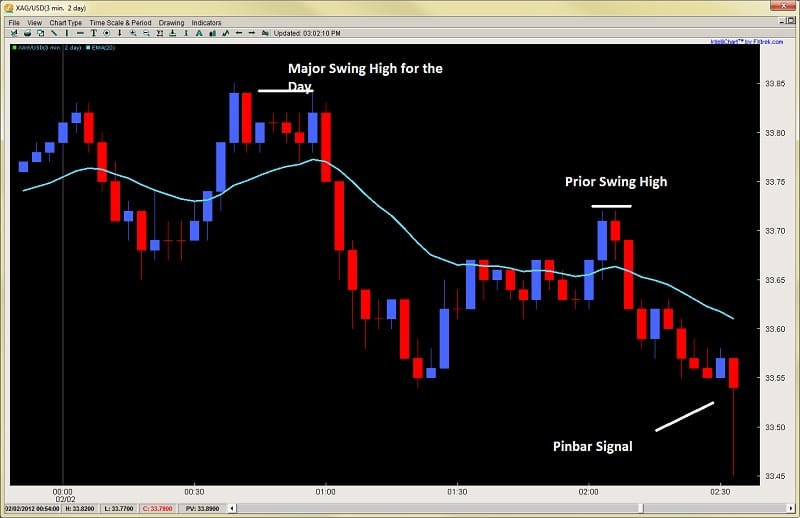
Taking a look at the chart below (3min on silver), following the grey vertical line which represents the London open, we can see price starts out a little choppy.  For the first hour, price action stays within a $.20 range which is actually less than the normal volatility for this pair of $.30 for the first hour of the London session.  This communicates to me there is actually very little directional dominance being a 33% lower range of volatility.  If this continues, then I will look for a reversion to the mean play.

Why?  Since no one dominant player is directing the market, there is still a tug of war going on with both sides being relatively equal.  This means price will continue to revert back to the mean until someone takes control.  Thus, I will look for reversal plays.  As you can see by the price action, the small swing down was about the same strength as the small swing up.

intraday price action 2ndskiesforex hour 1

At about the 2.30 mark (2.3hrs into London session), I got a pinbar formation.  This is a reversal signal and definitely leaves me the chance to make my reversal play.  However, I hold on the trade for two reasons;
1) If I took the trade on the open of the next candle, my stop would have needed to be about $.10 and my target to the last swing high would have only been about $.15 for a 1.5:1 Reward to Risk ratio.  

2) The market structure has not given me a HL (higher low) which would have confirmed to me the market structure was changing and that I had a reversal buy in play.

These two things combined told me to put the trade on hold so I passed.  Look at the chart below to see the resulting price action.

intraday price action 2ndskiesforex chart 2

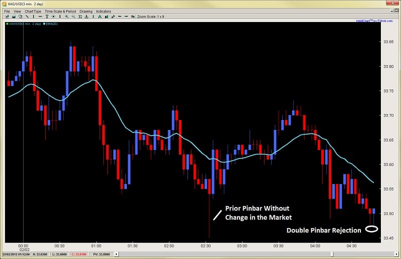
Initially, when the price action hit the prior SH (swing high), it sold off at a steady pace.  But noticed how it picked up with a very large red bar toward the end, making a quick rejection low. This increase in the size of the bar communicated stronger selling participation.  But it also had a small rejection to the downside followed by a gentle pullback (perhaps exhaustion).  This was a small clue there might be orders close to the lows of the prior pinbar, so I watched for the price action to give me a lower low.

As you can see at the very end of the chart, it did, forming a double-pinbar.  This double-pinbar formation communicated to me from a price action perspective two things;
1) not only was the first pinbar rejection a likely higher low offering me a good R:R play, but…

2) the second rejection was telling me after price made the first pinbar rejection, the market tried a second attempt to make a new low and failed.  It failed at exactly the same price yet this time closed up on the bar.

intraday price action pinbar signal 2ndskiesforex

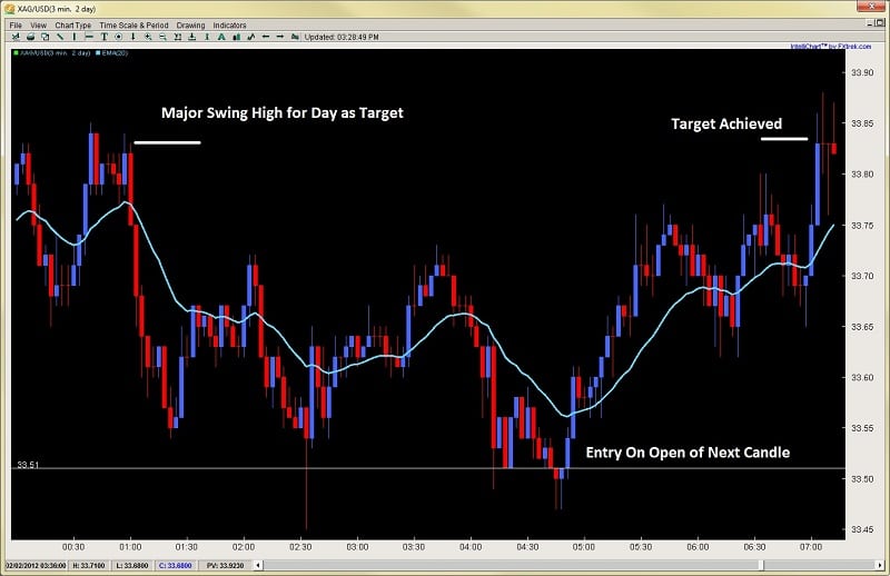
Combine this with the fact price was still staying below its normal intraday volatility levels, and I had all the ingredients for a nice reversal play.  All these together suggested a high-probability buy on the open of the next candle with a tight stop of less than $.10 while targeting the major swing high for the day at $33.85 (over $.33 away for a +3:1 Reward to Risk ratio).

Below is how the trade played out.  It broke the prior swing highs, made a HL (higher low) and then shortly after went on to its target at $33.85.  Keep in mind my entry was $33.51 with a target of $33.85 ($.34) and a stop of less than $.10 so over 3.4:1 R:R ratio.

intraday price action pinbar trading 2ndskiesforex

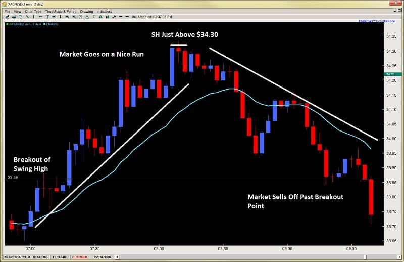
After hitting the first play on silver, it started to go on a run as it broke the SH (swing high).  After breaking the $33.85 swing high, the market climbed over $.50 in less than an hour.  Using my quantitative data on intraday volatility, this was approximately 20+% higher than the normal volatility ranges for this hour of trading.  I’ll confess, I did not catch this upmove, but looking at it, I had two choices:

1) look for a market structure change to reverse the pair short as it may revert to the mean after the larger than normal surge in volatility, or…

2) look for a pullback to a prior value/support area and look for an entry to get back long.

I honestly didn’t know which of the two was a better play, so I watched the price action for clues.  I want you to take a look at the next chart which shows the rise and fall of the shiny metal and take a look at the key difference between the two moves.  See if you can spot the two subtle clues which communicated to me what I wanted to play.

forex price action 2ndskiesforex feb 2nd

First, notice how the angle of the two moves and the subtle difference.  The buy up was a pretty sharp angle, while the sell-off, although impulsive in nature, had a flatter angle.  This flatter angle communicated to me there was less strength in the selling then there was in the buying.

Secondly, look at the nature of the buying and selling.  The buying was almost straight up with very small pullbacks telling me the buyers were quite dominant.  While in the pullback, there was a see-saw type action, telling me the sellers were a) less dominant, and b) there was a fight going on between the buyers and the sellers unlike in the upmove. This all communicated to me via price action the market was likely going to reverse back up so I should look for a long after seeing a market structure change.

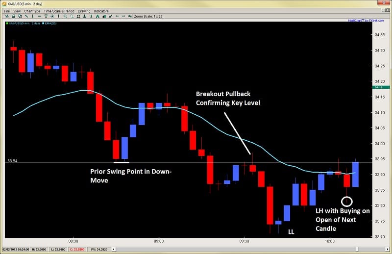
On the next chart below, shortly after the bottom, I got my market structure change.  After bouncing off the low, the price actually bounced back into the prior range of the last pullback suggesting the buyers were starting to wrestle control from the sellers.  Looking at the major swing low at $33.94 in the downtrend, if you look at the last two bars in the chart, you can see there was a rejection to the downside, followed by buying on the open of the next candle which went up to this key $33.94 level.

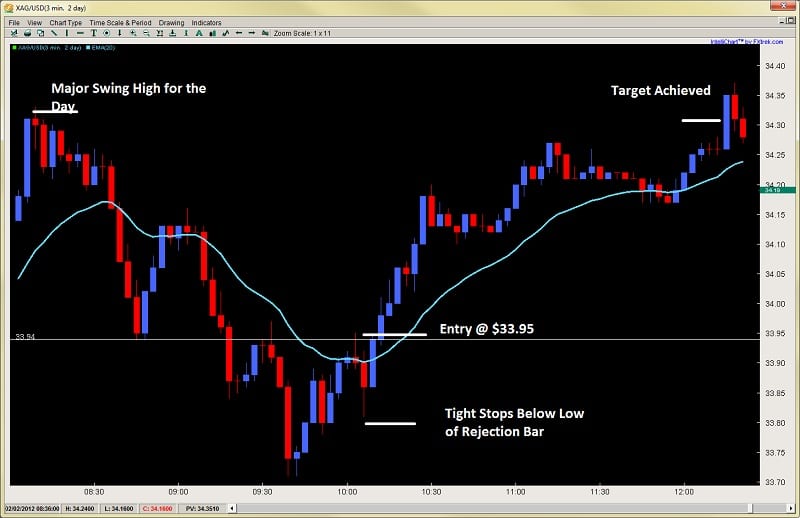
This rejection + the buying from the open was communicating to me the buyers were likely making their move.  When I see that, I am going to buy that.  I took a buy 1pip above this swing point at $33.95 with my stop below the low of the rejection candle prior, while targeting the SH for the day.  This gave me a $.35 target and a $.15 stop for 2.33:1 R:R which was fine with me.

intraday price action forex price action trading 2ndskiesforex

The market then climbed for the next 5 out of 6 candles suggesting the buyers had come in just before my move and I was riding the momentum of their buying.  After a small rejection, the market went sideways, so since the bulls were still in control and had not conceded it, I stayed in.

Shortly, after a little further buying and small pullback, the target was achieved taking out the Swing High for the day as you can see in the chart below.

2ndskiesforex intraday price action trading

This is exactly how I took each trade, found my entry, stop, and limits – all using pure price action analysis, combined with favorable R:R ratios.  This should give you an insight of how you can trade price action.  By learning to read the market structure, looking for changes and subtle clues, then taking the most favorable plays that present themselves.

I would like to add that even though I am trading on a smaller time frame, I am not necessarily looking to be significantly more active.  I am exploiting the same price action setups I see on the 1hr, 4hr and daily time frames.  In fact, my methodology is really the same – wherein I am looking for a couple really high quality setups with very favorable R:R’s.  These can be found every day, whether you are trading the 3min time frame, or the 1hr, 4hr and dailies.  Your ability to read price action and all the clues will help you to spot the best opportunities, where the big players are driving the market, and how to find high quality setups.

For those of you looking to trade price action, visit our Advanced Price Action Course where we teach rule-based systems for trading Price Action.

If you appreciate our price action commentary and insights, please make sure to click the ‘Like’ button at the top of the page.

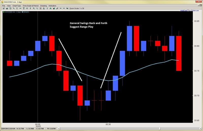
One of the questions I get most often about reading price action has to do with breakouts.
How to spot them?
How to know when it is a false breakout?
How to get in after it’s already broken out?
Ok, i’m in one now, how do I know it’s for real?
It is the last question we are going to focus on – how to determine if the breakout you are in is for real.
Over a series of three articles, we are going to cover 3 key elements to a breakout, dissecting the anatomy of a breakout such as;
what they should look like
what you will want to see
and what are the key characteristics of them.
By learning to read these price action patterns or elements inside a breakout, you will get a more unique grasp of how to understand breakouts.  This can be done on any time frame as the price action pattern is the same.
From an Order Flow Perspective
Before we get into what a breakout bar should look like, let’s explain what is happening from an order flow perspective in a breakout.
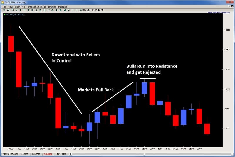
Using an upside breakout as an example, a resistance level has been established, with a minimum of one rejection, perhaps 2 and possibly more.  This rejection in price denotes sellers over-powered the buyers and wrestled control of the market.   The rejection could be slow, or it could be violent, but nevertheless, the bulls were in control, failed to break above a level, and the market pulled back.
price action trading - key price action elements to breakouts audusd rejection
Since they were successful in doing it before, there is a good chance previous or new sellers will be parked at the same rejection level to short the market again.  Naturally, their stops will be placed just above the key rejection level.  This is critical to know, because it is these stops when they get tripped which can help accelerate a breakout.
Why?
If there are players short at a key level, to exit they must buy back the pair which in turn, helps the bullish breakout get more steam.  Keep this in mind for later while we start to discuss the first key element of a breakout.
Key Element #1 – The Breakout Bar
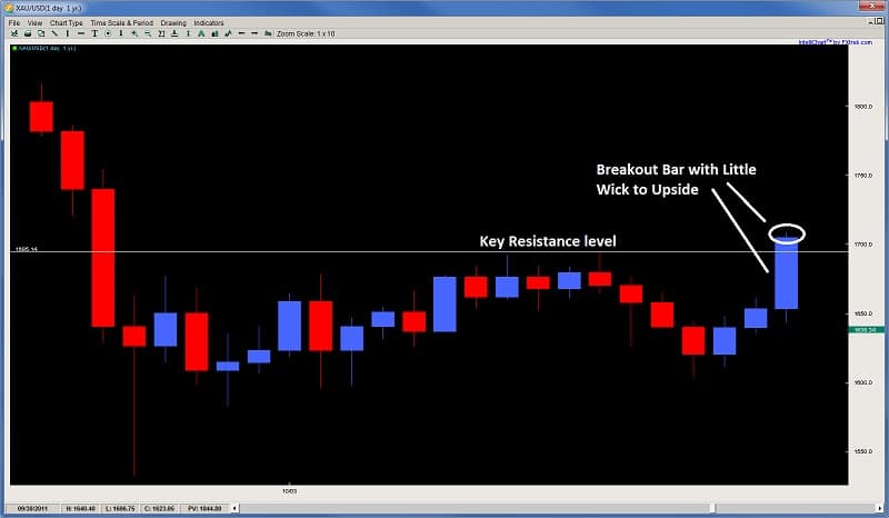
When witnessing a breakout, the first bar (or breakout bar) should be given the most scrutiny.  This bar should be anything but timid in nature.  Keep in mind, when a breakout is forming, there is a fight between the bulls and the bears which creates a tension.  Sellers have placed a lot of money believing the market will reverse, while the bulls believe it will clear the key resistance above.
Thus, when the bulls are trying to break a key level, if the price action and bar approaching the key level is timid in nature, say with a small body, perhaps a wick on both sides, this will only give the sellers confidence they (the bulls) do not have enough dollars, buyers, or both, to break the key level.  The sellers will sense this weakness and push back with a vigor if they really want to defend that level.
So the breakout bar should be strong in nature, signifying;
a) the buyers are putting a lot of force (either dollars, number of buyers, or both) into the breakout
and
b) they were able to clear out the sellers by tripping their stops
What does a strong breakout bar look like?
It should minimally be large in nature, meaning it has a large body (larger than usual).  This large body demonstrates strong buying power and participation from the bulls.  The stronger the force in a breakout, the more momentum it will likely have as it tries to make new ground.  A large body shows commitment and force on the buyers part.
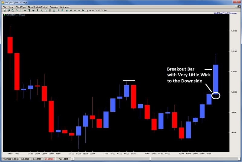
Another important element of a good breakout bar is it has little or no wick to the downside.
Why?
A bar that opens and has few or no pips to the downside, communicates to us the buyers were present and strong in the market from the open of the candle.  They wasted no time buying from the open giving the sellers no time to enter.  Their strong buying from the open suggests commitment to drive prices up and establish control from the beginning.  Thus, look for little or no wick to the downside on the breakout bar such as in the example below.
price action trading - key price action elements to breakouts audusd breakout bar
Thirdly (and consequently), the breakout bar ideally has little or no wick to the upside as well.  The presence of a little wick suggests the buyers maintained control going into the close, thus not taking profits, and likely communicating they think there is more upside to be had, thus staying in the market. This will also deter sellers from entering as they are reading the strong close from the bulls, thus, they will be hesitant and likely wait for a better price action trigger.  Take a look at the example below.
price action trading - key price action elements to breakouts audusd breakout bar upside wick
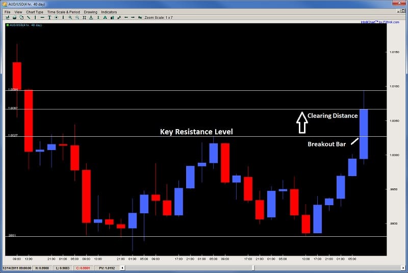
Lastly, a good breakout bar will have clearing distance.  This is the distance the bulls have cleared from the previous resistance level which was containing the upside.  If they only clear the resistance level by a small amount, its possible they did not trip any stops, thus failing to add steam to their breakout play.  This could also suggest to the sellers the bulls do not have a strong punch, so the bears may see a weakness, and thus enter the market.
However, if the breakout clears the resistance level by a good distance, then stops were almost certainly tripped, thus adding to the upside break.  This will also communicate to the bulls they have taken out all the barriers and thus can push for higher ground with less orders from the bear side.
To be specific, the clearing distance is the distance in pips from the high of the resistance level broken (or low in a downward break), to the close of the breakout bar.  The high of the breakout bar is useful as it tells us how far the bulls were able to push (and clear) from the resistance level in the breakout bar.  However, if it pushes really high, but gets rejected strongly and barely closes above the lows, this would communicate to us sellers did not accept the value of the pair that high above, and rejected it strongly, taking control from the bulls (who were in control during the breakout).  So the key is how far does it close above the high of the previous resistance level.  This is known as the clearing distance and is demonstrated in the chart below.
price action trading - key price action elements to breakouts audusd breakout bar clearing distance
In Closing
We have just covered 4 critical characteristics to what a strong breakout bar would look like.  They are;
1) Large Body
2) Small Wick to Downside (for upside breakout, while a small wick to upside for downside breakout)
3) Strong Close
4) Clearing Distance
These four things communicate to us from an order flow and price action perspective why they will likely lead to a strong breakout.
This is part one of a three-part series on reading price action and how to identify key elements to a breakout.  Stay tuned as next week we will cover the second aspect of a strong breakout and how this communicates the breakout will likely continue.
Please remember to leave your comments below and to ‘Like’ and ‘Tweet’ to share the article. 
Also make sure to check out our most recent article on Awareness, Negative Habits, and Concentration in Trading.
 

Many people will talk about their forex Risk-Reward ratios such as it’s important to have 2:1, 3:1, or whatever to one ratio, but this is just the tip of the iceberg of risk-management and leaves you uninformed and un-empowered.  You can actually have a 3:1 Reward-Risk ratio and lose all the money in your account.  You can also have a 1:1 Reward-Risk ratio and make money day in day out.

2ndSkies Forex Tip of the Iceberg Chris Capre

How can you understand the difference between the two?  Through the Risk-of-Ruin formula.

We did a 1hr webinar on Risk Management, the Risk of Ruin formulas and how critical they are, whether you are trading Price Action Strategies, Ichimoku Kinko Hyo, or any other system.

I got many requests for the information contained in the Risk of Ruin formulas so I am posting all the tables here so you can see the mathematics of your trading and whether you have the numbers in your favor.  Here they are below:


Risk of Ruin Formula using 10% Risk / Trade

ROR% with 10 capital at risk
Win Ratio %   Payoff Ratio 1:1   PR 2:1   PR 3:1   PR 4:1    PR 5:1
Win Ratio 10%    100 100 100 100 100
Win Ratio 15%    100 100 100 100 100
Win Ratio 20%    100 100 100 100 46.6
Win Ratio 25%    100 100 100 30.5 16.3
Win Ratio 30%    100 100 27.7 10.2 6.1
Win Ratio 35%    100 60.9 8.2 3.53 2.33
Win Ratio 40%    100 14.2 2.5 1.24 0.888
Win Ratio 45%    100 3.41 0.761 0.426 0.329
Win Ratio 50%    100 0.813 0.226 0.141 0.116
Win Ratio 55%    13.4 0.187 0.0635 0.0438 0
Win Ratio 60%    1.73 0.0401 0 0 0
Win Ratio 65%    0.205 0 0 0 0
Win Ratio 70%    0 0 0 0 0
Win Ratio 75%    0 0 0 0 0
Win Ratio 80%    0 0 0 0 0
Win Ratio 85%    0 0 0 0 0
Win Ratio 90%    0 0 0 0 0


Risk of Ruin Formula using 5% Risk / Trade

ROR% with 5 capital at risk
Win Ratio %   Payoff Ratio 1:1   PR 2:1   PR 3:1   PR 4:1    PR 5:1
Win Ratio 10%    100 100 100 100 100
Win Ratio 15%    100 100 100 100 100
Win Ratio 20%    100 100 100 100 21.7
Win Ratio 25%    100 100 100 9.33 2.67
Win Ratio 30%    100 100 7.67 1.03 0.372
Win Ratio 35%    100 37.1 0.672 0.124 0.0544
Win Ratio 40%    100 2.03 0.0623 0 0
Win Ratio 45%    100 0.116 0 0 0
Win Ratio 50%    100 0 0 0 0
Win Ratio 55%    1.81 0 0 0 0
Win Ratio 60%    0 0 0 0 0
Win Ratio 65%    0 0 0 0 0
Win Ratio 70%    0 0 0 0 0
Win Ratio 75%    0 0 0 0 0
Win Ratio 80%    0 0 0 0 0
Win Ratio 85%    0 0 0 0 0
Win Ratio 90%    0 0 0 0 0


Risk of Ruin Formula using 2% Risk / Trade

ROR% with 2 capital at risk
Win Ratio %   Payoff Ratio 1:1   PR 2:1   PR 3:1   PR 4:1    PR 5:1
Win Ratio 10%    100 100 100 100 100
Win Ratio 15%    100 100 100 100 100
Win Ratio 20%    100 100 100 100 2.2
Win Ratio 25%    100 100 100 0.266 0
Win Ratio 30%    100 100 0.163 0 0
Win Ratio 35%    100 8.37 0 0 0
Win Ratio 40%    100 0 0 0 0
Win Ratio 45%    100 0 0 0 0
Win Ratio 50%    100 0 0 0 0
Win Ratio 55%    0 0 0 0 0
Win Ratio 60%    0 0 0 0 0
Win Ratio 65%    0 0 0 0 0
Win Ratio 70%    0 0 0 0 0
Win Ratio 75%    0 0 0 0 0
Win Ratio 80%    0 0 0 0 0
Win Ratio 85%    0 0 0 0 0
Win Ratio 90%    0 0 0 0 0


Risk of Ruin Formula using 1% Risk / Trade

ROR% with 1 capital at risk
Win Ratio %   Payoff Ratio 1:1   PR 2:1   PR 3:1   PR 4:1    PR 5:1
Win Ratio 10%    100 100 100 100 100
Win Ratio 15%    100 100 100 100 100
Win Ratio 20%    100 100 100 100 0.0485
Win Ratio 25%    100 100 100 0 0
Win Ratio 30%    100 100 0 0 0
Win Ratio 35%    100 0.701 0 0 0
Win Ratio 40%    100 0 0 0 0
Win Ratio 45%    100 0 0 0 0
Win Ratio 50%    100 0 0 0 0
Win Ratio 55%    0 0 0 0 0
Win Ratio 60%    0 0 0 0 0
Win Ratio 65%    0 0 0 0 0
Win Ratio 70%    0 0 0 0 0
Win Ratio 75%    0 0 0 0 0
Win Ratio 80%    0 0 0 0 0
Win Ratio 85%    0 0 0 0 0
Win Ratio 90%    0 0 0 0 0


Hopefully after viewing the Risk of Ruin tables and underlying forex trading risk mathematics, you will begin to look at your trading differently, analyze whether you have the mathematics in your favor to make money day in day out, or are setup to lose money. Understanding the mathematics of risk can make all the difference in the world so make sure you study these numbers in relation to trading your rule-based system.

We have a Risk of Ruin Calculator available here, for your convenience.

Remember to leave us your comments which are always appreciated, and also to click the ‘Like’ and ‘Tweet’ buttons below to share it.

The 4-Hour Chart

No, this is not a Timothy Ferriss promotion or new book, but an examination of the 4hr chart, along with the how and why I recommend using it for your price action trading.
If you are in the beginning or developmental stages for learning how to trade the forex market, I definitely recommend learning to read price action off the 1hr, 4hr an daily time frames.  For our purposes, we will concentrate on the 4hr chart.

Some Advantages of the 4hr Time Frame?

Price Action is the result of order flow (the total summation of all buy and sell orders).  It really matters not why people buy and sell, or if they are buying and selling, what matters is who has dominant control of the market, where is the market most likely to go, and how can we trade it.
With that being said, a few minutes of price action can more often than not, represent a false move, perhaps Toyota buying some USD with JPY, and very likely have any significant force behind it to drive the market, bring in other players, and be the start of a big move.
Think about it…how many 1min, 3min, 5min, 10min, 15min, or even 30mins of price action throughout the day will really be representative of a major move and driving force throughout the day?
Now, think about the 4hr chart.  No matter how you slice it, 4hrs is half of a trading session (for the most part).  For any trading session, a 4hr candle will represent a large sum of order flow, sentiment, continued or sustained buying/selling, etc.  If a rejection happens on a 4hr chart, it likely represents a large rejection because to sustain that rejection, the market had to close the entire 4hr candle while maintaining the rejection till the end.  If it rejects during the 4hr candle, but closes exactly where it rejected, then it wasn’t that important because it couldn’t sustain that rejection in time.
chris capre 2ndskiesforex https://dev2ndskies.wpengine.com
Time is a critical component when reading price action and representing order flow.  In many cases, the longer price reacts/rejects off a key level, the longer it holds from that rejection, the stronger it can be. Of course the price action context leading up to it is key and informative, so make sure to understand this.
But if a key level can sustain the directional move for 4hrs as opposed to 5mins, then it had to do so through increased order flow and participation from the market.  That communicates there were more players and more money behind this move.
But on a 5min candle, or even a 1min candle, this could be nothing and represent little/meaningless order flow with no real potency behind it. It could be the result of some minor profit taking which creates a negative feedback loop in terms of order flow and price action.  But do this for 4hrs and sustain it into the close, and we are talking more participation, orders, money and participants.
For price to sustain a particular price action move for 4hrs means no matter how many players, sentiments, and ideas there were participating in the market, the dominant theme held for half the trading session and quite a long time.  But on a one min time frame, a 5min, or even 30min time frame, these moves could be simple noise which can move the market up to 30pips without having any major force behind it.  Think about how many 5min candles in between the NY close and Tokyo open and how much order flow will really be behind that?  Think about how many 1min and 3min candles will be between the 3rd and 4th hours of the london session (where volatility and pip ranges generally decrease) and how they will represent less order flow and participation. Then you will see how ineffective these candles can be and how what your reading has very little meaning.

One and Two Bar Patterns

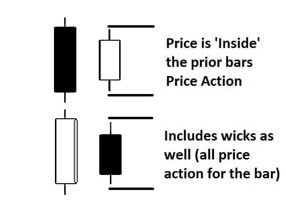
Continuing with that logic, for those who trade pure price action patterns, like an inside bar (which is a 2 bar pattern) shows up on a 1min, 3min, 5min or even 30min time frame, it is much more likely to be absolutely meaningless than an inside bar which shows up on a 4hr time frame.
Think about it, if price holds inside the previous price range on a 5min candle, that could mean almost anything and be the result of a laundry list of order flow environments and situations.  5mins of price going nowhere could mean anything and have very little direction on upcoming order flow.

But apply an inside bar on a 4hr time frame, and you are talking 4hrs of price action being held in a range for almost half an entire trading session.  That means no matter how many players participated in the market, nobody was able to break the previous price range for an entire 4hrs which tells you a) price was pretty suppressed, b) very little directional control in the market, c) very little participation.  That is much more communicative in terms of information than any passing 5mins.

The market could be in a dominant trend, but be simply pausing for 5mins because its coming to lunchtime, there were some short term counter-orders/forces in the market that will be quickly absorbed, a little profit taking (again, a negative feedback loop on price action and thus, not great for trading). Technically, for an inside bar pattern, you would be basing your decision on 8hrs of price action since an inside bar pattern is a 2bar pattern (thus 8hrs), so there is a lot more information in this then an inside bar pattern on a 5min time frame (10mins of price action).
inside bar chris capre https://dev2ndskies.wpengine.com
Furthermore, to get any real significant amount of data with confirmation and continuation of the order flow (and price action), you need far more 1min, 3min, and 5min candles to make sure the noise is filtered out. That means more moving parts and more variables to manage.  Contrast to the 4hr chart where one candle (or two) can give you all the information you need to make a trade while filtering out any noise and meaningless price fluctuations.
For an interesting story about meaningless price fluctuations, make sure to put in a question in the comment box below and i’ll tell you a story which will blow your mind.

In Conclusion

As we can see, when trading and reading price action, a 4hr candle will offer us much more information, and have a cleaner look and feel to it than any 1min, 3min or 5min chart.  This will make it easier for you in your learning process as you’ll be making decisions off of less false signals, more information and cleaner charts.
The 1hr, 4hr and daily time frames will have a greater communicative value about direction, clear support/resistance levels, what is a key rejection, who’s in control, while filtering out noise and meaningless order flow and price action. This will give you less confusing information in the beginning, and teach you how to be patient with your trading.
Once you have developed your skills, have some experience and confidence under your belt, it’s really up to you from there how you want to trade, whether it be on the smaller time frames (1min – 30mins) or larger time frames (1hr, 4hr and daily).  At that point, it’s a question of style and life-style.
But it should be noted we aren’t saying trading on the lower time frames is meaningless. One can trade price action on any time frame and make money. In fact people are making money on almost every time frame available.
Just understand you have to increase your price action skills and ability to read price action context before trading lower time frames. For some people’s brains, it doesn’t work with their natural wiring and dispositions. For other traders it does, so the key is finding what works for you. If it hurts your brain, then it likely isn’t for you, so make sure whichever style you trade isn’t hurting your brain, but engaging it well.
chris capre stressful brain https://dev2ndskies.wpengine.com
For those of you wanting to learn how to read price action and the order flow behind it, take a look at our Advanced Price Action Trading Course where you will learn rule-based price action systems to trade the forex market.
Please remember to leave your comments below and to ‘Like’ and ‘Tweet’ to share the article. 
Also make sure to check out our most recent article on Price Action Trading.

Many of you have been asking for specific content on how to do advanced price action forex trading.

advanced price action forex trading - Chris Capre - 2ndSkiesForex

So I put together a list of my top articles and videos to help you learn how to do price action trading.

https://dev2ndskies.wpengine.com/trading-videos/price-action-chris-capre-advanced-price-action-trading-strategies/
https://dev2ndskies.wpengine.com/trading-videos/understanding-price-action/
https://dev2ndskies.wpengine.com/strategies-for-forex-trading/forex-articles/the-4-staples-of-interpreting-price-action/
https://dev2ndskies.wpengine.com/trading-videos/price-action-reversal-candles/
https://dev2ndskies.wpengine.com/strategies-for-forex-trading/forex-articles/piercing-or-outside-candles/
https://dev2ndskies.wpengine.com/trading-videos/price-action-inside-bar-trading/
https://dev2ndskies.wpengine.com/strategies-for-forex-trading/forex-articles/the-breakout-retest-trade/
https://dev2ndskies.wpengine.com/trading-videos/price-action-trading-rejection-zones/
https://dev2ndskies.wpengine.com/trading-videos/price-action-trading-getting-into-trends/
Enjoy!
Chris Capre

One of the most challenging frontiers for forex traders has been interpreting Price Action without the known presence of order flow. Although there are many methods which dip their fingers into the toppings of the pie and get a taste of the price action (i.e. candlesticks, Elliot wave, pattern recognition), none of them seem to get fully into the bedrock of our subject – into the actual ingredients of price action.

What is Price Action?

Price action is essentially the closest relative to order flow in FX and across all markets. It is the direct result of order flow. Thus, it has the fingerprints of bias, speed of buying/selling, where buying and selling is occurring (support/resistance) when a breakout is genuine and where a likely reversal is occurring. From the continuous flow of price action which pours onto our charts, all indicators are born and thus dependent upon it. Hence, understanding and being able to interpret price action becomes an essential component to our trading. Understanding price action is a way to get into the essence behind what creates the indicators and most technical signals in the markets.

The 4 Staples

Since there have been countless books, articles, etc. written on how to find and use support and resistance levels, lets dive into four unique methods or staples for understanding price action.

  1. Impulsive vs Corrective

    Elliot Wave theory had the wisdom and insight to examine the difference between moves. The two essential moves everyone sees is either an Impulsive move or a Corrective move.

    1. Impulsive Moves

      An impulsive move is characterized by a forceful or strong move in one direction. It is fast and powerful, thus producing some of the larger candles in a set albeit any time frame. It is also usually followed by several candles moving in one direction, or the bulk of them in a move. The candles are often signified by closes towards the top or bottom of the candle, depending upon the direction of the impulsive move.

      They are ultimately created by a large amount of capital with the buyers/sellers coming in at a particular level with a specific direction in mind. The other scenario is they are created due to a price cascade, via tripping up large stops and, thus, removing the defenses to the upside or downside of a support or resistance level, creating an imbalance to the order books. Impulsive moves can happen on any time frame.

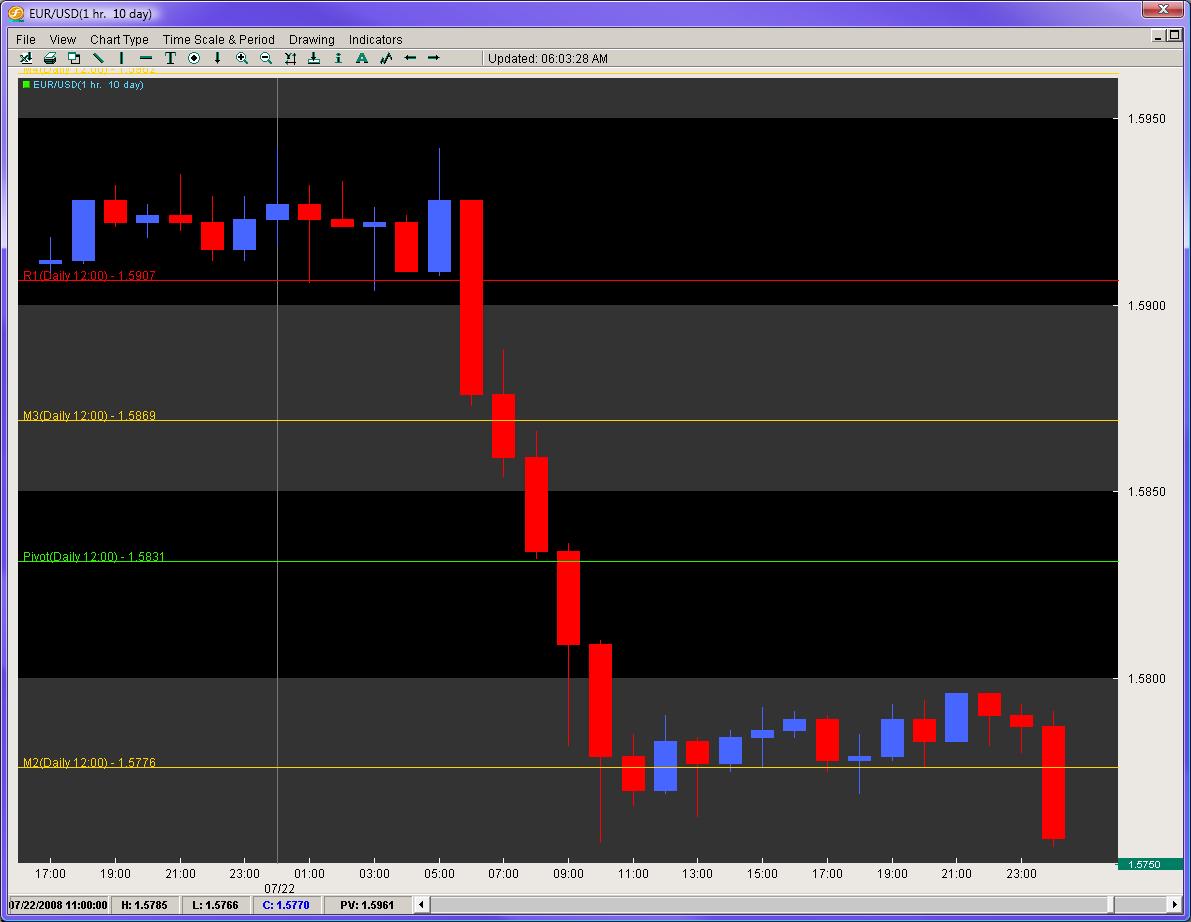
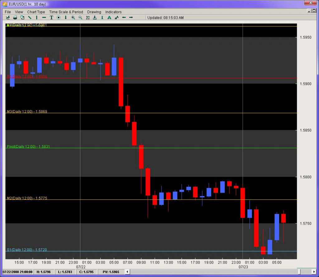
      Figure 1 illustrates a recent impulsive dive in the EUR/USD. In this 1 hr chart, notice how the move starts with the largest candle in the entire down move and the close being towards the bottom of the candle (signaling constant selling pressure for the entire hour).


      Also notice how before, the move is a mix of red/blue candles, but once the impulsive move begins, we have six red candles in a row.

      This send this pair on a peregrine falcon dive from 1.5928 to 1.5756 (172 pips) in a matter of 6 hours. The daily ATR for this pair was clocking in at 133 pips from top to bottom on a daily basis, but in 6 hours it eclipsed the average daily range by almost 22%. This is a great example of an impulsive move.

      These are the types of moves we want to be in. They are the moves where the order flow is most consistent and heavily biased in one direction. Its no secret the larger players move the market. Thus, being able to identify impulsive moves and riding such waves give us some of the best trading opportunities.

    2. Corrective Moves

      Corrective moves are the most common moves to follow an impulsive move. They are practically the inverse of impulsive moves. The candles are usually smaller in nature with closes not particularly aligned to the top or bottom. They are usually a mixed bag of fruit with both blue and red candles and generally have little or no bias. It is important to identify these because they are the prelude to the next impulsive move.

      From an order flow perspective, they are usually created by one of two scenarios: 1) profit taking after an impulsive move with few significant buyers/sellers coming in to challenge the previous move, or 2) a clear mix of buyers and sellers residing at the same place and a potential reversal point. More often than not, a corrective move following an impulsive move is usually a continuation move.

      In Figure 2 we are looking at the same EUR/USD move which displays the corrective move before the large triple landing dive for this pair, followed by another corrective move and then further selling.

      1-EURUSD Corrective Move Chart

      Remember, when trading, we want the order flow bias to be heavily in our favor. Corrective moves offer little bias with order books closely aligned to 50% buyers and sellers. Even in the better case scenarios with a 60/40 tilt, you still have a much higher percentage of players on the other side of the market, moving the price action in the opposite direction of your trade. Ideally, we want the highest tilt available and corrective moves in and of themselves do not offer this for us as traders.

      The next two methods come from a trade I had done while working for a hedge fund.

  2. Pips Gained vs. Pips Lost


    In the summer of 2006, I had joined a hedge fund in California, and was on my first trader call with the President and CEO. We were discussing our trade ideas for the week, and I brought up a controversial pair – the NZD/JPY. Although I was sensing an impending reversal down the line, I was still bearish on the pair. However, the President and CEO were bullish on the pair, feeling the time for the reversal was ready to leave the womb and enter the world.

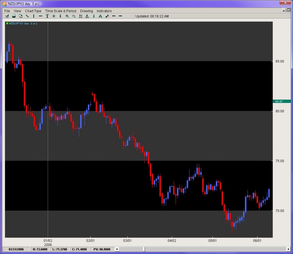
    Looking at figure 3, we can see the pair was on a heavy decline from just above 85.00, falling all the way down to 68.00. The pair had bounced off the lows 400 pips to challenge the 72 figure. After a little dip, the pair re-attacked the 72 level and looked to break to the upside. There was also the presence of a small Inverted Head and Shoulders pattern which is a clear reversal pattern.

    2-NZDJPY Pips Gain VS Lost Chart

    In front of all this, I still disagreed. Regardless of the top from this down move (87.05), the pair had started the year at 80.48 with the current price being 72.15 on the close of the then current day. The pair had ultimately lost 833 pips on the year. The price action had suggested for the bulk of the year, traders were much more apt to be selling instead of buying. Furthermore, using our impulsive vs. corrective analysis, the most impulsive moves for the six months of price action were clearly to the downside, with the series of moves having more consistency in the sell-offs vs. the buy-ups.

    I shorted the pair while the President and CEO were against it. The pair then declined 340 pips over the next two weeks. Longing the pair at that time was clearly not the option.

    Thus, we can see how measuring pips gained vs. lost gives an insight into where the previous buying and selling had occurred and where the next likely move is. Another stellar example of this is the USD/CAD.

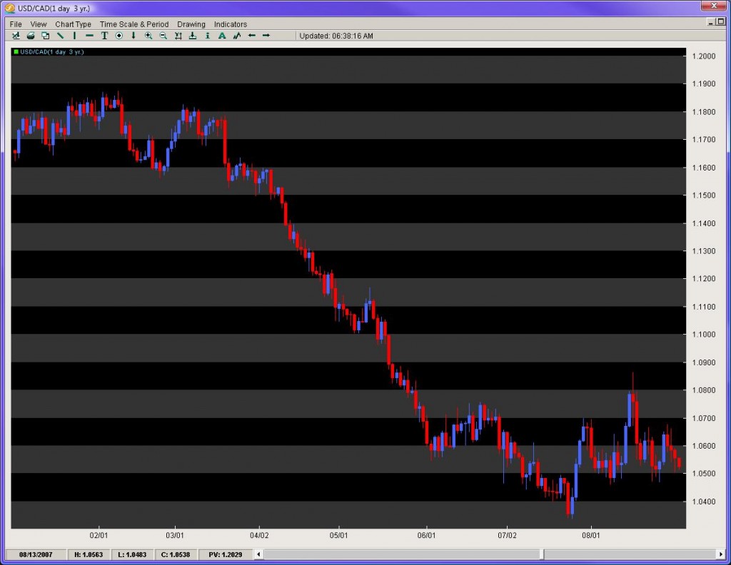
    In the late summer of 2007, the USD/CAD (figure 4) had started to show some bottoming after a torrential sell-off. After some consolidation, the pair sold off from 1.1800 to 1.0400 in a period of 4 months. This was a merciless move that could find nobody willing to step in front of the locomotive selling. The pair finally found a decent floor after bouncing off the 1.0400 handle and settled between 1.0500 and 1.0700. At this time, hundreds of technicians and economists, still baffled by the overextended downtrend and momentum of this move, were calling for a reversal, at least in the short term. Now consider some very important questions using the pips gained vs. lost method.

    3-USDCAD Pips Gain VS Lost Chart

    The pair sold off roughly 1400 pips in 4 months and was down about 1100 for the year. On top of that, it was only 4.5 years ago the pair was at 1.6000 (5500 pips ago) and had yet to complete anything greater than a 50% retracement of any major leg, with each retracement going to its corresponding extension.

    In light of all that, why in the world would anyone be paying attention to indicators and their over-extension since the pair had no regard for them? Furthermore, who in the last 4 years made significant money buying the USD/CAD? And since the order books/price action were completely dominated by an overwhelming pips lost vs. pips gained, who could even think about buying or a reversal until we have a clear bottom, albeit an activated reversal pattern or a 61.8% fib break of any major leg?

    The answer was obvious – keep selling until proven otherwise since that is where the price action had reigned king and had yet to be dethroned.

    Measuring pips gained vs. pips lost gives us a pure look at where the order flow is most consistent leading up to the current day/time. This method is very powerful over longer time frames, but is incredibly helpful on shorter intraday times as well. Be wary of trading in front of serious moves where the pips gained vs. lost is against you.

  3. Counting Candles


    Counting candles in a series or leg of a move can be useful on many fronts. First, it can tell you how many weeks/days/hours/minutes a pair has been bought up or sold off. If you are looking at an entire year, this can be very helpful in identifying where the clear buying/selling pressure is likely to continue. Even on intraday moves, this has potency. It also gives you a rough idea for a particular leg, what the percentage is you will make money on that candle, or lose money.

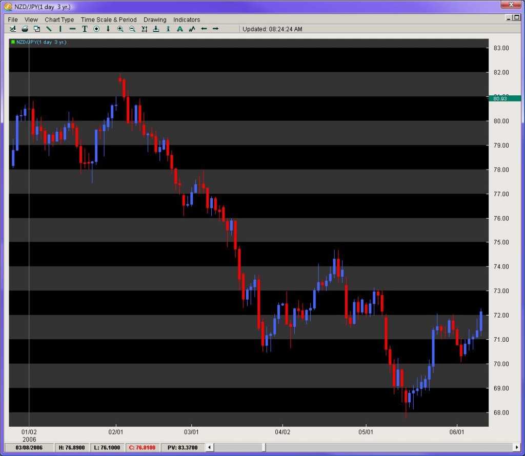
    A look at figure 5 ushers some insight into this. Looking at our NZD/JPY daily chart, while heading into this trade, for the year the pair had 59 red candles and 52 blue candles. That meant on any given day up till that point in 2006, there was about a 50% chance of making money if you entered and exited the position on the beginning and ending of each day. However, using the pips gained vs. lost method, the 50% became much more heavily weighted to the downside suggesting if you sold on any day and were correct, you would make more money. The counting candles gave us an initial % value to the likelihood of our trade being successful, but combined with another method, increased the value of our short position significantly.

    4-NZDJPY Counting Candles Chart

  4. Time Variables

    Pattern recognition and Elliot wave methods do a solid job of bringing in time variables into trading, but they leave many details into question. Two methods to working with time variables are listed below.

    1. Time lapse/display for patterns


      When looking at a pattern, albeit Head and Shoulders or IHS, wedges/triangles, or even consolidations, it is important to examine the time lapse/display involved and how it should play itself out.

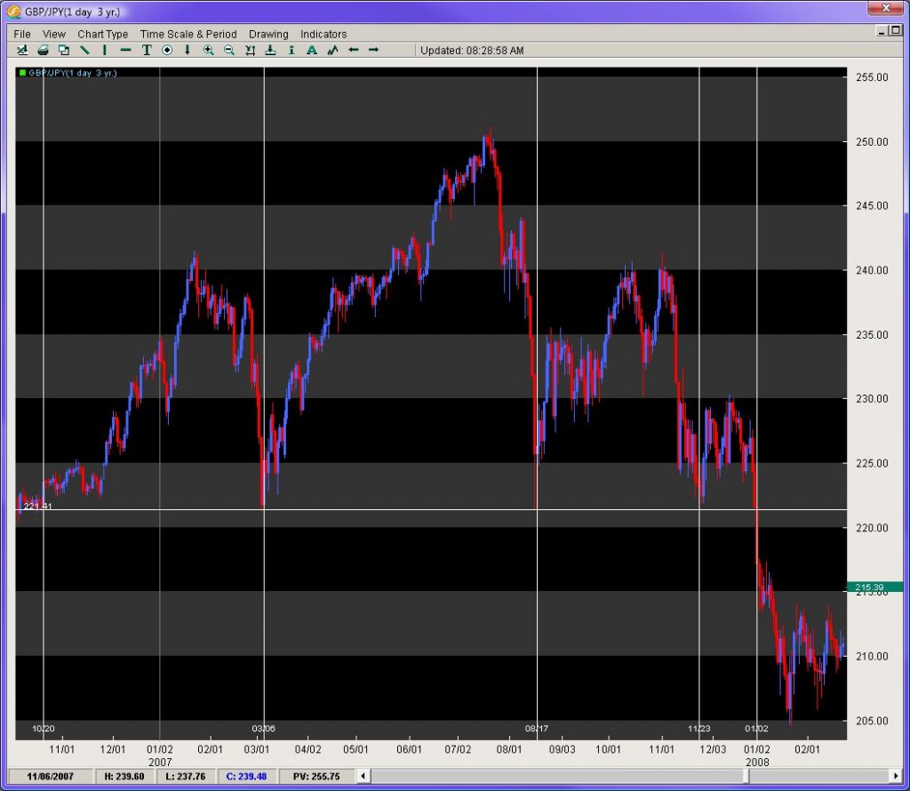
      The GBP/JPY from late 06′ to the beginning of 08′ was forming a large Head and Shoulders pattern. This was heavily watched by technicians as the break was suggestive to be massive with the distance between the head and neckline roughly 2900 pips. What was more interesting was the time displayed in the formation of the pattern.

      Looking at figure 6, notice the vertical lines which identify the touchdowns where the beginning and ending of each shoulder was made. The left shoulder from initial floor around 221.41, to its rise and fall back down to the same level took about 4 months and 3 weeks. What was tough for traders to figure out was when the right shoulder was forming, particularly if the second touchdown on 221.41 in late November was going to be the last stand at the OK Corral.

      Notice how the pair bounced just a bit, and then re-attacked the same price level to easily break it the 2nd time around. When the RS was forming, the space or time displayed between the 1st/2nd touchdown was only about 3 months, yet the initial LS took 4 months and 3 weeks suggesting the RS should take about the same amount of time to form.

      5-GBPJPY Time Lapse Chart

      If you look at when the pair finally activated the break of the neckline, the time lapse or display was 4 months, and 2.3 weeks. This is very common amongst patterns – to have a consistent time lapse or display within themselves. Some other notables are wedges and triangles which usually complete or exit their patterns between 2/3rds and 3/4ths of the move. Rarely ever do they go to completion.

    2. Length of consolidation


      One other important time variable is how long a consolidation is forming. The larger the consolidation, the greater the probability the ensuing breakout will be legitimate and powerful. Breakouts are such a mystery to so many traders. Measuring the length of the consolidation can provide us powerful insights into this trading conundrum.

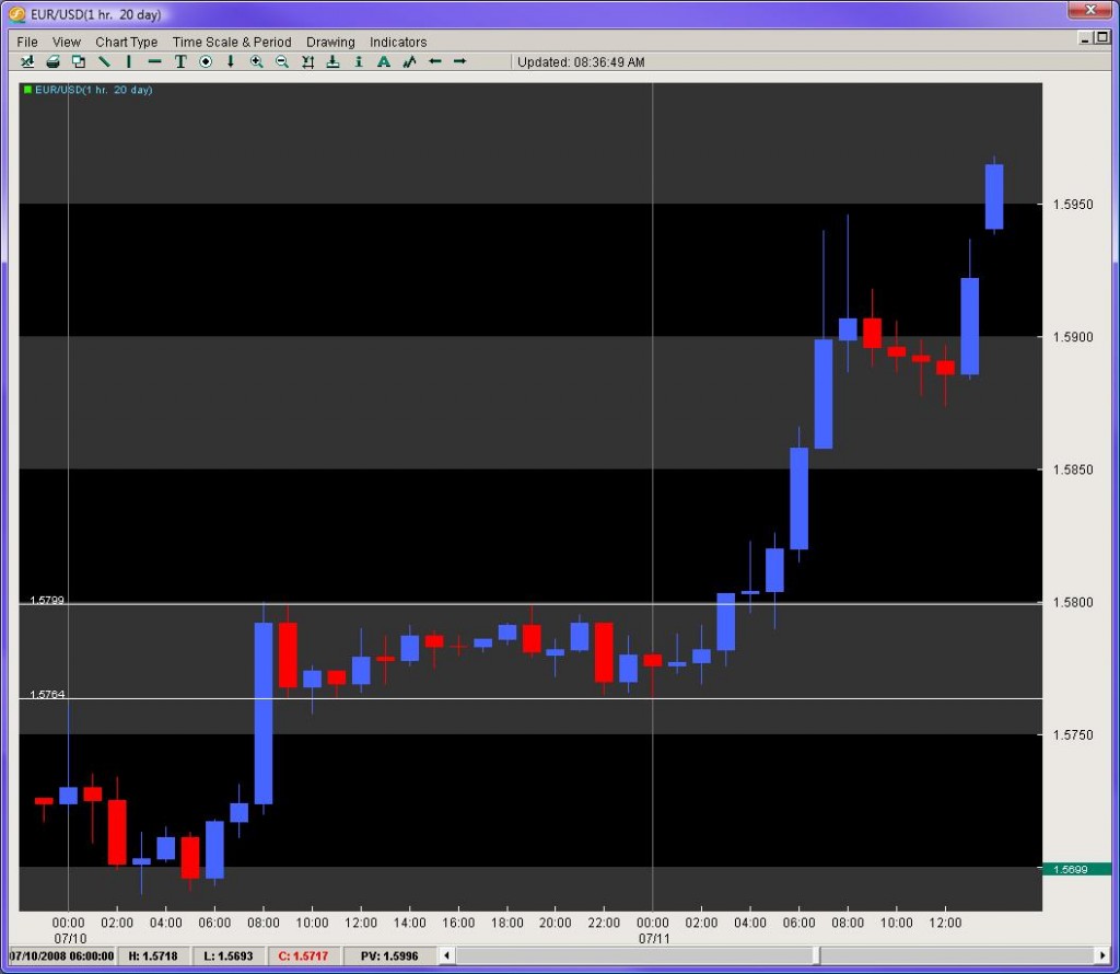
      Taking a look at the EUR/USD in figure 7, on July 10th, 2008 the pair had opened the European session at 1.5724, dipped to the round number at 1.5700 and then come early NY session was bought up in solid fashion up to the 1.5800 handle. This 100 pip move occurred over 3 hours, where it not surprisingly tapered back a bit at the London close. The pair then consolidated from 9am PST within a 36 pip range for the next 18 hours.

      6-EURUSD Consolidation Chart

      While it is not surprising there was no breakout during the Asian session, what is interesting is that from Noon – 4pm EST, where there is still plenty of liquidity, the pair could not find any new buyers/sellers. For the next 13 hours, the pair still trotted in place not just through the Asian order books, but also through the first four hours of the European session. That means through three sets of different order books/interest, the pair was hemmed in a 36 pip range and nobody could alter this for a total of 18 hours. When you see a consolidation for that long a period of time, expect a significant breakout to occur.

      The following breakout gave us a nice retest of the previous resistance level and then generated a 160 pip move in roughly 4 hours. This was the largest single day climb of the week and ironically followed the longest consolidation of that week.

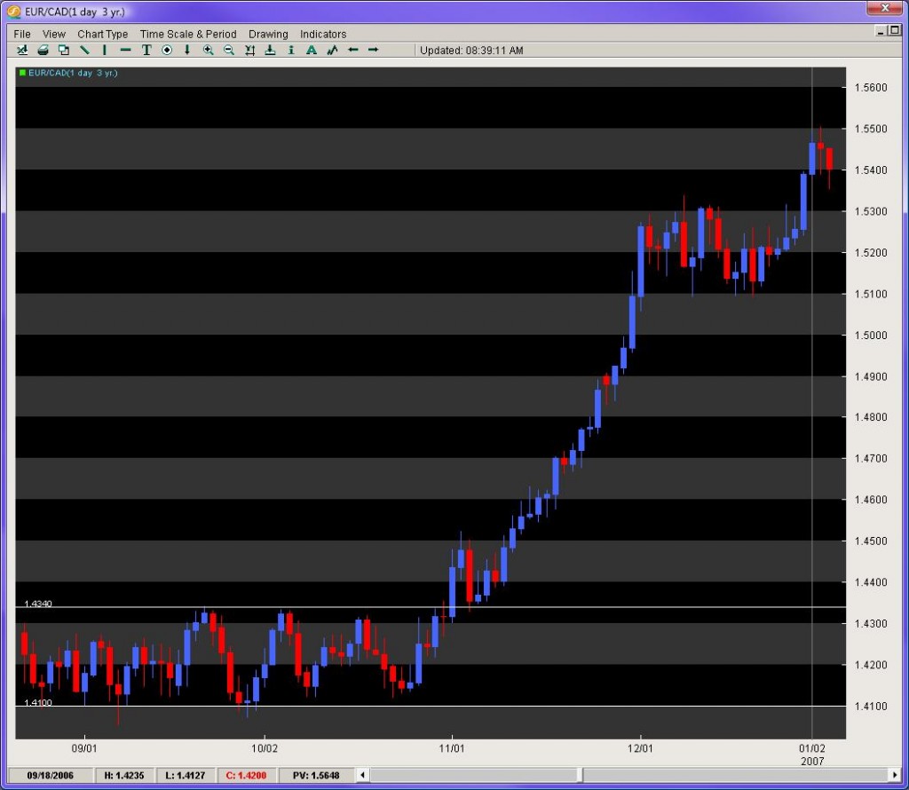
      One last example of this method can be delivered via the EUR/CAD (figure 8). In the fall of 2006, this pair had entered a really tight consolidation between the end of August to the beginning of November, encroached between 1.4060 – 1.4350 (290 pip range). This was the tightest 60 day plus range over the last 4 years. With the Bollinger Bands applying their python like constriction, a large breakout was calling out to most traders. When the pair finally did breakout, it gave us a handsome retest of the previous 70day resistance level, and then went on a Himalayan trek for a 1000 pip climb in only one month. Being able to identify long consolidations can point us towards legitimate and powerful breakouts.

      7-EURCAD Consolidation Chart

In Summary

Although there are many great methods for gleaning solid information out of price action (candlesticks, Elliot wave, pattern recognition), it is important we reach deeper into one of the most unexplored areas of technical analysis – that of understanding and interpreting price action. Being the closest relative to order flow and the mother of all technical indicators, a continual and intensive study of price action can only provide us with some of the most important gems of information to support our trading decisions.

The 4 staples or methods of understanding price action listed above are designed to give the traders a unique set of tools for approaching their charts and building a recipe for solid trades. Through the lens of these and other methods, ones trading can be vaulted to another level of insight, ability and success in trading the FX market.

For those of you wanting to learn more about Price Action Trading, make sure to check out our Advanced Price Action Course which teaches you rule-based systems for trading pure price action while also allowing you to join a community of traders.

I have been getting a lot of comments, questions and emails about money management trading strategies as of late, with the market becoming very volatile.

This article will show you the most important math you will need to learn to have a long term money management strategy in place, which will put the mathematics in your favor.

Risk of Ruin

The Risk of Ruin is a statistical model which tells you the chances you will lose all of your account based upon your win/loss % and how much risk you put per trade.  This is absolutely critical to know.

Case in point, lets say you are risking 10% of your capital per trade, and say have a 2:1 Reward to Risk Ratio or R:R, and have an accuracy rate of say 35%.  Did you know you have a 60.8% chance you will lose all of your money?

Is this something you would want to know ahead of time?  Lets hope so.

But first, we need to talk about its history and how we can adapt it to trading.

History of the Risk of Ruin Model

The mathematics of the Risk of Ruin tables were first applied to gambling.

In gambling, say blackjack, if you win a hand with the dealer busting, you get a 1-1 payout so if you put $100 on the hand, you will win $100.  It helps to know this ahead of time so you can see if your edge (% chance you will win over time) is enough to make money or lose money.

However, here is the tricky part. In trading, we rarely know exactly how much we are going to make per trade. 

We have a limit and a stop (hopefully) right off the bat so we are aware of our risk and potential profit.  But here is the harbinger and some questions to consider;

  1. How many times have you actually closed a winning trade before hitting your full profit target?
  2. Do you have a trading system where the profit target is exactly the same (fixed amount of pips) and therefore you know what your exact payout will be if you hit the target?
  3. Do you know exactly how accurate you are going to be with your trading based on the system you use?  In other words, have you modeled it so you can predict its overall accuracy within a few % each month?

If the answer to question 1 is around 25% or greater, then we will need to take this into serious consideration when calculating our risk of ruin.

If the answer to question 2 is no, then you will need to favor this in when calculating your risk of ruin.

If the answer to question 3 is no, then the answer is the same as above and its likely the mathematics are working completely against you.

Lets explore each question, then the math and then see what is a stable level of risk so you can keep your account growing.

Closing a Winning Trade Before Hitting Full Target

For those of you that are still learning how to trade consistently, be honest and ask a critical question:

How many times have you closed a winning trade before hitting the full target? 

If what I hear from people learning how to trade is representative, the answer is likely “many”.

If you were perfect in your discipline and never made an error in trading and risk management, then I would say go ahead and risk 10% of your capital every time, if you could always trade with 40% accuracy and had a reward to risk ratio of 2:1.

If you did this, you would have only a 14.3% chance of losing all your capital and likely have a winning account.

However, if you cut your profit targets for whatever reason – say 50% of the time and you cut them in half, then with the same level of accuracy, your risk of ruin goes up to about 60%.

Meaning you have a 60% chance of losing all your capital.

This changes the game completely, and puts the mathematics heavily against you having a long trading career.

In fact, every time you shorten your original profit target, you stack the numbers against you.

Now ask yourself what is more likely…that you a) are shortening your profit targets or b) increasing them?

If you are shortening them, this means you have to decrease the amount of risk per trade to keep the same mathematical edge.

A trading system where the profit target is fixed every time (say 50pips)

How many of you are using this as your only method to trade the markets?

My guess is the answer is likely less than 10%, as most of you are probably not using just one system to trade the market, but several.  Even if you were using one system, the chances are it does not have a fixed target.

The reason why having a fixed target gives you an edge (mathematically), is once you can stabilize the accuracy ratio, you can easily calculate your risk of ruin because your risk and reward are fixed from the outset.  This makes the math very tidy.

However, having a fixed target may not always be advisable.  Sometimes the market will go for a runner, so it helps to take advantage of those big moves when they come.

They increase the alpha (the rate of return on an instrument in excess of what would be predicted by an equilibrium model) on your returns, and help smooth out losing periods.  For a full article on alpha, click here.

To give you a different picture, if your system is on average 50% accurate, your R:R ratios are 2:1, you should be making $1000 on every win and $500 on every loss.

After 10 trades you will have banked $2,500.  However, if you have an alpha of 5%, you will make an extra $125 which over time adds up.

Regardless, if your system does not have a fixed profit target in pips, then you will want to reduce your risk % based upon keeping the mathematics more in your favor.

How Accurate Are You Going To Be?


Unless you have done massive forward and backtesting on your system, you will unlikely know the answer to this question.

On top of this, markets change and your accuracy levels will likely change with them.  A question to ask yourself is;

Do you even know your current accuracy ratio for all your trades? Per Pair? Per System? 

If you do not, then it is highly likely you will have the numbers stacked against you, and your chance of losing all your capital is more likely than you assume.

What this means is to be on the safe side, you will want to have a smaller amount of % equity at risk per trade.  This also becomes more critical in the early stages of your trading where you are likely to make more mistakes, have a lower equity ratio and take profit before hitting your full target.

Now that we have gone over this, lets take a look at a table below using the Risk of Ruin formula.
risk_of_ruin = ((1 – Edge)/(1 + Edge)) ^ Capital_Units

ROR % with 10% capital at risk Payoff Ratio 1:1 PR 2:1 PR 3:1 PR 4:1 PR 5:1
Win Ratio 25% 100% 100% 99% 30.30% 16.20%
WR 30% 100% 100% 27.70% 10.20% 6.00%
WR 35% 100% 60.80% 8.20% 3.60% 2.30%
WR 40% 100% 14.30% 2.50% 1.30% 0.80%
WR 45% 100% 3.30% 0.80% 0.40% 0.30%
WR 50% 99% 0.80% 0.20% 0.10% 0.10%
WR 55% 13.20% 0.20% 0.10% 0.10% 0.00%
WR 60% 1.70% 0.00% 0.00% 0.00% 0.00%
WR 65% 0% 0.00% 0.00% 0.00% 0.00%
WR 75% 0% 0.00% 0.00% 0.00% 0.00%
WR 80% 0% 0.00% 0.00% 0.00% 0.00%

Lets deconstruct this briefly.

Using 10% of capital at risk per trade, if you are 35% accurate and have an R:R ratio of 2:1, you have a 60.8% chance of losing all your capital.

However, if you can increase your edge (accuracy) by 5%, you only have a 14.3% chance of losing your entire account.  This shows the power of increasing accuracy ratio to gain a greater edge.

Now, lets take the same accuracy ratio of 35% but increase the R:R to 3:1 from 2:1.

What this does is turn your 60.8% risk of ruin to 8.2% so in actuality, this gives you a tremendous edge.

Here is the challenge; in trading, it is actually harder to increase the profit target from 2:1 to 3:1 than it is to increase your accuracy ratio of 5%.

An increase of 5% in accuracy is not a big shift.  10-20% is a big shift and much harder to achieve.  Over 100 trades, you only have to win 5 more or 1 in 20 more.

But to increase your profit target from say 100 pips to 150 becomes much harder, simply because you are trying to capture more of the days range.

This requires more precision in your entry, all to increase your bottom line edge by 6% from 14.30 risk of ruin to 8.2% risk of ruin.  And if you are not hitting your full targets to begin with, does making your profit target larger seem more reasonable?  Unlikely.

Now lets take the other side of this equation.

Lets say you are 35% accurate (not too demanding a figure) and have a 3:1 R:R. You will only have an 8.2% chance of losing all your capital. 

However, if you are like virtually everyone else learning how to trade and you take profits early, say 50% of the time, how does this change the mathematics?

It turns your Risk of Ruin from 8.2% to 34%.  So now you have a 3 in 10 chance of losing all your capital.  Not bad but definitely less stable.  This is assuming you are perfect in taking profits at 3:1 R:R 50% of the time and 50% at 2:1 R:R.

However, things happen and make it very difficult for us to be not only perfect in our discipline, but also perfect in our mathematics and R:R ratios.

It is simple if we are trading blackjack where we know the fixed profits we can make and lose. However, this is not blackjack – it is a fluid living breathing market and sometimes it would be advisable to exit early.

Does this increase your edge or reduce it?

More than likely, any adjustments to the system and R:R ratios decrease your edge, not increase them.

So what does this mean for you?

Risk less than 10% of your capital per trade.  Risk a lot less.  Put the edge so far in your favor that it is almost inconceivable you would lose all your capital.

If you have capital, you are in the game. If you don’t, you are out. Your capital is your ammo and without it, your dead in this game. 

Especially when learning how to trade consistently, keep your risk low – like 2%.

Even when you are really good, keep it low because you will have losing periods and when you do, you want to absorb them well and not take big chunks out of your account.  Risking 10% will do this but risking 2% will not.

Although it may not seem like you will make a lot of money risking 2% and having a 2:1 R:R, over time as your account grows, it will compound and you will take losses with ease of stride.

However, by risking 5-10%, you severely alter the mathematics and your edge.  And far worse, you increase the psychological pressure to recover the losses and that actually compounds the emotional/mental energies against you.

As long as your R:R ratio is 2:1 or better, when you lose you will lose a little and when you win you win much more.  Even if you take a series of losses, it will only take just as many wins to be back ahead.

Case in point; say you have a 10k account and have a 2:1 R:R and risk 2% per trade.  Here is how the math works out below after a series of 3 losers and 3 winners:

10k with 1 loss at 2% = $200 loss and acct is at $9,800
$9,800 with 2nd loss at 2% = $196 loss and acct is at $9,604
$9,604 with 3rd loss at 2% = $192.08 and acct is at $9,411.92

So you lost 3 trades in a row and now win 3 trades, here is the tally:

$9,411.92 with 1st win at 4% gain (2:1 R:R ratio) = $376.47 and acct is at $9,788.39
$9,788.39 with 2nd win at 4% gain = $391.53 and acct is at $10,179.92
*thus after 2 trades you are back into profit.
$10,179.92 with 3rd win at 4% gain = $407.19 and acct is at $10,587.11

So even after two wins, you erased 3 losses and with the 3rd win you are way ahead.

Thus, hopefully you can see the importance of having a good R:R while having low risk.

It is psychologically hard to deal with big losses, but little losses have a much smaller impact on your emotions and trading, so keeping an edge both mathematically and psychologically is crucial to winning at this game.

For another great article on money management trading strategies, make sure to check out Your Equity Threshold and the Psychology of Money

I was recently reading some article on a very popular finance site whereby the person was talking about the stock market and today’s 376pt crash. 

They were saying how it is not good for buy-and-hold investors, but it is good if you are using a dollar-cost-averaging strategy.

The funny thing is this term is totally misunderstood in context, history and is really used by rookies.  You will never see a hedge-fund manager using this term, nor some ultra-high level investor. 

When have you ever heard Warren Buffet, George Soros, Mark Faber or any other high roller using this term? 

Never.

You know why?  Cause its a joke.

The History of Dollar Cost Averaging

The term was first used in Chinese chop shops whereby they tried to goat people on to trading more when the prices were falling heavily.  They would use the term ‘dollar-cost average’ trying to get you to buy again even though the price got hammered. 

Why would they do that? 

Because chop shops like theirs got paid in two ways;

1) by customers trading

2) by taking the other side of the trade

When the market crashes like they did today, people are totally afraid to buy and rightfully so.  However, to keep the market busy, supported artificially with the dumb money, and make more money off of trading, people use the term ‘dollar-cost-average‘ like its some brilliant investment idea. Think of how well a dollar cost averaging strategy worked on Bear Stearns, Lehman Bros. or a host of other companies that failed in 2008 or the dot.com bust.

It is the most rookie, insane and ridiculous idea that after something fell huge, we should buy it again. Why?  Because it is cheaper?  After a huge day of selling, unless it is sitting at some major support, who will want to buy it?

Dollar Cost Averaging is usually used by salespeople who usually work for a company like Prudential or Vanguard or whomever the company is, whereby, the person who is pushing it is usually selling a prescribed set of products which of course, they benefit from you investing in.  

These are not traders in the market who live or die by them.  They get a salary and a commission for how many of these products they sell you. Yeah, a dollar-cost-averaging strategy worked for Bank of America (BAC) when it dropped from the mid $40’s to about $4.  Oh yeah, it worked again with Citigroup (C) which fell from the mid $20’s to about $3.  Great strategy!

Bottom line is whenever you hear the term used by anyone, you know immediately they are just using it without any real understanding of the word, its history or significance.  You know immediately they are a rookie and really do not have any clue as to what’s going on in the market.

Maybe this has little use for Forex traders, but you likely are going to run into this word or some investment ‘professional’ who uses this so understanding what it really means and where it comes from will help you in the future steer clear of that person.

In fact, any student of price action witnessing a market where people are saying, ‘dollar-cost-averaging’ would be selling the market and making money why others are buying it and getting killed the next day.

If you liked this forex dollar cost averaging article, make sure to comment below. For another great article on money and trading, make sure to check out Money Management and the Risk of Ruin

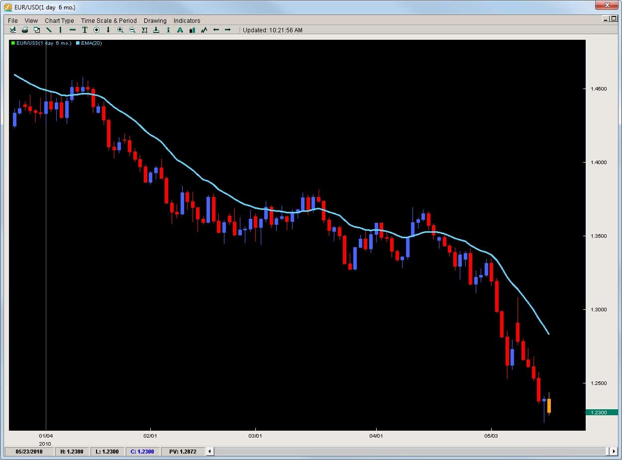
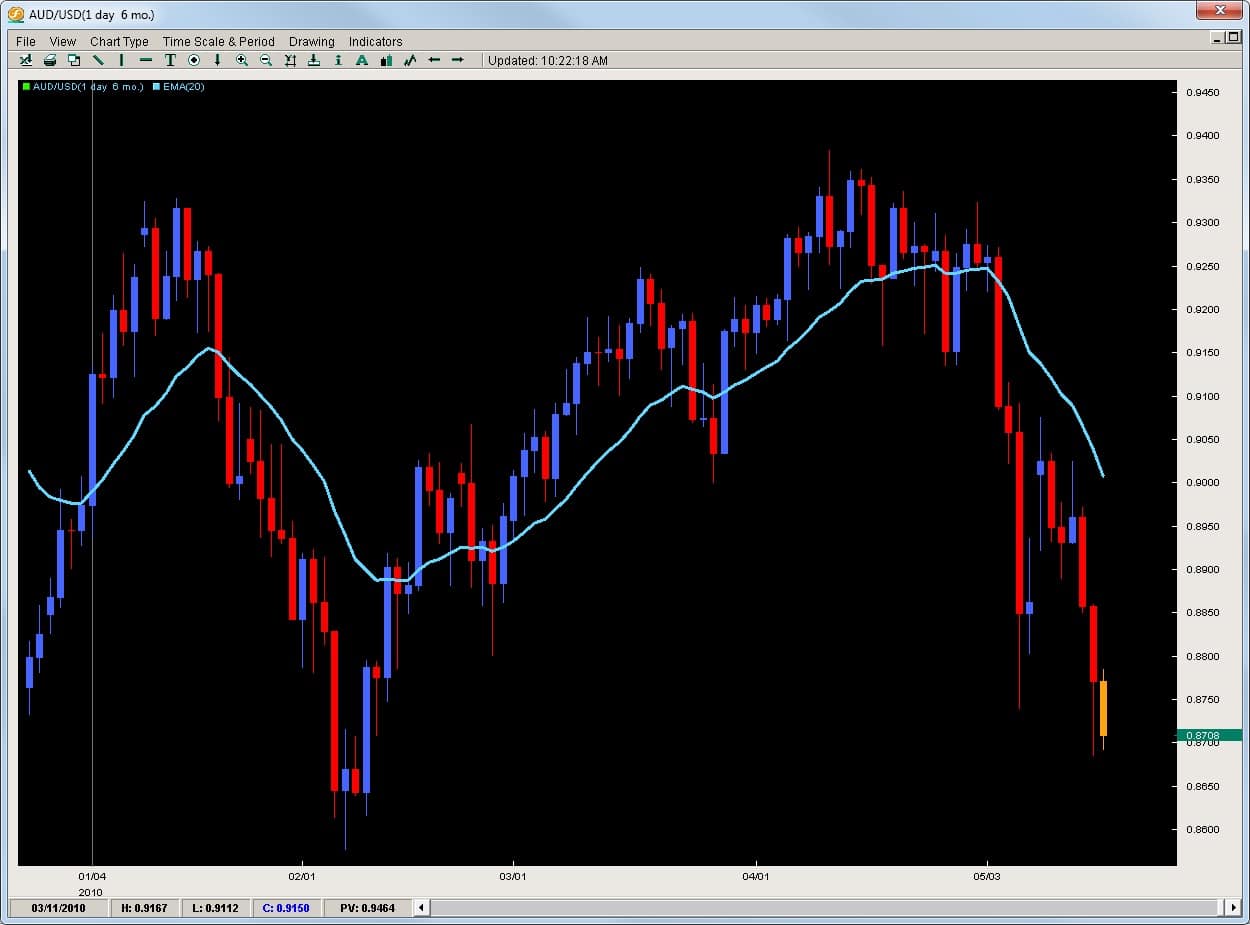
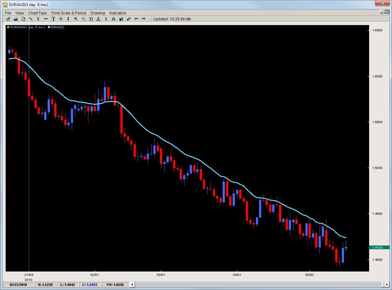
Trading Forex is in many aspects the same as trading any other instruments.  However, there is one crucial way in which trading Forex is completely different than trading other markets. When you are trading any other instrument, you are trading a single instrument based upon its individual strength or weakness.  However, in Forex you are trading two instruments or currencies which have their own individual strengths and weaknesses.  Thus, the equation is a little more complex but actually makes it easier to find trading opportunities. Why? Because when we are trading currencies, we simply are looking for the greatest polarity between the strongest and weakest currencies.  By trading a strong currency against a weak one, we greatly increase the chances the pair will move in our direction as long as we are buying the strong currency and selling the weak one. If you can analyze the price action and isolate the strong vs. weak performing currencies, then you can find some great price action trading setups. How to Find Strong vs. Weak Currencies? The method is actually quite simple.  Since the USD is the most commonly traded currency (either as major or cross) we can see how individual currencies are performing against the greenback. Example #1 EUR vs. AUD If we look at the two charts below, we are seeing the daily charts of the Euro vs. the USD and the AUD vs. the USD.  We can see how the EURUSD has been tumbling opening the year at 1.4330 and is currently sitting at 1.2300 shedding over 2000pips. Contrast this with the AUDUSD which opened the year just under .9000 and has ranged currently only being down 300pips. 300 vs. 2000.  Who is going to win this battle?  The AUD will over the EUR. Thus, how does this lead to a trading opportunity for us?  By buying the strong pair vs. the weak pair, or selling EURAUD. What does that chart look like?  See below. The EURAUD opened the year at 1.6000 and is currently sitting at 1.4130, shaving off 1870pips. Thus, trading does not always have to be complicated requiring lots of indicators to find good trades.  By understanding how to read price action, determine impulsive vs. corrective moves and spot good formations, you can find great trading opportunities.

If you are serious about learning how to trade this market successfully, and find simple high-probability trades using pivots and price action only, you can check out the Trading Masterclass or the Advanced Ichimoku course which will teach you rule-based proprietary price action strategies and systems to trade these profitable setups.

One of the most challenging aspects for traders is finding and entry point into the market, particularly when looking for reversals or rejections. However this is not as complicated as it seems for there is a tool which is exceptional at helping traders find intraday entries for reversals – Pivot Points.

What are Pivot Points?

Originally created by floor traders, Pivot Points were simply used to mark key support and resistance levels based upon the previous High, Low and Close for the last day of price action. These three metrics were combined, then divided by 3 and this formed the Daily Pivot. The DP (daily pivot) was used to determine if the overall pressure for the day would likely be more down or up. If price opened above the DP, buying was generally preferred and vice versa if it opened below.

From the DP several other pivots were formed which were Resistance or R pivots and Support or S pivots. Finally, after becoming so popular they created Mid-Pivots which were simply the halfway point between any two pivots. Below are the calculations for the pivot point trading technique which we use:

DP = (H + L + C) /3

s1 = DP – (H – DP);//S1
s2 = DP – (H – L); //S2
s3 = L – (H – L); //S3

r1 = DP + (DP – L); //R1
r2 = DP + (H – L); //R2
r3 = H + (H – L); //R3

S1 = Support 1 pivot
S2 = Support 2
S3 = Support 3
R1 = Resistance 1 pivot
R2 = Resistance 2
R3 = Resistance 3

Here is what they look like on a chart below

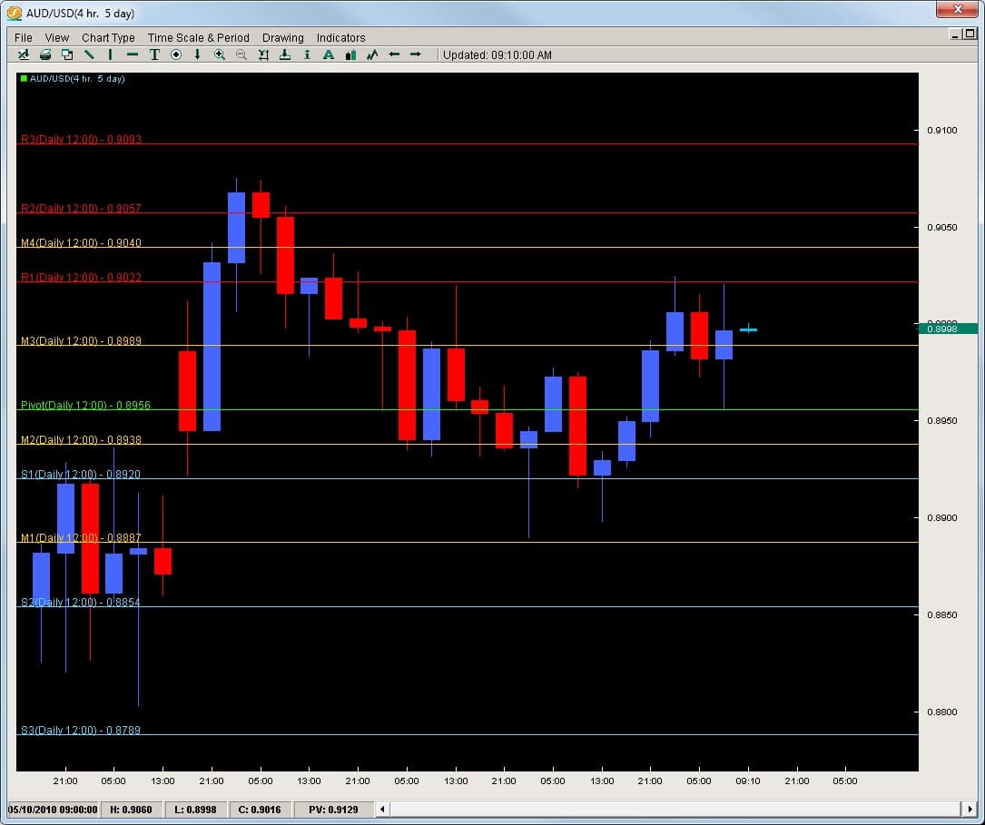
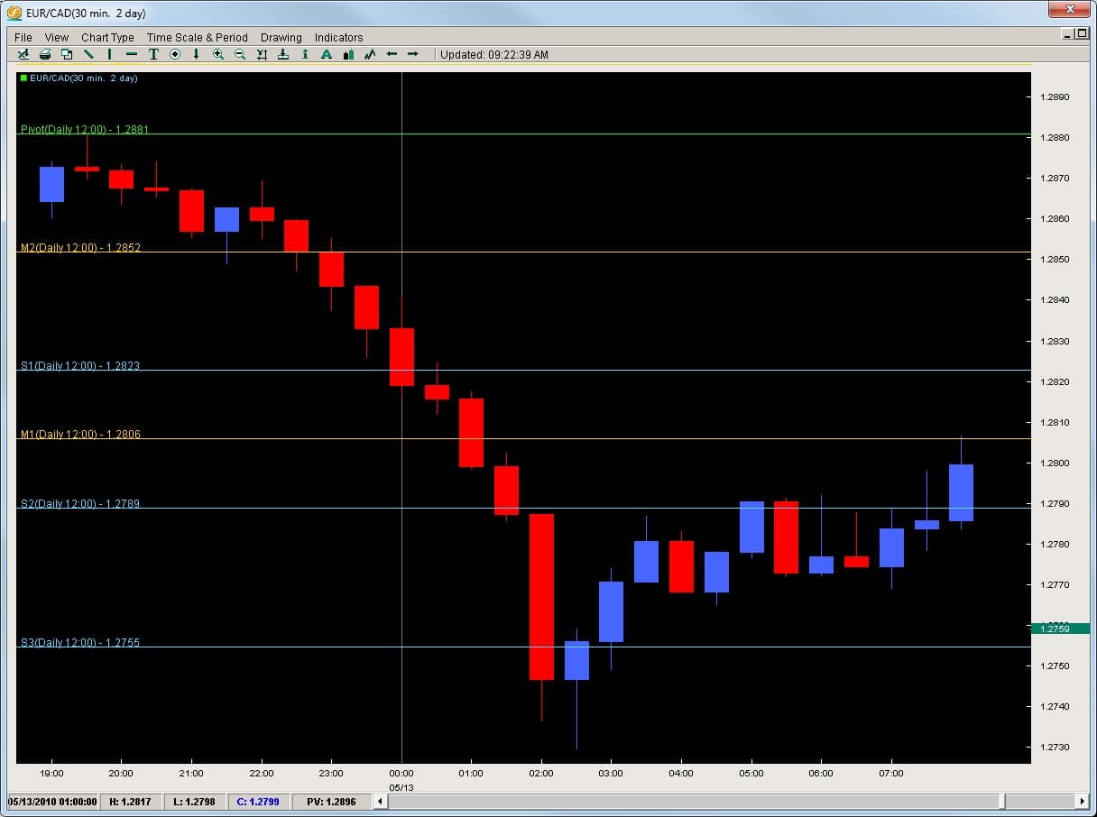
The blue colored lines are the support pivots and the red colored ones are resistance pivots while the yellow are the mid-pivots. As the name suggests, support pivots are the intraday support levels for that day while the resistance pivots offer key resistance price levels to watch for that day. We set our pivots to the London open since the London traders are basing their charts off their open and with the majority of traders coming out of London, we feel these will be the most effective and consistently watched by the institutional market.

The Statistics

The bottom line is price action has a greater chance to respond to a pivot level for that day than any other indicator out there. Our quantitative research done over the last 10 years suggests every 1hr candle from the London open to NY close has a 70+% chance of touching a pivot. Meaning, if you are going to be in a trade for more than 1hr, chances are the price will touch, react or respond to a pivot.

Since the institutional traders move the market, they are likely placing orders here on an intraday basis more than anything else.

How to use them for Reversals and Rejections?

To use forex pivot points for reversal entry or a rejection/reversal play, the first thing we need to do is find an existing trend or momentum play. If you read our article on Impulsive vs. Corrective moves in reading price action, you will be able to easily spot these.

EURCAD

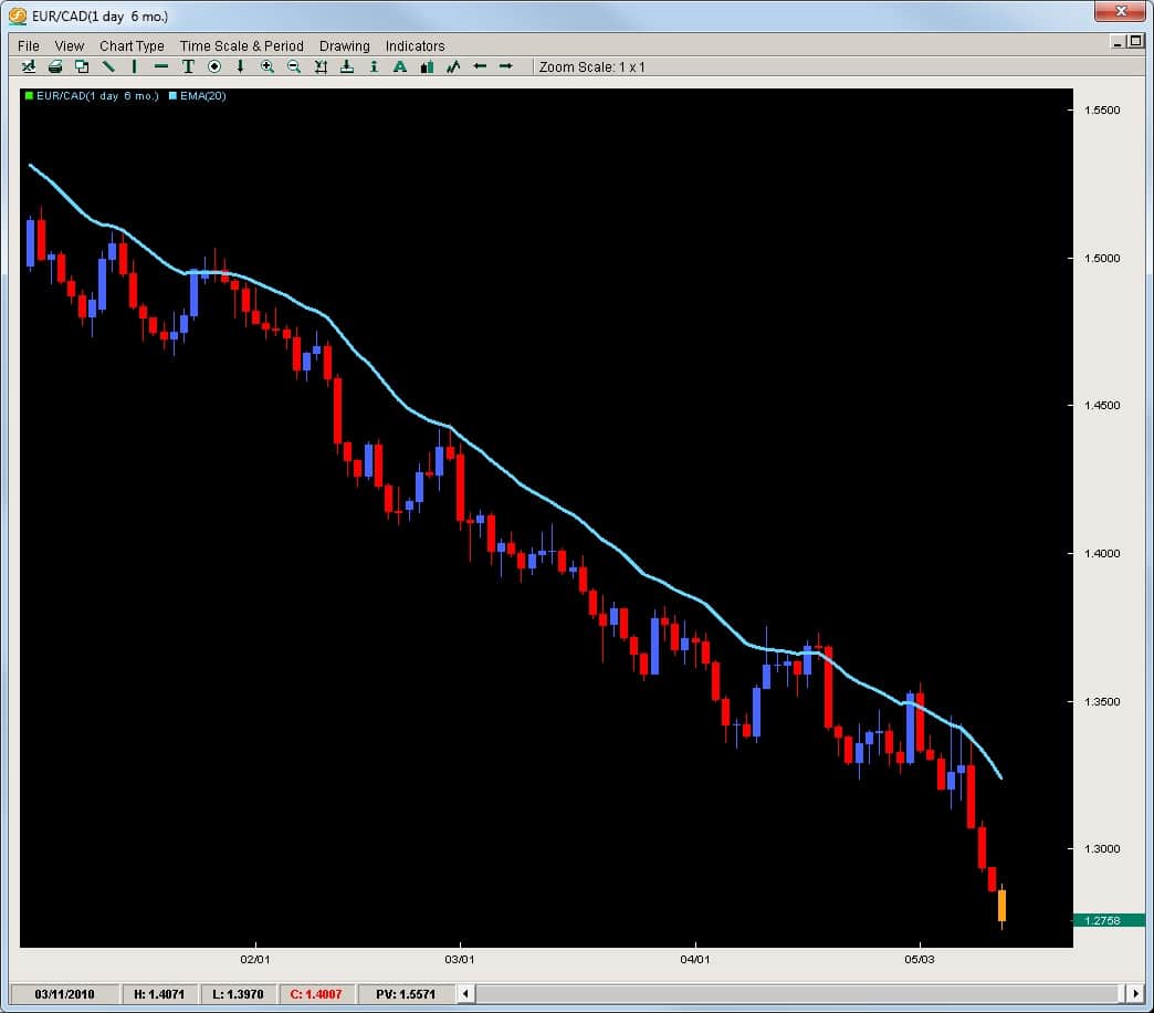
We will start with the EURCAD which on the daily chart below we can see is clearly in a downtrend.

Without needing a heavy IQ to see this is in a downtrend, we will look to take shorts on this pair. As you can see, the pair often pulls back giving us some intraday moves to get back into the trend at a higher price to sell it lower.

The Intraday charts and the Pivot Points

The best way to get into these trends is to find a pullback on an intraday chart, like the 30m, 1hr or 4hr charts. We will use the 30m chart or this example although the pivots should not change as long as you are on any intraday time frame. They should be the same for the entire 24hrs from London open to London open.

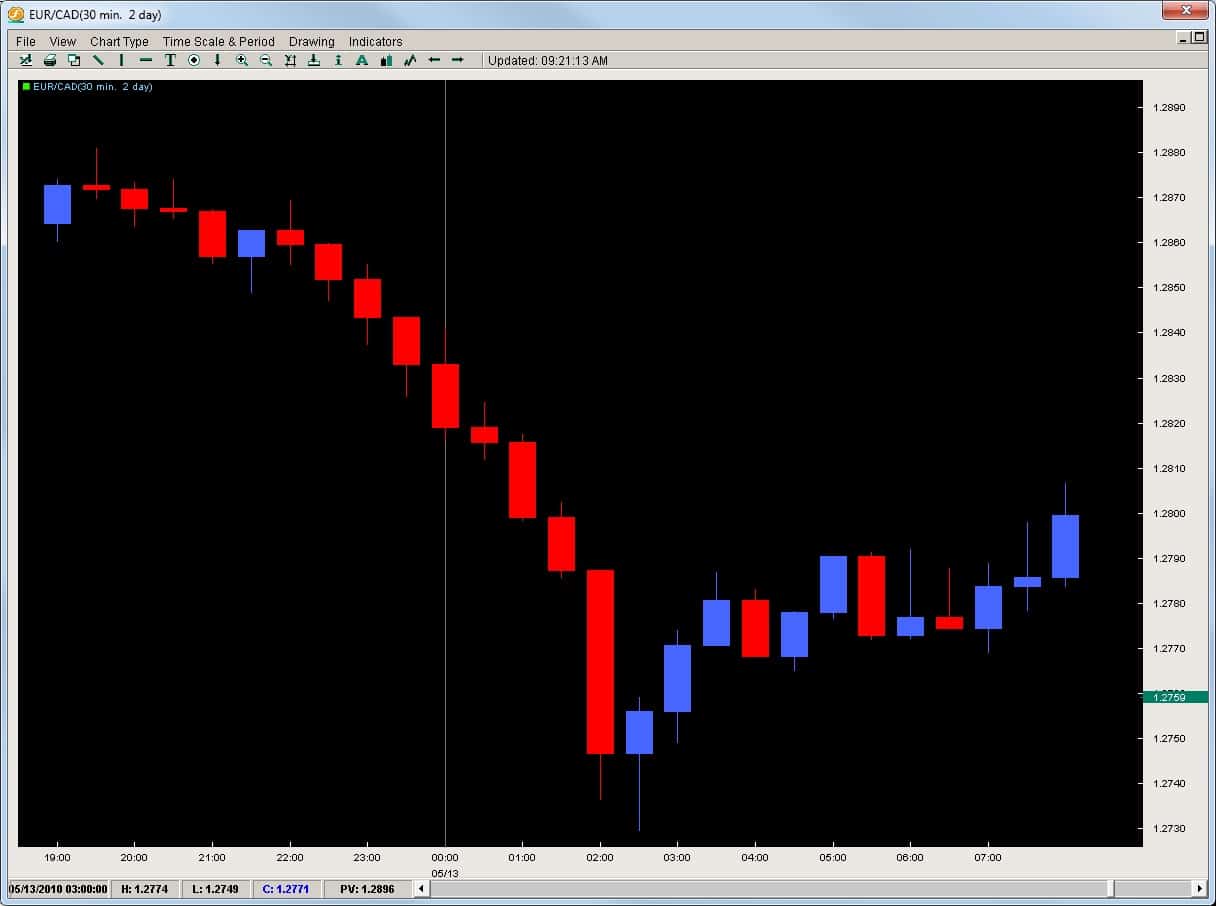
Looking at the EURCAD on the 30m chart below, the pair sold off aggressively and then formed a bounce. It gave a nice pullback which was not impulsive thus signaling the bulls had not come in with a domineering force. See chart below.

Now, noticing the move back up is not impulsive, we should be looking for a sell entry point to get into the market. The chart above was without pivots, but the chart below has the pivots on giving us a clear price level to get into the market.

Now we can see how after price reversed a little, it got stuck by the S2 pivot (2nd blue line to the bottom) which rejected price 5x before it broke. Price then advanced to where? The M1 Pivot.

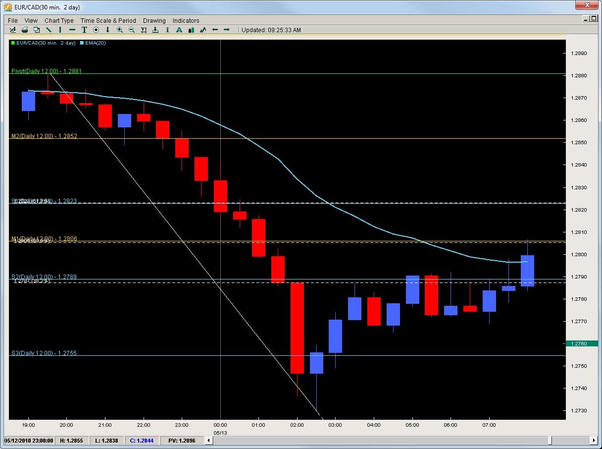
Now pivots by themselves are potent and we can certainly use them for our entries to reject or get into a reversal. However, when we combine them with a 20ema or Fibonacci retracement, they become that much more powerful. Here is the chart below with both of them added onto the chart.

As you can see, they all come together right around the 1.2800 level which gives us a perfect location to get into the market. We could make the argument the Fibonacci levels were more important to the price action on the day, but before the sell-off ended, but until a trend is over, Fibonacci levels cannot be drawn. Hence, we can see how powerful a pivot trading strategy can be and how much price action responds to them since they were affective price before the trend ended and the Fibonacci levels were even drawn.

If you are serious about learning how to trade this market successfully and find simple high-probability trades using pivots and price action, you can check out our Trading Masterclass.