Reversals are one of the most common elements in markets traders are wanting to either know of to avoid or confirm their trade. The clues to whether a reversal is in play are hidden in the price action and easily found. These key elements are found in rejections which show up in the price action formation of long wicks occurring at key price levels.

Starting with the Rejection Wicks

The key point in a candle which confirms a rejection at a key price level is a wick and the larger the wick, the better. With that statement comes the question of ‘how much or how large the wick should be to be considered a strong wick.’

The answer to this question would be a minimum of 50%.

Why?

Because this is the minimum amount to satisfy the condition that one side of the market does not have more control than the other. Think about it like this. If price is in an uptrend and starts to approach a key price level, once it touches this key price level now creates a wick which reverses 50% of the price advance of say a 4hr or daily candle, this 50% rejection means the bears were able to stop the upward force/momentum of the current uptrend and 4hr/daily candle, but were able to push prices back 50% of that candle and move. This would translate into the bears having at least as much strength on the board in terms of order flow than the bulls because they were able to take half of the gains and eliminate them.

In some sense, it would actually translate into more strength because they also had to stop the momentum which was already upward. Thus, to stop momentum on any moving object takes energy and force. This then translates into there being the minimum requirements for a reversal for it demonstrates the bears have the minimum energy and force to reverse the trend.

Obviously the larger the wick the better because if the bulls who have the current handle on the market run into some sell orders and are not only unable to keep advancing price, but get pushed back quite a strong amount, this means the bears have taken short term control of the market and this can be seen in the price action.

Remember, a wick is a rejection of price. If price was accepted at a certain level, it would stay there or advance past it. However, if the order flow in the market does not support price being at that level, it will reject it and send it back because the institutions would be finding that price over-valued and time to sell. This is what it means when we say a wick is a rejection of price action.

Using them at Key Price Levels

This is the trickier part of your assignment – finding the key price levels. However with a few simple tools, its not that hard to confirm. We will suggest three tools to help you confirm the reversal is happening at a key price level.

Before we do, its important to note this works better on time frames such as the 4hr and daily charts. Anything below this does not contain enough time to signify an important impact on the market. Thus, when we are talking about these, we are referring to the 4hr or daily charts.

1) Pivot Points – key price levels that are respected and watched by all institutional traders, when strong price rejections occur at key pivot levels, they often have more impact. Why? Because institutions place intraday orders around pivots more than anything else. They enter the market at these locations more than they do any other price levels so when we see price reject strongly off a pivot point – it usually has more impact.

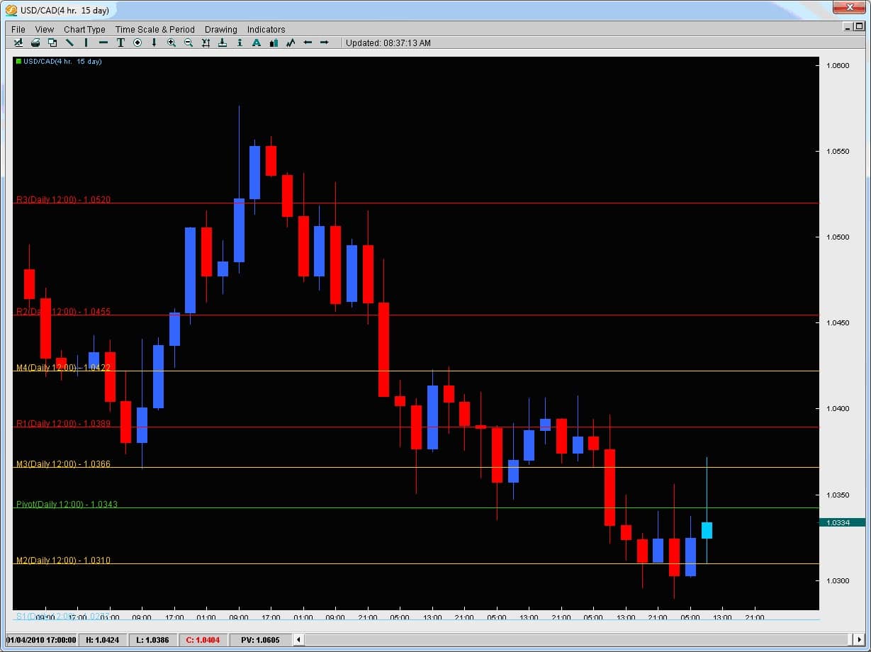
Taking a look at Exhibit A below, we can see how the price action had a pretty strong intraday rejection off of the M3 pivot level at 1.0366. This was the highest price surge for any candle on this trading day and it rejected back down below the daily pivot to stop where? At the M2 Pivot showing you the market is respecting these two pivot levels.

The fact that this pivot also happened to line up with a lot of the support for the candles to the left along with the swing low all the way to the left of the chart at the same price level shows this to be a strong intraday price rejection point. One can also notice the candle is over 50% of the entire candle’s size suggesting its strength. One other key point in the price action is that there is two way interest here as the support of this candle lies with a decent rejection to the downside which is also at a pivot.

Thus, when rejections occur at intraday pivot levels, they have more potency so look for them to line up at a pivot whenever possible.

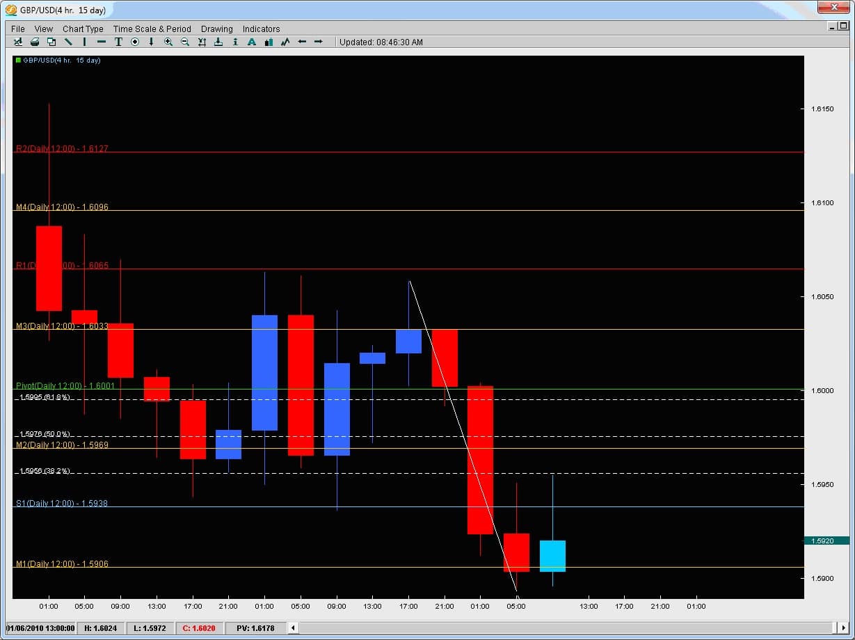
2) Fibonacci Levels – another tool to look for and help confirm the rejection is for them to occur at key Fibonacci levels. Which ones would we consider key? The 38.2 / 50 / 61.8% fib levels. Now which fib levels are the next question because they can be drawn from anywhere. Anytime you have a strong trend in place, there will be market swings and corrections. Fibs were meant to be used during trends to find retracement levels where pairs would find support/resistance in their current trend to continue the trend. Thus, when we pull fibs, we always pull them in the direction of the trend looking at the major swings. Below is an example.

In this chart above we have the GBPUSD 4hr chart where price was consolidating after a downmove and then started another leg down. Price hit a floor around 1.5900 and then started to attempt a reversal. However it created two rejection wicks right at the same level which was not only support for the previous consolidation move but also a 38.2% fib level thus making it a good rejection area according to Fibonacci price levels.

By combing previous support/resistance levels along with a key Fibonacci level, when a rejection wick occurs at these levels, it gives it further confirmation of it being a legitimate rejection.

3) Key Support/Resistance Levels – previous swing highs and lows are great places to look for rejections to take place because the market had already rejected price there once before. If the market rejected price at a key level once before, it certainly should be considered it could happen again.

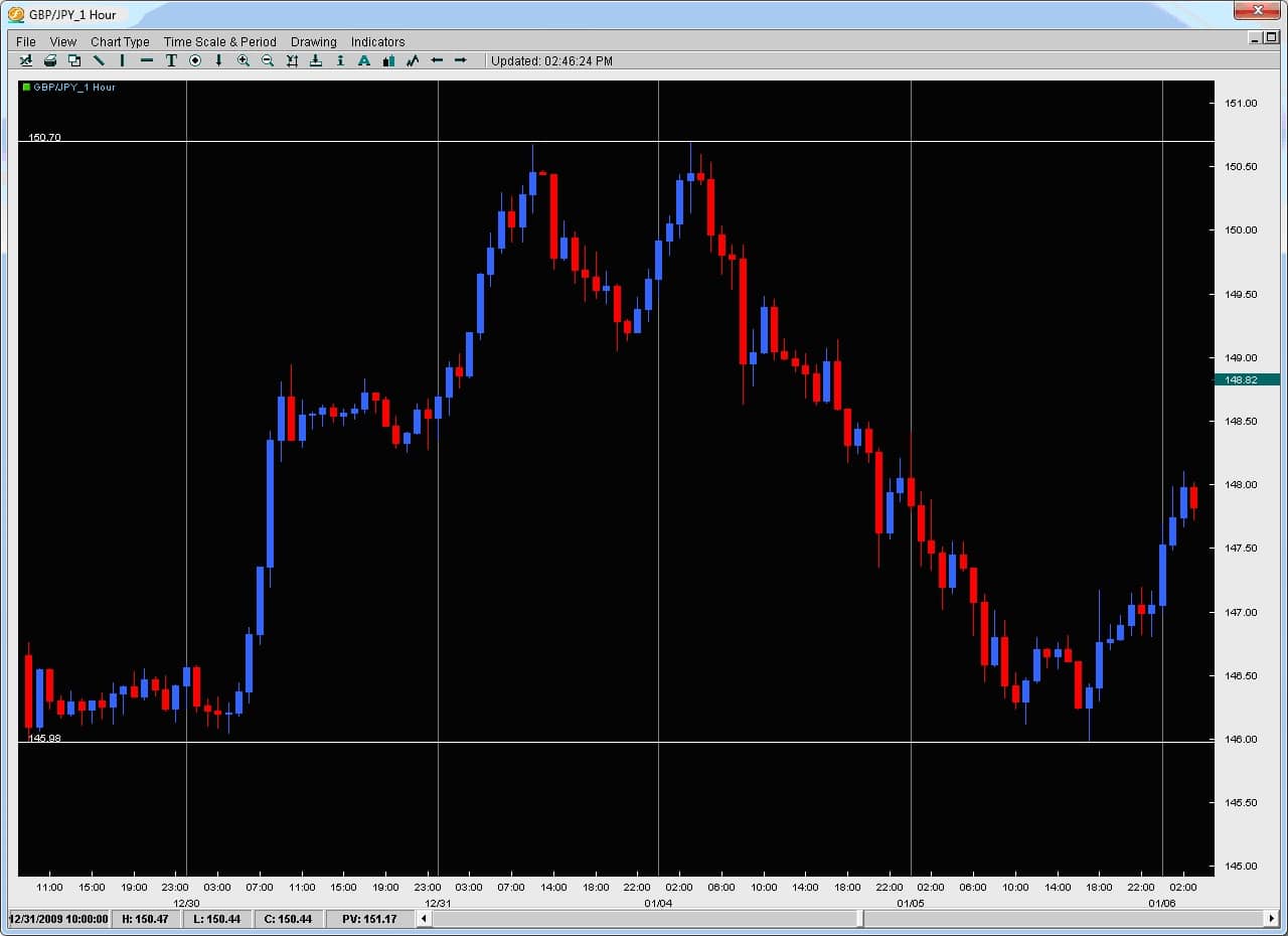
Looking at the chart below, we actually have two examples in the same chart. Starting at the bottom the price action was stable and holding at a particular level building a base around the 146.00 handle. After several touches on this price level, it launched up towards 150.68 where it rejected back down to 149.00 or 268 pips. It then very quickly re-advanced on this same price and swing high only to create a very strong rejection at this level by producing a very large wick. The price action from here then went all the way down to where? The last major base of support down at 146.00. Thus, by spotting these previous key swing highs and lows, and looking for larger rejections off of them, we can find great trading opportunities or examine the price action to confirm our reversal trade.

To learn more about how to spot these simple high-probability setups and how to trade reversals with rejections, you can check out the Trading Masterclass or the Advanced Ichimoku course which will teach you rule-based proprietary systems to trade these profitable setups.

In one of our previous forex tip articles, we wrote about the inside bar and how it is an important price action formation that can offer great trading opportunities.  However it is important to note not all inside bars are created equal. To Review: An inside bar is a bar where the entire price action (including the wicks) are totally inside the previous bar.  Now on lower time frames these are more common and not too important (say on anything less than 1hr chart) but on the 1hr time compressions and above, they have a lot more significance.  In total, Inside bars form approximately 10% of the time (or are approximately 10% of all candles) and are a unique price action formation. When they occur at critical support / resistance levels (prior highs/lows, Fibonacci retracement levels, outer pivots, larger Kumo formations, etc) they have more impact and can often lead to strong price moves. There are several key reasons why an inside bar would form which a few are listed below:

  • Price is consolidating after a large up/down move in price and is about to start another leg in the same direction
  • Price is coming up against a critical support/resistance level which shows some hesitation in the market as to whether it will continue or not
  • Price Action and liquidity is dropping before a critical news announcement so with nobody taking new positions, price will not have enough order flow to move consistently in one direction
  • Profits are being taken

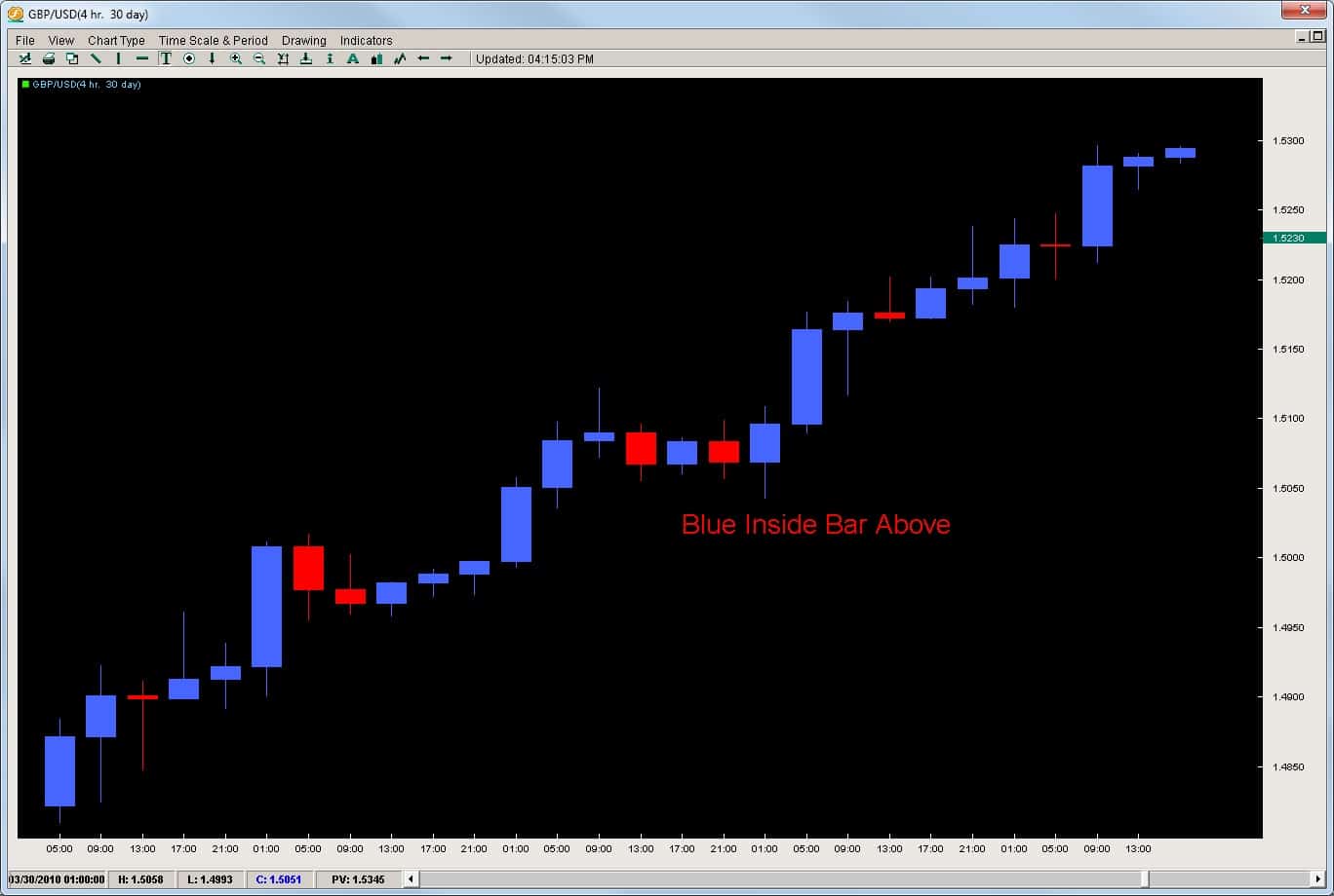
Since news events naturally drain liquidity before the event, they become less important in forming inside bars.  The key things to note is that an inside bar generally forms from a) the consolidation of a large move before starting another leg or b) price is coming up against a critical support/resistance level which shows hesitation in the market. This pause in the price action gives us a great chance to get into trending moves as we can use the inside bar to get into the trend before the next leg starts. However,  you still cannot treat them as equal.  As traders we have to note whether the inside bars are occurring with trend or counter-trend?  If they are occurring counter-trend, then they become much more difficult to trade. Case in point, take a look at the chart below on the GBPUSD 4hr chart.  The trend is clearly to the upside with virtually no red bars and a 300pip climb.  Then we have a red bar in the middle of the chart followed by a blue

inside bar.  This inside blue bar was followed by another 250pip leg up. Even though the pause happened at the 1.5100 barrier and after a decent wick rejection to the upside, the bottom line is the inside bar formed after a down candle.  The translation of this is price hit a resistance, traders took some profits, started to evaluate the move and while doing so, price sold off a little.  An inside bar formed after price sold off a little so this inside bar does not tell us much other than price volatility is contracting.  These are the least informative of the inside bar setups. Thus, you cannot trade every inside bar the same as they signify many different price action situations. With that being said, there are ways to trade them efficiently.  We have actually analyzed inside bars on every pair from the 1hr to weekly time frames.  From this data, we were able to extract the % chance it would; -break with trend -break counter-trend -what the average pip break with trend was -what the average pip break counter-trend was -and several other metrics If you want to get access to this and other proprietary quantitative data on the inside bar strategy or several other price action setups we have tested, then check out our Price Action and Pivot Point course where you get access to this data along with permanent access to our live forum and a follow up private one-on-one session. To learn more about this course, click on the link Price Action and Pivot Point Course or email us directly via the Contact Page

The Breakout-Retest Trade

Here is a simple price action strategy anyone can trade on almost any time frame.

This forex breakout strategy is based upon a simple price action formation called the Breakout-Retest formation.

The key element involves price breaking a major high or low with a very impulsive move. The impulsive move suggests commitment from the institutions pushing price and the fact its occurring at a significant high/low adds weight to the move and price action around it.

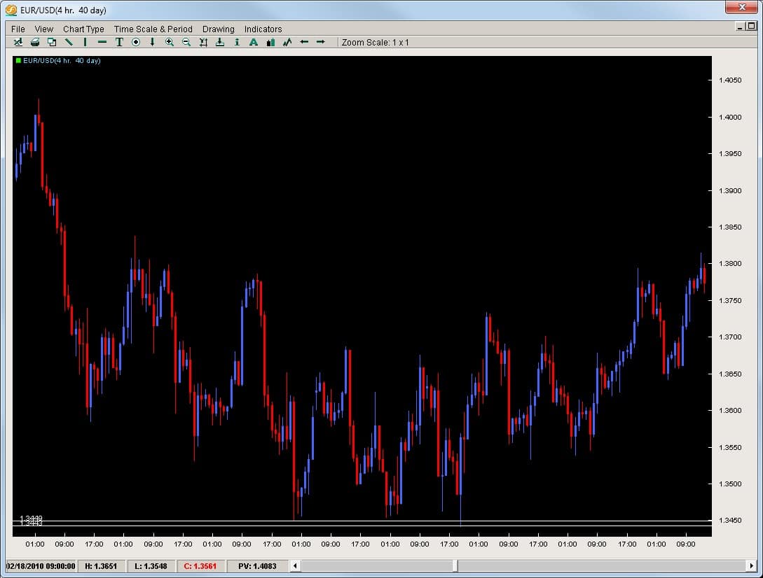
Taking a look at the chart below on the EURUSD 4hr time compression, we can see how the pair dropped from 1.4050 all the way down to 1.3449 / 1.3443 forming a triple bottom at these prices. The pair then bounced in a corrective manner up towards the 1.3800 level.

That triple bottom held from the 1st touch at 2/18 till 3/02 thus demonstrating this bottom was a strong support while being the yearly low up till this point.

eu-4h-breakout-retest-pic

So we have the 1st part of this trading formation in play;

1)need a significant (and tested) high or low – in this case low in place

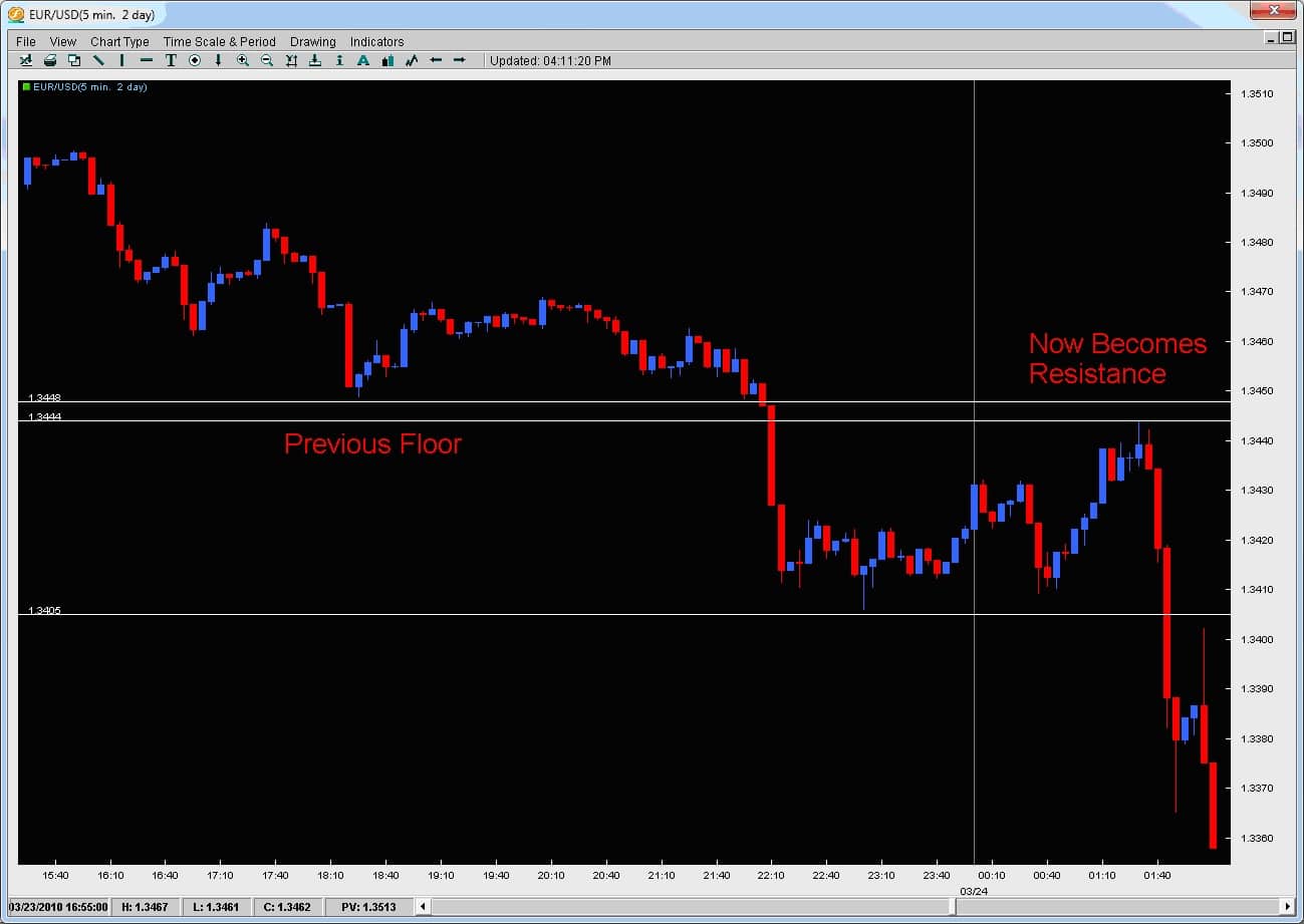
Now, lets take a look at what price did on the 5min chart yesterday when it attacked this low area (1.3443 – 1.3449) level again. It broke through it by approximately 40pips and then returned back to the exact same level it used to consider support – now to treat it as resistance.

This price action formation is what is known as a Breakout-Retest or Breakout-Pullback.

Why is this such an important price action formation?

Because the market has via large amounts of money considered a particular price (1.3443-9) and important level. It was confirmed by bouncing 350pips after 3 tests of this level so the market participants had to have put a lot of money in the market to make this happen.

The fact the market (with a lot of money) considered something once support means we want to watch it to see what happens when it breaks. If it becomes resistance and the market confirms this with price action, then it becomes even more important because a lot of money was behind it acting as support, and now a lot of money is relating to it as resistance.

When this happens, it becomes a very important breakout-retest level and an entry location for us to trade the breakout. You can see exactly how the market did this in the chart below.

eu-5min-breakout-retest-pic1

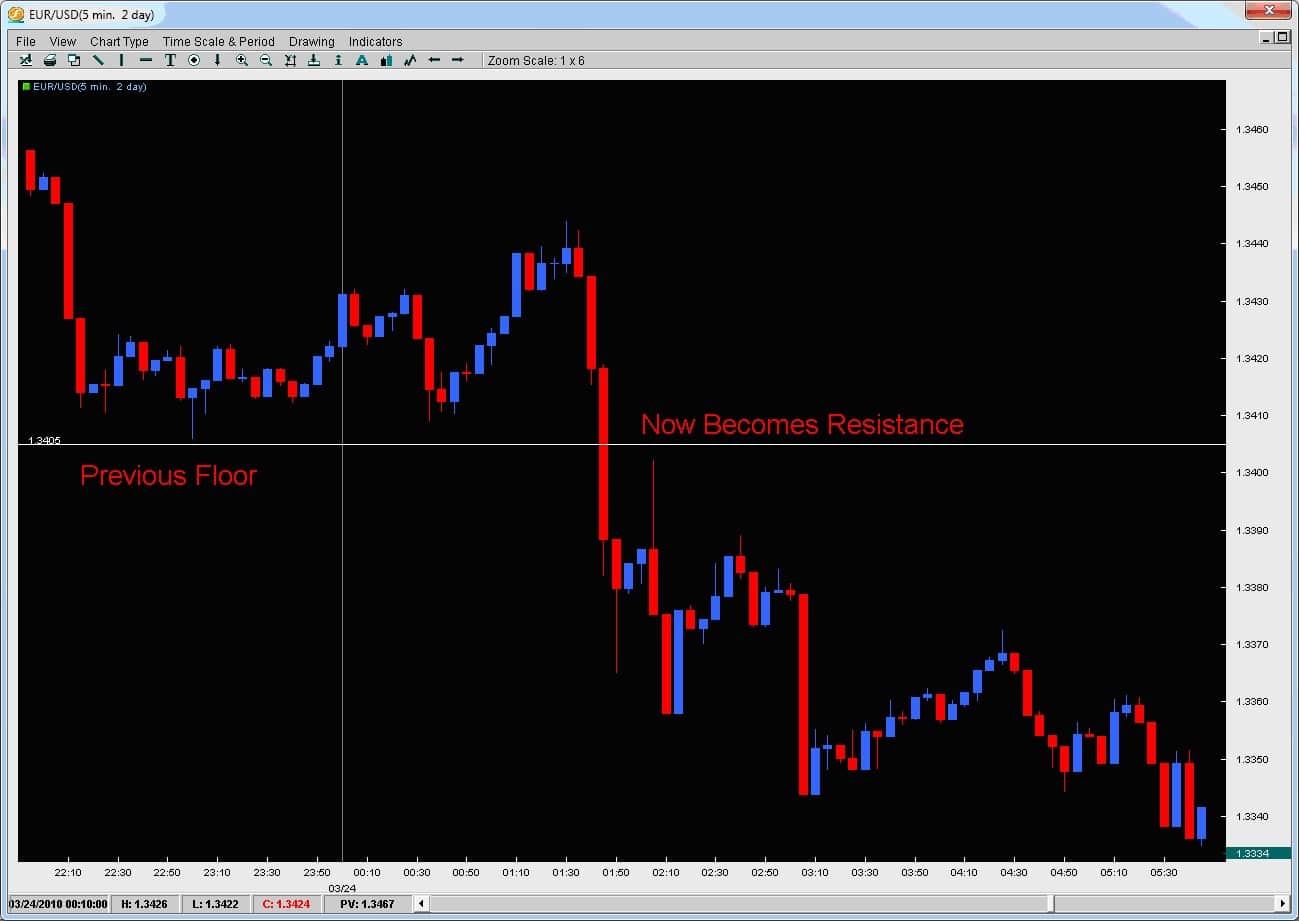
In fact, the market does this twice as the bottom of the first major breakout becomes…resistance forming a breakout-retest level. See chart below.

2nd-eu-breakout-retest-pic

So how do we trade this method?

The simple answer is to look for these significant highs/lows confirmed by price action and then watch for the break. The time frame is not too important but intraday time frames such as the 5m or 30m often work well to spot the key breakout level.

Once its broken, look for price to retrace exactly to that level. If it does, you can enter a trade in the direction of the breakout using the breakout-retest level as your entry price. You can always adjust a few pips to make sure you get in the trade as price will not always go to that level to the pip.

If you are serious about learning how to trade breakouts and advancing your learning curve, view the courses we have available today.

Effective Trailing Stops

One of the most common questions I get from traders is how to trail a trade.There are several solutions and one of them is to have two targets whereby the 1st one gets easily hit and then you move the stop to BE (breakeven) to reduce the risk.However, trades can often go for a run so there has to be a way to systematically measure and trail the position.

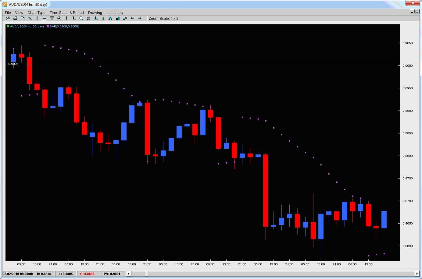
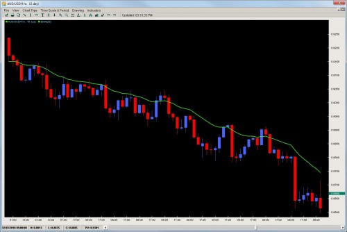
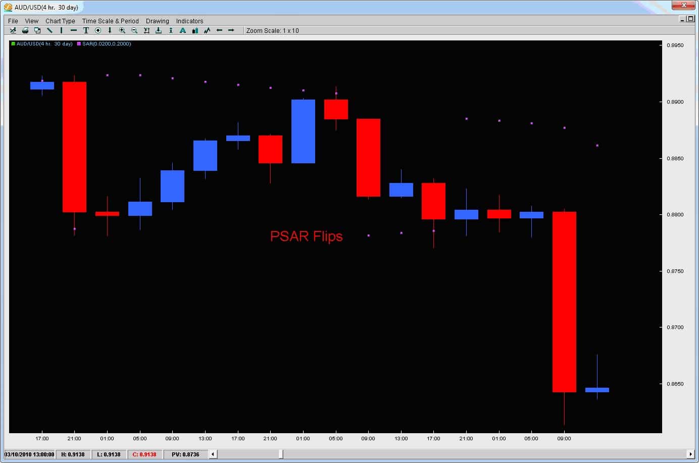
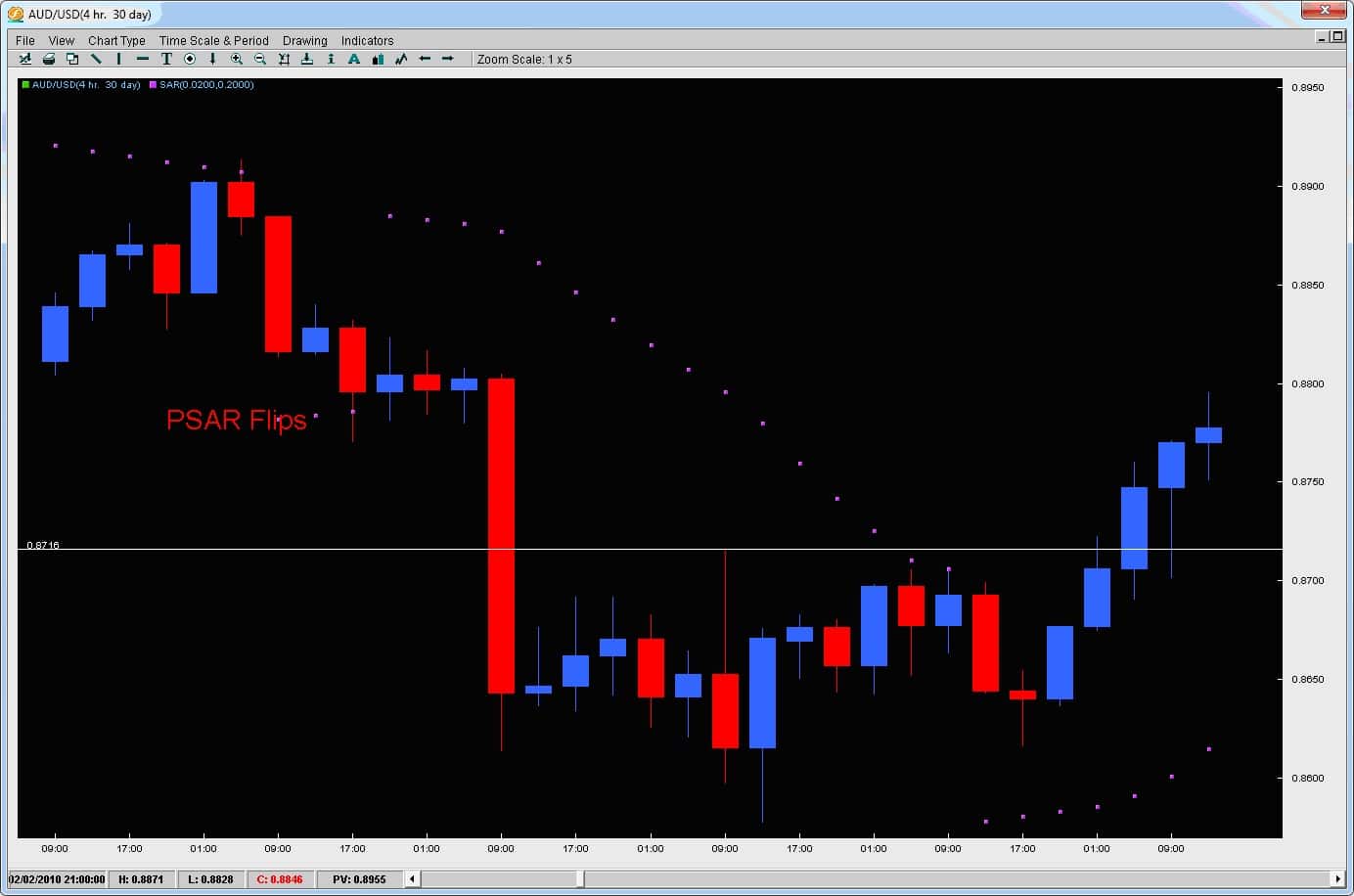
One effective trailing stop forex method or indicator is the Parabolic SAR which stands for ‘Stop and Reverse’. In many ways, this indicator was built for this and is ideal but the typical method of using it may not work so we are going to offer a solution. Take a look at the chart below on the AUDUSD 4hr time compression.Notice how its falling steadily in the beginning but then later gets more impulsive.Trends do not always move the way we want them to which is a straight line like Carl Lewis in the 100M sprint.Trends can oscillate back and forth like inhaling and exhaling but the bottom line is they are still in tact. One way to use the Parabolic SAR is to trail behind each dot say by 15pips on time frames 1-4hrs and 9pips less than the 1hr time frame.You only have to adjust the stop at the close of each candle.If it gets tagged, fine your out but if its still active, adjust it after each candle.In the chart below, we could have gotten short on the break of .9000 and by trailing behind the PSAR dots we would have stayed in this position for a while.

trailing-stop-chart-1 Now, notice in the middle where the PSAR dots flip to the other side of the price action on the chart below.
trailing-stop-chart-2

Using the traditional method for the PSAR you would exit the position.We offer and alternative which is to keep the last stop you had on the last dot that was on the side of the trend.By doing this, if the pair flipped for a small corrective move, then when the trend continues you will still be in the trade.If you get stopped out, you still locked in profit.We feel this is much more advantageous as is still gives you an opportunity to be in the market.In this case, it would have turned into much greater profits staying in the trend banking another 110pips.

trailing-stop-chart-3

Then at the bottom when the pair is really ready to reverse, your PSAR trailing stop gets hit and you lock in your profits as you no longer want to be in the position.

We actually have two very popular forex trailing stop strategy (Shadow Swing Trading) which use proprietary trailing stops that are great at keeping you in trending moves capturing the lions share of the move while neutralizing risk as quickly as possible on intraday time frames.

If you would like to learn more about our systems, check out our courses.

One of the most difficult challenges for traders is finding forex entries and exits.

It’s an important question that needs to be answered and can determine if you are; 1. getting in at the correct location 2. can have your risk defined and as minimal as possible 3. have a clear location to take profit 4. and know how to protect the position If any of these are challenging for you, then you will want to learn how to use pivot points. Created by floor traders decades ago, they were used as a method to mark key levels of support and resistance. It started out with the daily pivot but morphed into other pivot levels the institutions are watching constantly on a daily basis. If I told you about 70-80% of all 1hr candles will touch a pivot level from the London open to the London close and sometimes even the NY close, would you pay attention to them? I’d hope so because price action’s constant contact with them suggests their potency as something that has to be respected. Before we go into examples of them on the charts, we will go over their basic construction.

All the pivots start with the composition of the DP or Daily Pivot. The DP is calculated by adding yesterday’s high, low and close, then dividing them all by 3.

The formula looks like this: DP = (H + L + C) /3 If you think about it, some of the most important pieces of data from a price action perspective are yesterday’s high, low and close. The high and low mark the extremes of price for that day (or how far the market was willing to go) and the close measures the acceptance of price at a particular level, along with how much strength in the buying or selling there was (determined by the closes’ position to the high or low). The remaining pivots are calculated by various multiples of the DP.

The formulas are below:

S1 = DP – (H – DP);

S2 = DP – (H – L);

S3 = L – (H – L);

R1 = DP + (DP – L);

R2 = DP + (H – L);

R3 = H + (H – L);

To briefly define them, the S1, S2 and S3 are what we call support pivots (S = Support) and the R1, R2 and R3 are what we call resistance pivots (R = Resistance). The S1 Pivot is the closest of the support pivots and the R1 the closest of the resistance pivots. The farther we go out (S2, S3, R2, R3) the further the pivots are from the DP.

A chart below will show what they are and how they relate to price.

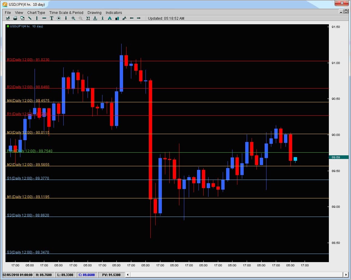
pivot-pic-1

In this chart we are looking at the USDJPY on the 4hr time frame. The red lines are Resistance pivots and the blue lines are Support pivots. The yellow lines are Mid-Pivots and are simply the halfway point between any two pivots.

So how do Pivots help you with Entries and Exits?

Simple. The institutions regard pivots as one of the most important things for placing intraday forex entries and exits. Price actions response to them confirms this but in regards to any other indicator out there, nothing has more contact with price action than pivot points (except a really short moving average which has little meaning to price at that point). There are actually statistics out there which show how price will make contact with pivots 70-80% of the time (on hourly chart). Lets take a look at the GBPUSD on the 30m chart below.

pivot-pic-2

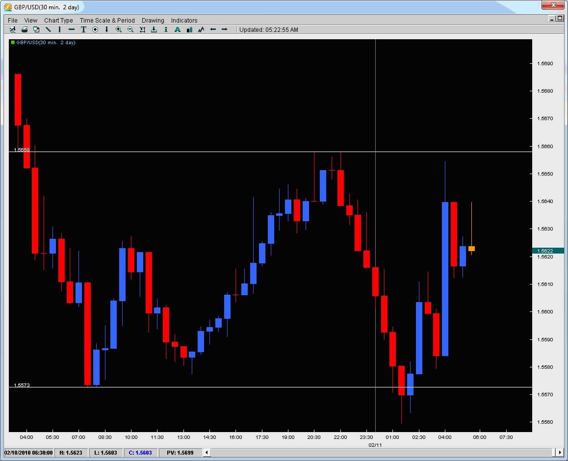
The grey line represents the London open (today Feb. 11th, 2010). We can see from the recent top why price today got rejected up around 1.5650/60 because of the last top there and price’s rejection at this level. But what about the bottom? The previous bottom was 1.5573 which the two candles to the left had touched but today, price went another 15pips past them. Why did the two candles today go past them and why did the market reject or react so sharply to those levels? Also, after bouncing off the bottom, price climbed to 1.5610 where two wicks to the topside formed and caused a small rejection. What was there to reject price in the past? This exact same rejection level became a support level once price had broken it.

Take a look at the chart below and you will have the answer why.

pivot-pic-3

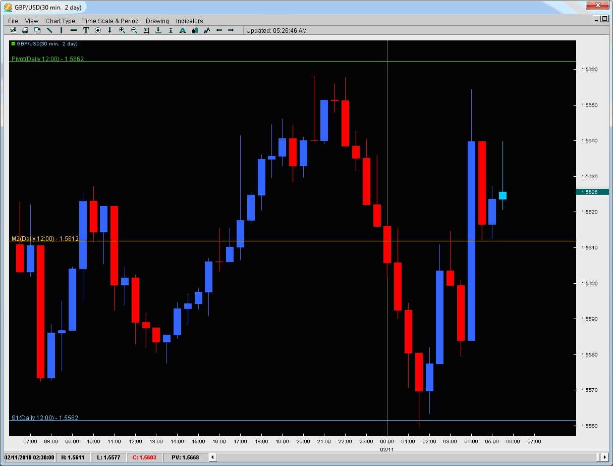
As you can see, price went past the previous support level and touched the S1 (Support 1 Pivot). Treated it as support for two candles, then rejected off of it.

Where did it go to?

The M2 Pivot (Mid2 Pivot) and rejected twice off there. Once price broke this level, it then came back to do what? Treat the Mid-2 Pivot as support. These types of reactions/responses from the market occur all the time on an intraday basis. They give the trader a much more precise level to enter the market for intraday trading while also giving us ideas for precise exits. If you would like to learn how to use them for precise forex entries and exits for your intraday trading, learn what the % chance price will break any given pivot on any given day, learn what the % chance price will touch the next pivot after breaking one pivot, or how to spot key reversal and breakout strategies using pivots, then check out the Price Action and Pivot Point Course.

We have gone over one method to use the 20ema for getting into trends after they have materialized and gotten underway. In this article, we will talk about another common setup trends often form giving us as traders another method to get into trends.

The EMA Failure – With Trend Setup
As mentioned before, trends will often oscillate and provide minor pullbacks before resuming another leg of the trend. These moves can pullback to the 20ema, touch it and then continue trending. Another method is the EMA failure, where the trend will pullback to the 20ema, break it briefly, and then resume the trend. We will talk about this method and gives some examples.
It stands to reason the institutions are watching how price action responds to these moving average touches because the market so often responds to them in such a clear and undeniable fashion. If a moving average has acted as support (or resistance) during a trend, then when it breaks it, the market should or could reverse. However, more often than not, the institutions will often use this as an opportunity to get back in the trend. It is often the case after breaking counter-trend the 20EMA, it will shortly after slam back above (or below) it to resume the trend. Lets look at a few examples and talk about some common characteristics when this happens.

AUDUSD 4hr Chart

aud_usd1
Moving in a solid consistent downtrend, the pair has had several touches off the 20ema treating it as resistance and a trend continuation signal.However, look at the middle of the chart where it breaks it for 2.5candles.Usually when something is treated as resistance and gets broken, the buyers come in thinking the trend is over or reversing.However, the market never did this as the price action after it barely gained ground only to slam back below the 20EMA and start another run.It did this a total of three times with the behavioural pattern the same each time.

GBPUSD 4hr Chart

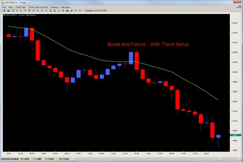
Already in a strong downtrend, the pair pong’d off the 20ema once and sold off for another 28hrs straight, dropping 300pips in the process.However, take a look at what happened when it actually broke the 20ema for the first time and closed above it.
gbp_usd

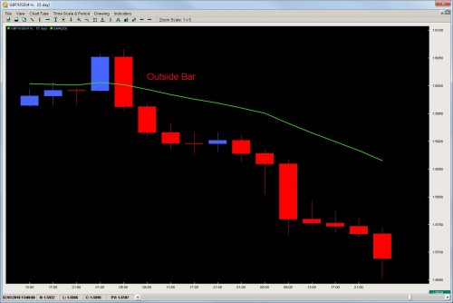
After closing above it, some traders might have gone long and quickly gotten trapped in this move after the pair on the following candle formed an outside reversal candle and then sold off 350pips in the next 48hrs.Not all EMA breaks are created equal and its important to realize when they are the real deal and when they are with-trend setups.

2 Key Points


The market will often exhibit two key characteristics when the 20ema break is a failure or a with-trend setup.

  1. Time – the market spends a short period of time (3-4candles max) above the 20ema on the other side of the trend before breaking back above (or below) it in the direction of the original trend.This is the market showing with time that trend is still alive and about to start another leg
  2. Reversal Slam – after breaking above the 20ema counter-trend, the market comes back with a vigor slamming back below (or above) the 20ema with trend to show their renewed energy to continue the trend.The strong price action move is confirmation with a lot of money from the institutions the trend is going to resume and this move is often highlighted with a reversal pattern of sorts as in the case below (outside bar)gbp_usd4

    When you have the combination of the Time and Reversal Slam together on a counter trend 20ema break, it gives us traders a with-trend setup that is usually low risk and high reward but more importantly, a way to trade trends after missing the initial move.

    To learn more advanced price action setups, check out the Trading Masterclass course.


One of the amazing things about the Ichimoku Cloud trading strategy is the actual Cloud or ‘Kumo’ which is something unique wherein nothing like it was created before and nothing sense has come after. The Ichimoku Cloud or Kumo is designed to represent support or resistance but in a different form the western world has seen – to view support and resistance as evolving or dynamic and not static like pivot lines, Fibonacci lines, support lines or trend lines.

To the creator (Goichi Hosada), support and resistance was evolving and really based upon previous price action.Particularly, the highs and lows of previous price action was of great concern to Hosada (along with the opens and closes) which showed levels of rejection where the market would not accept price.The previous highs and lows would also give traders the range where the market was accepting price.

So the real question is ‘how’ does the Ichimoku Cloud or Kumo represent support and resistance?The answer lies in the construction of the Cloud or Kumo.


Kumo Composition

There are two main lines of the Kumo which are referred to as Senkou Span A and Senkou Span B.  For the purposes of efficiency, we will refer to them as Span A and Span B.  The space or value in between these two lines is what forms the Kumo.

Span A is formed by taking the Tenkan Line and adding it to the Kijun Line (white and red lines respectively from chart above), then dividing that value by 2 and plotting it 26 periods ahead.  The formula is;

(Tenkan Line + Kijun Line) / 2 placed 26 periods ahead

Span B is formed by taking the highest high (over the last 52 periods), adding to it the lowest low (over the last 52 periods), dividing that by 2 and plotting that 26 time periods ahead.  The formula is;

(Highest High + Lowest Low for the last 52 periods) / 2 and plotted 26 time periods ahead.


Now, before we fully get into the construction of the Kumo, we have to talk about what the Tenkan and Kijun lines are which help to form the ever changing Senkou Span A.

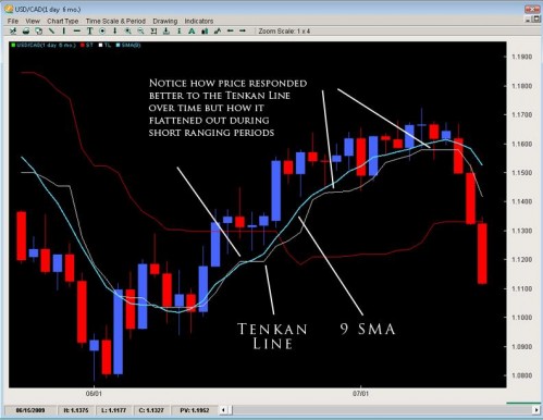
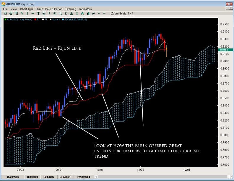
The Tenkan Line or Tenkan Sen (Sen means line in Japanese) is known as the conversion line or turning line is similar to a 9SMA but actually is quite different.  Remember a SMA (simple moving average) will smooth out all the data and make it equal but the Tenkan Line will take the highest high and lowest low over the last 9 periods.  The explanation for this is Hosada felt price action and its extremes were more important than smoothing any data because price action represented where buyers/sellers entered and directed the market, thus being more important than averaging or smoothing the data out.  As you can see by the chart below, the Tenkan Line is quite different than a 9SMA.  Because the TL (Tenkan Line) uses price instead of an averaging or the closing prices, it mirrors price better and is more representative of it.  You can see this when the TL flattens in small portions to move with price and its moments of ranging.

Ichimoku Cloud,Kumo Composition


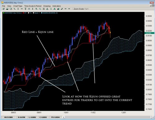
The Kijun Line (or Kijun Sen) is known as the datum line, standard line or trend line designed to indicate the overall trend for the instrument or pair.  The formula behind it is the same as the Tenkan line using price action and the highest high + lowest low with the only change being in the periods as it does it over the last 26 periods.

aud-usd


Why 26 periods?  The answer to that is a matter of history.  When the Ichimoku was first created, the Japanese markets were open 6 days a week on Saturdays.  If the markets are open 6 days a week, this generally results in 26 trading days for the month – hence 26 periods for the Kijun.  In essence, what it was meant to be was a measure of the highest high + lowest low for the last month of price action.  If the Kijun has been climbing – it means price has been gaining ground for the last month.  If it is flat, then it will be the midpoint of the range of price for the last month of price action (or representative of the price equilibrium).

Now that we have uncovered the composition of the Tenkan and the Kijun lines, lets talk about how they form the Senkou Span A.

Going back to its construction:

Span A is formed by taking the Tenkan Line and adding it to the Kijun Line (white and red lines respectively from chart above), then dividing that value by 2 and plotting it 26 periods ahead.  The formula is;

(Tenkan Line + Kijun Line) / 2 placed 26 periods ahead

So the Tenkan line (which is the momentum line) and the Kijun line (which is the trend line) that are based upon price action are moving.Their valued added together, divided by 2 and sent 26periods ahead is what forms the Senkou Span A or Span A.So the first portion of the Ichimoku Cloud or Kumo is based upon evolving price action lines which are half momentum, half trend monitoring.When you put these two together, you get the Span A which is always changing based upon the acceleration or deceleration of price based upon how they effect the Tenkan/Kijun lines (and in turn, the Senkou Span A).

The second line is the Senkou Span B which is a little different.Its based solely upon price action, particularly the last 52 candles of whatever time period you are on.If you are working with a daily chart, we are talking about the last 52 days, for a 1hr chart, the last 52 hours of price action.After taking the high and low for the last 52 candle range, it takes their values, divides them in half, and shoots them 26 time periods ahead.

The shading in between is called the Cloud or Kumo.


Why 26 periods?

The answer to that is a question of history.Originally, when the Ichimoku Cloud was built, Hosada was mostly using it off of daily charts.The Japanese were trading 6 days a week so 26 days would represent a full month of trading.Hence 26 time periods to see where future support and resistance would be one month out.

This is where we can use the Ichimoku Cloud for reversals.

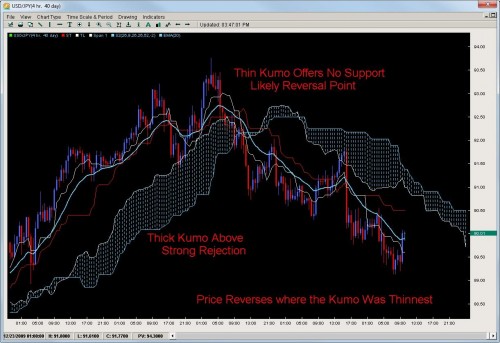
If the Ichimoku Cloud or Kumo represents support and resistance, then the thicker the Cloud, the thicker the S/R it offers.If price is below the Kumo, it will act as resistance, if price is above the Kumo, it will act as support.The Cloud can take many forms and shapes (virtually infinite) which is what makes it tricky but thick Kumo’s often will reject price and the longer the time frame (4hr, Daily, Weekly), the more powerful the Kumo will act as support or resistance.

Take a look at some Ichimoku cloud trading strategy examples below.


USDJPY 4hr Charts

Notice how the pair rejects off the really thick Cloud but when it reverses is where the Cloud was the weakest or most thin.

usd-jyp

USDCAD 4HR Charts

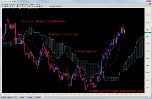
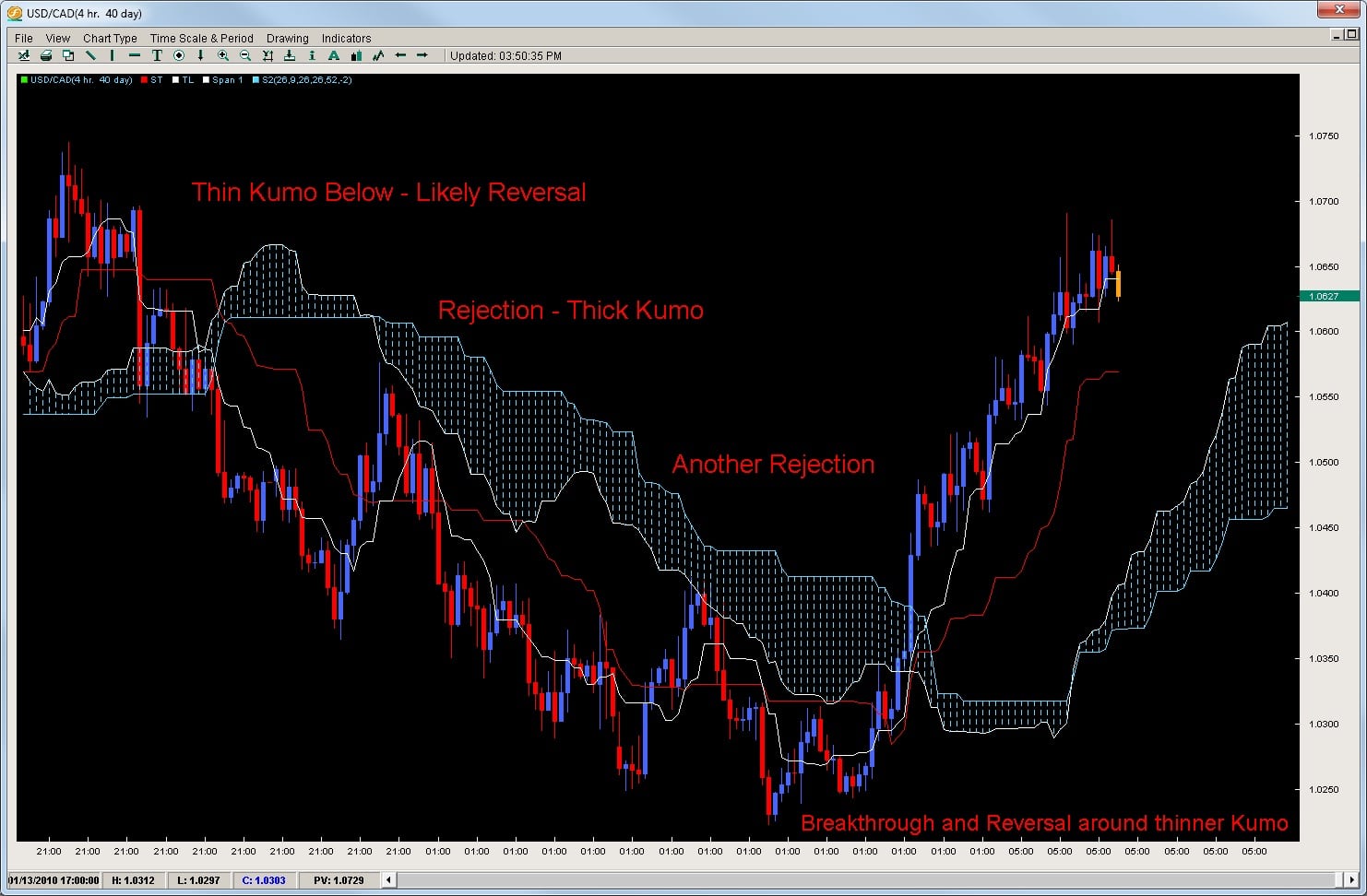
Taking a look at another example, the USDCAD after its initial fall, rejected off a really thick Kumo twice telling us a reversal was less likely.However the Kumo starts to thin out giving us a window to break through the Kumo and likely reversal point.

usd-cad1

So the key tactic in both is to look for thinner Cloud formations which offer a window or glimpse into an upcoming reversal.Remember the Kumo is sent 26time periods ahead so you have plenty of warning when the window is opening.If you are in the current trend, the window in the Kumo could be a warning to take some profits or if you are looking for a reversal, then the Cloud offers you a good location and method to time a reversal which is one of the hardest things to do in trading.

Another clue hidden in the Cloud can be the flipping of the Senkou Span A and B which can indicate a reversal but do not always.The other main point is price does not always reject off a thick Kumo so its important to watch price action as well but the Ichimoku Cloud is excellent at spotting and timing reversals.

To learn more about Ichimoku Cloud trading strategies, or proprietary quantitative based strategies on the Ichimoku Cloud, check out the Advanced Ichimoku Course.

Using the Ichimoku Cloud to discover Reversals

One of the amazing things about the Ichimoku Cloud is the actual Cloud or ‘Kumo’ which is something unique wherein nothing like it was created before and nothing sense has come after.The Ichimoku Cloud or Kumo is designed to represent support or resistance but in a different form the western world has seen – to view support and resistance as evolving or dynamic and not static like pivot lines, Fibonacci lines, support lines or trend lines.

To the creator (Goichi Hosada), support and resistance was evolving and really based upon previous price action.Particularly, the highs and lows of previous price action was of great concern to Hosada (along with the opens and closes) which showed levels of rejection where the market would not accept price.The previous highs and lows would also give traders the range where the market was accepting price.

So the real question is ‘how’ does the Forex Ichimoku Cloud or Kumo represent support and resistance? The answer lies in the construction of the forex Ichimoku Cloud or Kumo.


Kumo Composition

There are two main lines of the Kumo which are referred to as Senkou Span A and Senkou Span B.  For the purposes of efficiency, we will refer to them as Span A and Span B.  The space or value in between these two lines is what forms the Kumo.

Span A is formed by taking the Tenkan Line and adding it to the Kijun Line (white and red lines respectively from chart above), then dividing that value by 2 and plotting it 26 periods ahead.  The formula is;

(Tenkan Line + Kijun Line) / 2 placed 26 periods ahead

Span B is formed by taking the highest high (over the last 52 periods), adding to it the lowest low (over the last 52 periods), dividing that by 2 and plotting that 26 time periods ahead.  The formula is;

(Highest High + Lowest Low for the last 52 periods) / 2 and plotted 26 time periods ahead.

Now, before we fully get into the construction of the Kumo, we have to talk about what the Tenkan and Kijun lines are which help to form the ever changing Senkou Span A.

The Tenkan Line or Tenkan Sen (Sen means line in Japanese) is known as the conversion line or turning line is similar to a 9SMA but actually is quite different.  Remember a SMA (simple moving average) will smooth out all the data and make it equal but the Tenkan Line will take the highest high and lowest low over the last 9 periods.  The explanation for this is Hosada felt price action and its extremes were more important than smoothing any data because price action represented where buyers/sellers entered and directed the market, thus being more important than averaging or smoothing the data out.

As you can see by the chart below, the Tenkan Line is quite different than a 9SMA.  Because the TL (Tenkan Line) uses price instead of an averaging or the closing prices, it mirrors price better and is more representative of it.  You can see this when the TL flattens in small portions to move with price and its moments of ranging.

tenkan-line

The Kijun Line (or Kijun Sen) is known as the datum line, standard line or trend line designed to indicate the overall trend for the instrument or pair.  The formula behind it is the same as the Tenkan line using price action and the highest high + lowest low with the only change being in the periods as it does it over the last 26 periods.

kijun-line

Other Notes About the Tenkan and Kijun
As a whole, if the Kijun has been climbing – it means price has been gaining ground for the last month.  If it is flat, then it will be the midpoint of the range of price for the last month of price action (or representative of the price equilibrium).

Now that we have uncovered the composition of the Tenkan and the Kijun lines, lets talk about how they form the Senkou Span A.

Going back to its construction:

Span A is formed by taking the Tenkan Line and adding it to the Kijun Line (white and red lines respectively from chart above), then dividing that value by 2 and plotting it 26 periods ahead.  The formula is;

(Tenkan Line + Kijun Line) / 2 placed 26 periods ahead

So the Tenkan line (which is the momentum line) and the Kijun line (which is the trend line) that are based upon price action are moving.Their valued added together, divided by 2 and sent 26periods ahead is what forms the Senkou Span A or Span A.So the first portion of the Ichimoku Cloud or Kumo is based upon evolving price action lines which are half momentum, half trend monitoring.When you put these two together, you get the Span A which is always changing based upon the acceleration or deceleration of price based upon how they effect the Tenkan/Kijun lines (and in turn, the Senkou Span A).

The second line is the Senkou Span B which is a little different.Its based solely upon price action, particularly the last 52 candles of whatever time period you are on.If you are working with a daily chart, we are talking about the last 52 days, for a 1hr chart, the last 52 hours of price action.After taking the high and low for the last 52 candle range, it takes their values, divides them in half, and shoots them 26 time periods ahead.

The shading in between is called the Cloud or Kumo.

If the Ichimoku Cloud or Kumo represents support and resistance, then the thicker the Cloud, the thicker the S/R it offers.If price is below the Kumo, it will act as resistance, if price is above the Kumo, it will act as support.The Cloud can take many forms and shapes (virtually infinite) which is what makes it tricky but thick Kumo’s often will reject price and the longer the time frame (4hr, Daily, Weekly), the more powerful the Kumo will act as support or resistance.

Take a look at some examples below.

USDJPY 4hr Charts
Notice how the pair rejects off the really thick Cloud but when it reverses is where the Cloud was the weakest or most thin.

kumo-reversal-chart-1

USDCAD 4HR Charts
Taking a look at another example, the USDCAD after its initial fall, rejected off a really thick Kumo twice telling us a reversal was less likely.However the Kumo starts to thin out giving us a window to break through the Kumo and likely reversal point.

kumo-reversal-chart-2

So the key tactic in both is to look for thinner Cloud formations which offer a window or glimpse into an upcoming reversal.Remember the Kumo is sent 26time periods ahead so you have plenty of warning when the window is opening.If you are in the current trend, the window in the Kumo could be a warning to take some profits or if you are looking for a reversal, then the Cloud offers you a good location and method to time a reversal which is one of the hardest things to do in trading.

Another clue hidden in the Cloud can be the flipping of the Senkou Span A and B which can indicate a reversal but do not always.The other main point is price does not always reject off a thick Kumo so its important to watch price action as well but the Ichimoku Cloud is excellent at spotting and timing reversals.

To learn more about the Ichimoku Cloud for reversals, or proprietary quantitative based strategies on the Ichimoku Cloud, check out the Advanced Ichimoku Course.

Traditionally, the Ichimoku Cloud is known for its ability to pick up trends and keep traders in them until they are over.It should be noted that any system or method which is good at finding trends is also good at finding reversals because if you are finding the times/locations when trends are ending, then you are finding consequently a reversal.

There are several components inside the Ichimoku Cloud which give it a unique capacity to find trends, establish if we are in a trend, which direction and when it is over.One of them is the Kumo or Cloud which is one of the most unique technical indicators out there.


Kumo Composition

There are two main lines of the Kumo which are referred to as Senkou Span A and Senkou Span B.  For the purposes of efficiency, we will refer to them as Span A and Span B.  The space or value in between these two lines is what forms the Kumo.

Span A is formed by taking the Tenkan Line and adding it to the Kijun Line (white and red lines respectively from chart above), then dividing that value by 2 and plotting it 26 periods ahead.  The formula is;

(Tenkan Line + Kijun Line) / 2 placed 26 periods ahead

Span B is formed by taking the highest high (over the last 52 periods), adding to it the lowest low (over the last 52 periods), dividing that by 2 and plotting that 26 time periods ahead.  The formula is;

(Highest High + Lowest Low for the last 52 periods) / 2 and plotted 26 time periods ahead.


What is it used for?

The most important way to look at the Kumo is as support and resistance – meaning if it is thick, then the support/resistance (depending upon where price is in relationship to the cloud) is strong.  If price is above the Kumo, we are in a general uptrend or would want to look for more buying opportunities.  If price is below the cloud, it is below resistance (the Kumo) and we want to be searching for more shorts than longs.  The longer price stays below/above the cloud, the stronger the trend we are in and the more support/resistance the Kumo will offer.

These are generic ways to look at it but effective.What is important to note is in trends, price will stay on one side of the Kumo.The farther price is from it, the stronger the trend and more volatile it is.Thus, the Kumo can be a very effective tool for option traders as well as trend/momentum traders.


How can we use it for Reversals?

Because the Kumo will often hold price on one side of it, when price breaks it, such a move can often signal a reversal.There are various factors which will increase the likelihood of a reversal such as:

  • Thickness of the kumo when broken
  • How long price has been on one side of it
  • How far price has moved before touching/piercing the kumo
  • What time frame you are working on

These are all critical when assessing whether a Kumo break is signifying a reversal or not.

A few examples

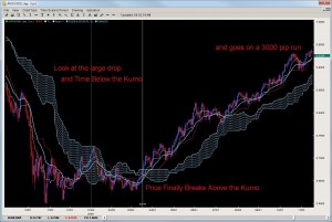
Take a look a the AUDUSD below.It was below the Kumo for a long period of time and had a massive fall.Then after a couple of attempts on the daily chart, broke above the Kumo.Now remember the Kumo represents support and resistance so the pair breaking above it, then coming back to the Kumo to treat it as support was a great role-reversal play.After retouching the Kumo, it went on a 3000 pip run!

aud_usd3

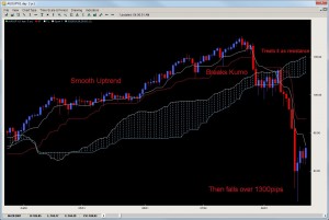
Another example is on the AUDJPY on the daily chart which was on a smooth consistent uptrend.Look what happened when it broke the kumo.It took a few days, but then after attempting to break back above, treated the Kumo as resistance, and the pair then fell over 1300 pips in a few months.

aud_jpy1


Final Notes

The Kumo breakout strategy is one of the key systems used by Ichimoku traders for spotting key reversals, qualifying them and giving traders a unique opportunity to either take profits or reverse positions.Its great for timing trends, reversals and trading key reversals when they are in play.Because of its unique ability to measure support and resistance, the Ichimoku Cloud and its Kumo construction offer the trader some unique trade opportunities.

It should be noted there are other key elements needed to trade the Kumo Breaks with precision.We have analyzed Kumo breaks on Forex, Futures, Commodities and Indices over the last 10 years and with our proprietary indicators and analytical programs, are able to give precise measurements for how far and long a Kumo break should travel which gives you a precision edge when trading them.

To learn more about our proprietary Ichimoku trading strategies and systems, visit our Advanced Ichimoku Course where you will get access to 10 years of proprietary quantitative data on how to trade Ichimoku Clouds.

This is by far the most popular of the trading methods in the Ichimoku Cloud trading arsenal.

It is simple, elegant and great at picking up trends and trend reversals. If you like trading trends or momentum trading, the Tenkan/Kijun cross is a great method to use.

What is the Tenkan?

The Tenkan Line or Tenkan Sen (Sen means line in Japanese) is known as the conversion line or turning line is similar to a 9SMA but actually is quite different. An SMA (simple moving average) will smooth out all the data and make it equal, but the Tenkan Line will take the highest high and lowest low over the last 9 periods.

The explanation for this is Hosada felt price action and its extremes were more important than smoothing any data. This is because price action represented where buyers/sellers entered and directed the market, thus being more important than averaging or smoothing the data out.

As you can see by the chart below, the Tenkan Line is quite different than a 9SMA. Because the TL (Tenkan Line) uses price instead of an averaging or the closing prices, it mirrors price better and is more representative of it.  You can see this when the TL flattens in small portions to move with price and its moments of ranging.

Akin to all moving averages, the angle of the Tenkan line is very important as the sharper the angle, the stronger the trend while the flatter the Tenkan, the flatter or lesser the momentum of the move is.  However, it is important to not use the Tenkan line as a gauge of the trend but more so the momentum of the move.  However, it can act as the first line of defense in a trend and a breaking of it in the opposite direction of the move can often be a sign of the defenses weakening.

The Kijun Line (or Kijun Sen) is known as the datum line, standard line or trend line designed to indicate the overall trend for the instrument or pair.  The formula behind it is the same as the Tenkan line using price action and the highest high + lowest low with the only change being in the periods as it does it over the last 26 periods.

Why 26 periods?  The answer to that is a matter of history.  When the Ichimoku was first created, the Japanese markets were open 6 days a week on Saturdays.  If the markets are open 6 days a week, this generally results in 26 trading days for the month – hence 26 periods for the Kijun.

In essence, what it was meant to be was a measure of the highest high + lowest low for the last month of price action.  If the Kijun has been climbing – it means price has been gaining ground for the last month.  If it is flat, then it will be the midpoint of the range of price for the last month of price action (or representative of the price equilibrium).

Also like the Tenkan Line, the angle of the Kijun is reflective of the overall trend in place. Price breaking the Kijun after being in an up/down trend often has serious consequences for that trend and can many times lead to a reversal of sorts. Ultimately because it uses a longer period to measure price action, its a more stable method for determining the direction of the trend than the Tenkan Line.

Because of price to respect this line during a strong trend, it can potentially be used as a stop loss for traders already in the correct direction of the trend. Hence, when price breaks or closes below it by a significant amount, the trend is often over.

Applications for the Tenkan and Kijun

The most common usage of the Tenkan and Kijun are the ‘cross’ or what we call the TKx (Tenkan-Kijun Cross). Similar to how a MACD uses a cross of its two lines, the Ichimoku Cloud does the same. It is interesting to note that the Ichimoku uses the same periods as the MACD, however it was created over a decade earlier.

One of the main signals for Ichimoku traders, the TKx can often indicate when a trend is about to begin by forming a cross (upward cross = possible upward trend while downward cross = possible down trend). A generic upward cross can be used as a bullish signal (or exit for people already short) and a generic downward cross can be used as a generic bearish signal (and vice versa for current bulls). However, notice we used the term ‘generic’ meaning there is more to the cross.

Hosada was able to give a further definition to the cross based upon its position to the Kumo or cloud. If the cross was below the Kumo, then it was considered a ‘weak’ signal since the cross was below the Kumo or below resistance. A medium signal was when a cross happened inside the Kumo as it was occurring within the field of support/resistance. A strong signal was when the bullish cross happened above the Kumo as it was happening after clearing resistance. The opposite is true for bearish signals whereby a weak signal is a cross above the Kumo, while a medium signal is inside the Kumo and a strong signal below the Kumo.

One important reminder to all this is to make sure you reference the Chikou Span to see how current price is in relationship to previous price action.

Exhibit A – Tenkan / Kijun Crosses

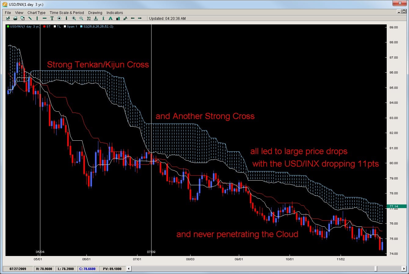
Take a look at how the USD/INX gave 3 strong downward crosses with each move selling off nicely and never penetrating the Kumo highlighting the downtrend.

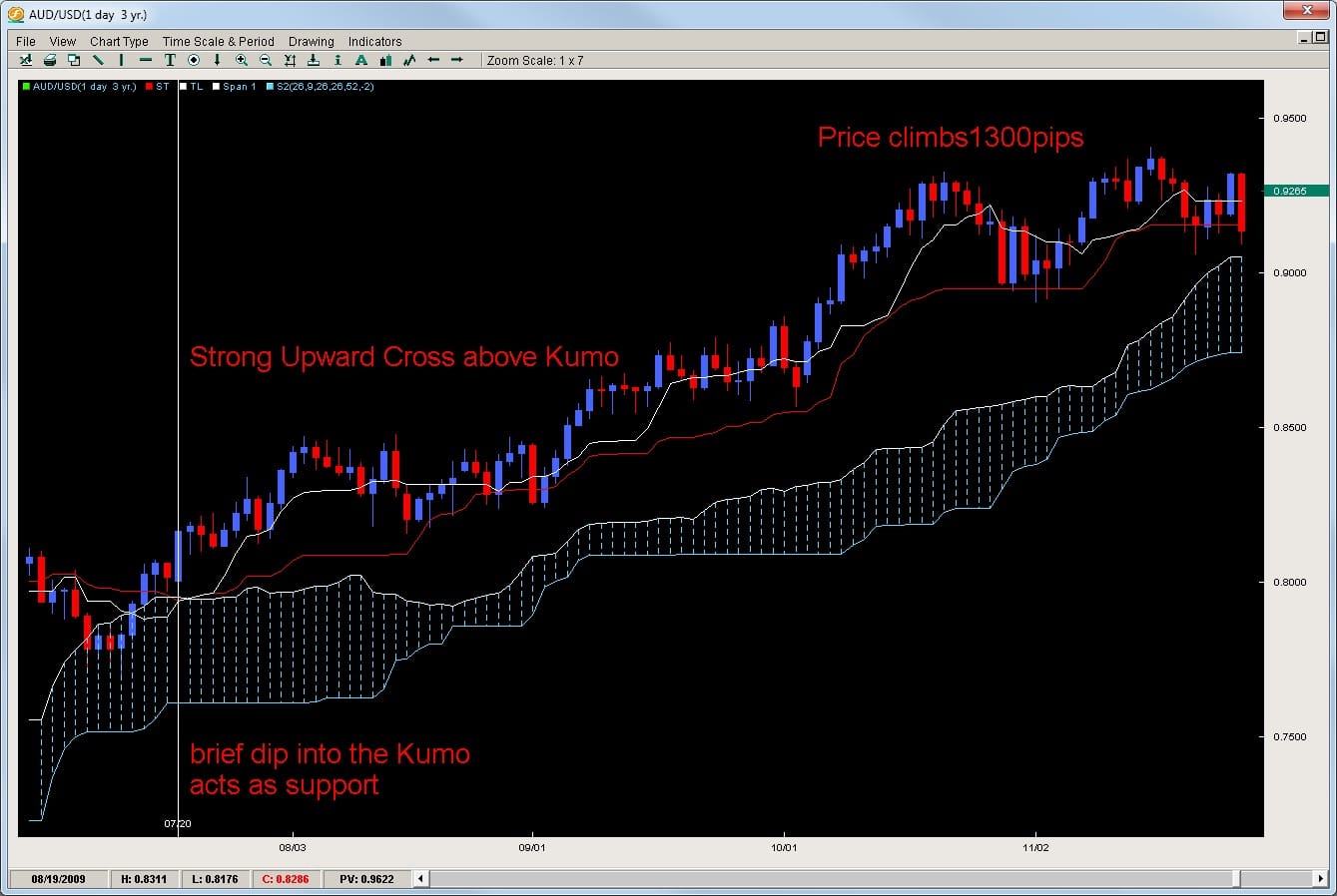
In another example, the AUDUSD gives a nice upward cross in an already established uptrend. First it entered the Kumo but had a very shallow penetration leading to a strong upmove over 1300pips from the Tenkan/Kijun cross.

Closing

There are many important factors to consider when trading the Tenkan/Kijun cross such as time frame, kumo shape/configuration, previous moves-series of crosses, angle/shape of the cross, etc.

We have proprietary quantitative data on all pairs for the last 10 years to give you an edge when trading the Tenkan/Kijun cross. To get access to this data, or learn how to trade the Ichimoku on an advanced level, check out the Advanced Ichimoku Course.